Benjamin Moore San (027) is a timeless and tranquil paint color that embodies the essence of coastal living. This light, airy hue is perfect for creating spaces that feel open, calming, and effortlessly chic. Whether you're designing a beachside retreat or infusing a hint of seaside charm into your urban oasis, San (027) delivers a fresh and versatile aesthetic that works beautifully in a variety of settings.
San (027) is a soft, breezy blue with distinct gray undertones that prevent it from feeling overly bright or saturated. The touch of gray gives the color a sophisticated edge, making it an excellent choice for those who love subtle, muted tones. Its nuanced undertones strike a perfect balance, offering both calmness and depth, which makes it adaptable to different lighting conditions. In natural light, the color leans toward its blue side, evoking images of clear skies and ocean waves, while in artificial or dim light, the gray undertones add a gentle grounding effect.
One of the standout features of Benjamin Moore San (027) is its versatility. Its understated elegance allows it to pair harmoniously with a variety of coordinating colors. Here are some suggestions:
Neutral Colors: For a clean and serene look, pair San (027) with warm whites like Benjamin Moore Simply White (OC-117) or soft grays like Gray Owl (OC-52). These combinations work beautifully in minimalist spaces and evoke a sense of calm.
Earthy Tones: Complement its coastal vibe with sandy beiges like Edgecomb Gray (HC-173) or taupe tones like Revere Pewter (HC-172). These colors create a cozy, grounded palette that's ideal for living rooms or bedrooms.
Bold Accents: Add a pop of color with vibrant coral tones like Calypso Orange (2015-30) or sunny yellows like Hawthorne Yellow (HC-4). These accents bring a playful energy to the space without overwhelming the subtle beauty of San (027).
Deep Blues: For added depth and drama, pair San (027) with navy hues like Hale Navy (HC-154) or deep teal shades such as Blue Note (2129-30). These combinations are perfect for creating contrast in larger spaces or for accent walls.
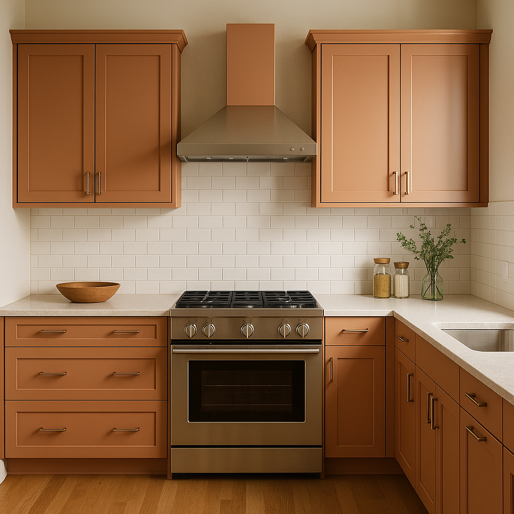
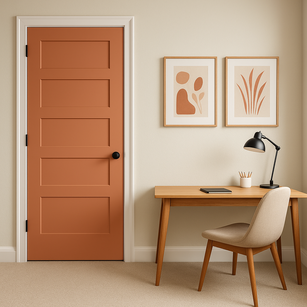
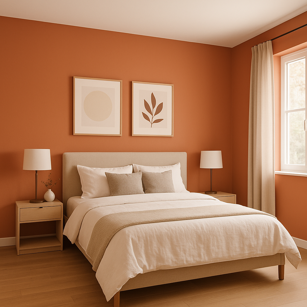
San (027) is incredibly versatile and can be used in various areas of the home or office to evoke a sense of calm and sophistication. Here are some ideas for integrating this color into your interior design:
Bedrooms: Its tranquil quality makes it ideal for bedrooms, where relaxation is key. Pair it with soft white bedding and natural wood furniture to achieve a serene sanctuary.
Bathrooms: San (027) is a natural choice for bathrooms, as its oceanic inspiration complements spaces designed for rejuvenation. Use it alongside crisp white tiles and chrome fixtures for a clean, spa-like feel.
Living Rooms: In living areas, San (027) can act as the perfect backdrop for coastal-inspired decor. Pair it with woven textures, light wood tones, and airy fabrics to enhance its breezy charm.
Home Offices: Bring focus and calm into your workspace by using San (027) as the primary wall color. Its muted tones promote concentration while maintaining a stylish, professional aesthetic.
Accent Walls: If you’re looking to create visual interest, San (027) can be used for an accent wall. Pair it with lighter complementary colors to highlight architectural features or draw attention to specific areas of a room.
Benjamin Moore San (027) is more than just a paint color—it’s a mood setter. Its soft, coastal-inspired tones make it perfect for those seeking an understated yet polished look for their interiors. Whether you're designing a serene bedroom retreat, a breezy coastal living space, or a calming home office, this versatile color adapts effortlessly to your needs. With its gentle balance of blue and gray undertones and its ability to pair well with neutrals, earthy tones, and bold accents, San (027) is a truly timeless choice for any design style.
View Colors Only by Brand (No Imagery):
Sherwin-Williams
|
Benjamin-Moore
|
Behr
|
Valspar
Live on the Eastern Slope of Colorado and looking for a local painting professional, check out all our painting services and reach out for a free estimate.
Copyright © 2026 : Wild Fox Painting Inc. : 12435 Mead Way, Littleton, CO 80125


