Benjamin Moore Twilight (049) is a sophisticated, deep gray that exudes timeless elegance and depth. This rich, moody shade has a subtle hint of blue undertones, making it a versatile choice for both modern and traditional interiors. Twilight strikes the perfect balance between warmth and coolness, creating an inviting yet dramatic ambiance that can transform any space into a refined retreat.
The defining characteristic of Twilight is its cool blue undertone, which gives the color a unique depth and dimension. While Twilight is predominantly a dark gray, the blue undertone adds a softness that prevents it from feeling too heavy or overly stark. This complexity allows Twilight to shift subtly depending on the lighting in your space: in brighter light, the blue undertones may become more pronounced, while in dimmer settings, it leans toward a velvety charcoal gray.
Benjamin Moore Twilight pairs effortlessly with a variety of colors, making it a versatile choice for creating harmonious palettes. Here are some coordinating colors to consider:
Benjamin Moore Twilight is a versatile color that can be used across a variety of design styles and spaces. Its bold yet balanced character makes it ideal for creating a dramatic statement or an understated backdrop.
Twilight is a fantastic choice for living rooms, especially when paired with metallic accents like brushed gold or silver. Use it as a feature wall to anchor the space, or paint the entire room for a cozy, intimate vibe.
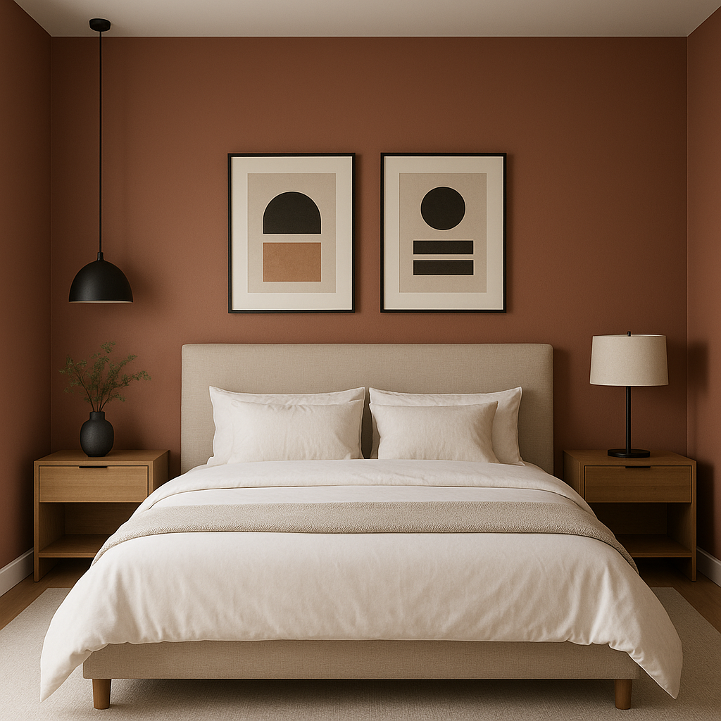
In bedrooms, Twilight creates a tranquil and restful atmosphere. Pair it with crisp white linens and soft textures to achieve a sophisticated sanctuary.
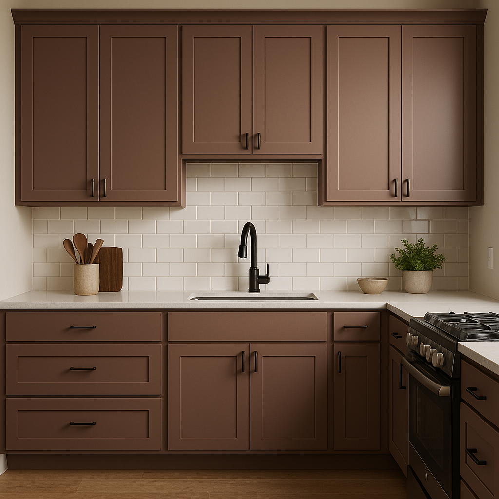
Twilight works beautifully in kitchens and dining areas when paired with white cabinetry and marble countertops. Add pops of color through accessories or artwork for visual interest.
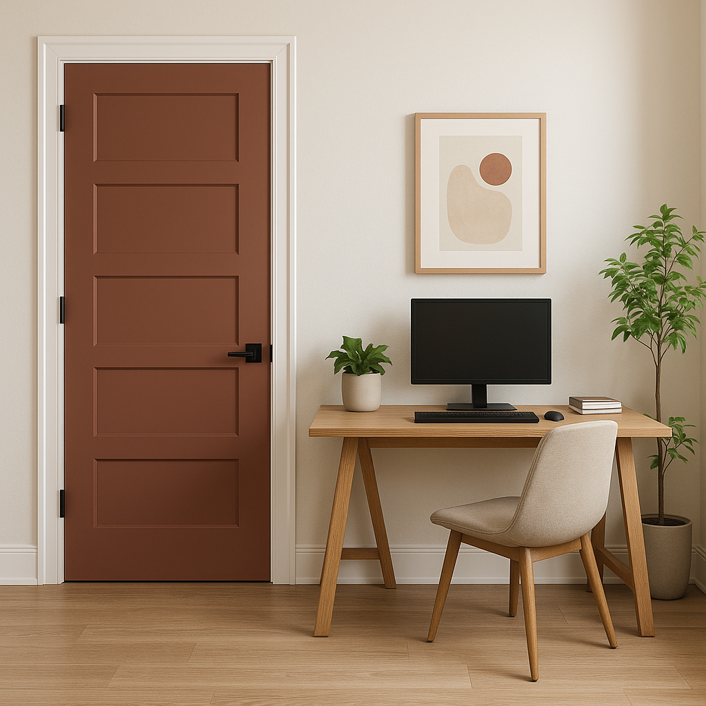
For a productive yet stylish workspace, Twilight can foster focus and creativity. Pair it with sleek furniture and minimalist decor for a modern and professional look.
Twilight isn’t limited to interiors—it’s equally stunning as an exterior paint color. Its deep, cool tone complements natural materials like stone and wood, making it an excellent choice for front doors, shutters, or siding.
When choosing Benjamin Moore Twilight, consider the lighting in your space. Natural light will emphasize its blue undertones, while artificial lighting can skew its appearance toward a darker gray. Test the color in different areas and times of day to ensure it aligns with your design vision.
Benjamin Moore Twilight (049) is more than just a paint color—it's a statement. Its refined depth, versatile undertones, and ability to harmonize with a wide range of coordinating colors make it a go-to choice for creating spaces that are elegant, modern, and undeniably captivating.
View Colors Only by Brand (No Imagery):
Sherwin-Williams
|
Benjamin-Moore
|
Behr
|
Valspar
Live on the Eastern Slope of Colorado and looking for a local painting professional, check out all our painting services and reach out for a free estimate.
Copyright © 2026 : Wild Fox Painting Inc. : 12435 Mead Way, Littleton, CO 80125


