Benjamin Moore Pennies (063) is a striking shade that exudes warmth, sophistication, and subtle drama. This rich copper hue is a blend of earthy tones and metallic elegance, making it an excellent choice for creating inviting and memorable spaces. Its unique color profile combines timeless charm with contemporary appeal, making it a versatile option for a variety of interior design styles.
Pennies (063) carries distinct reddish-orange undertones that give it a warm, glowing appearance reminiscent of polished copper. There’s a subtle hint of gold that adds depth and richness to the color, making it feel both luxurious and approachable. These undertones make Pennies adaptable to different lighting conditions, shifting from a vivid coppery glow in bright spaces to a deeper, more grounded tone in dimly lit areas.
The color’s undertones work beautifully in spaces where warmth and vibrancy are desired, whether you’re designing a cozy living room, a moody dining area, or even a statement-making accent wall.
To bring out the best in Benjamin Moore Pennies (063), pair it with coordinating colors that complement its coppery warmth. Here are some suggestions:
Neutrals: Soft and muted neutrals, such as Benjamin Moore White Dove (OC-17) or Classic Gray (OC-23), create a balanced and sophisticated palette. These light tones allow Pennies to shine as the focal point of the space.
Earthy Greens: Sage or olive greens, like Benjamin Moore Saybrook Sage (HC-114) or Gloucester Sage (HC-100), pair beautifully with Pennies for a nature-inspired aesthetic. The coolness of green contrasts with the fiery warmth of copper for a harmonious blend.
Deep Blues: Rich navy tones, such as Benjamin Moore Hale Navy (HC-154) or Newburyport Blue (HC-155), create a bold and dramatic pairing. The contrast between the deep blue and radiant copper adds visual interest and a sense of luxury.
Metallic Accents: Incorporating metallic shades like gold, bronze, or even brushed nickel accents can enhance the metallic quality of Pennies, tying the space together with a cohesive design.
Benjamin Moore Pennies (063) is a versatile color that can be used in various ways throughout your home. Here are some suggestions for incorporating this beautiful shade into your design:
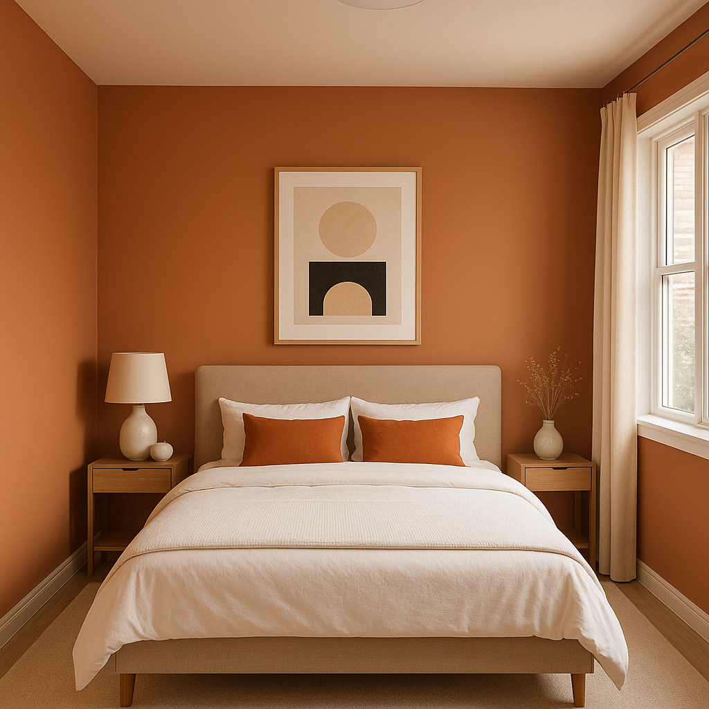
Pennies is an excellent choice for creating accent walls in spaces like living rooms, dining rooms, or bedrooms. Its vibrant warmth draws the eye, adding focus and personality to the room without overwhelming the overall design.
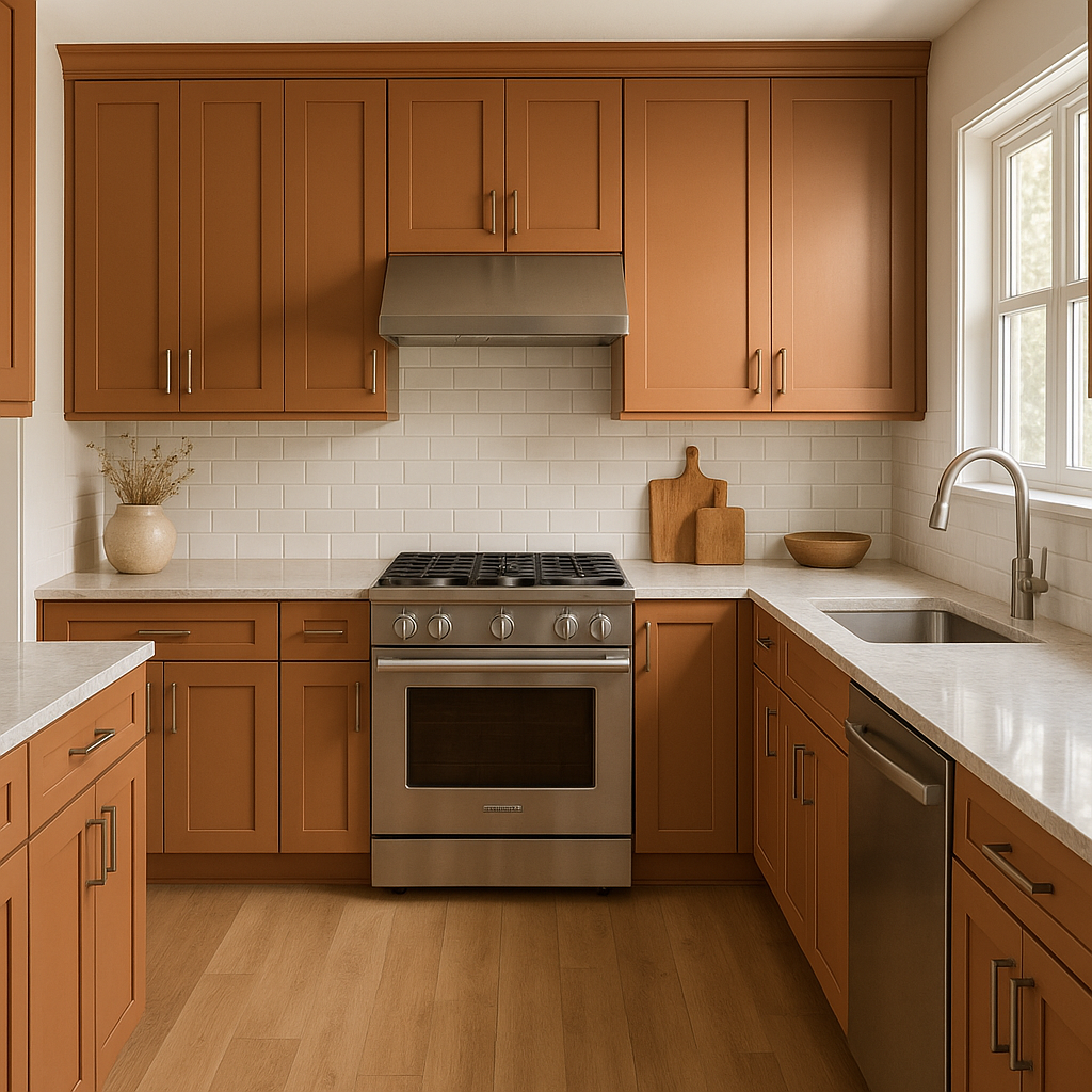
For a bold and unexpected twist, consider using Pennies for kitchen cabinetry or an island. Pair it with crisp white countertops and metallic hardware for a modern yet inviting kitchen.
This coppery hue lends itself beautifully to dining rooms, where a sense of warmth and intimacy is often desired. Pair it with dimmed lighting and rich wooden furniture for an elegant and cozy atmosphere.
Make a lasting impression by using Pennies in your entryway or foyer. Its radiant tone sets the stage for the rest of your home and creates an inviting first impression.
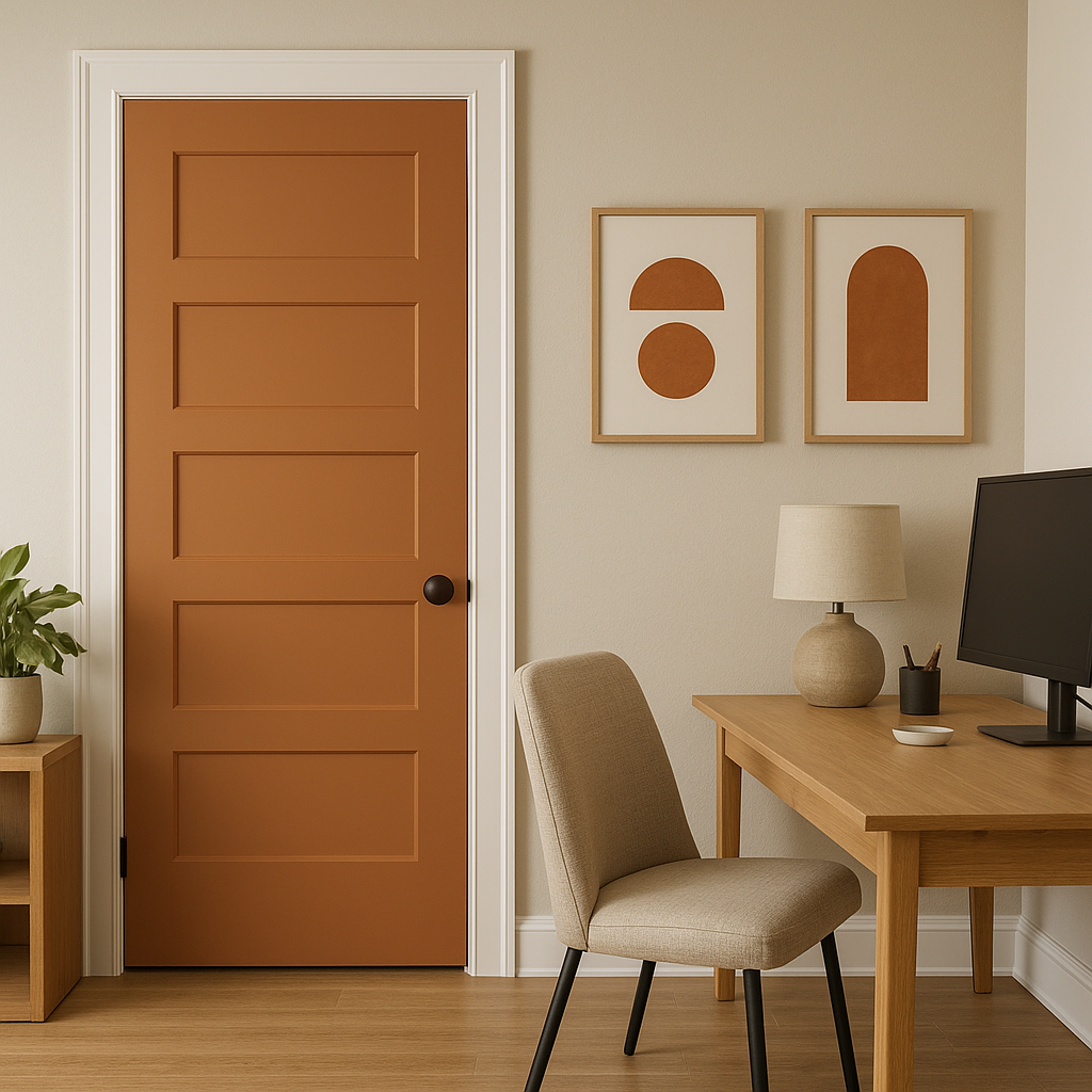
If painting walls with Pennies feels too bold, consider using it on furniture pieces like side tables, dressers, or chairs. You can also incorporate the color through textiles like throw pillows, rugs, or curtains to add pops of warmth throughout your space.
Pennies is not just for residential interiors—it’s an excellent choice for commercial spaces like restaurants, boutique shops, or offices. Its richness and warmth give professional spaces a welcoming yet sophisticated vibe.
Because Benjamin Moore Pennies (063) has warm undertones, lighting plays a crucial role in how it appears. In natural light, the reddish-orange tones become more vibrant and lively, while under warm artificial lighting, the gold undertones are accentuated, creating a cozy and luxurious feel. When using Pennies in your design, consider layering your lighting with a mix of ambient, task, and accent lighting to maximize its dimensionality.
Benjamin Moore Pennies (063) is a color that makes a statement while remaining versatile enough to complement a wide range of design styles. Whether you’re looking to create a cozy oasis or a bold focal point, this copper-inspired hue brings warmth, elegance, and personality into every space it touches.
View Colors Only by Brand (No Imagery):
Sherwin-Williams
|
Benjamin-Moore
|
Behr
|
Valspar
Live on the Eastern Slope of Colorado and looking for a local painting professional, check out all our painting services and reach out for a free estimate.
Copyright © 2026 : Wild Fox Painting Inc. : 12435 Mead Way, Littleton, CO 80125


