Benjamin Moore Succulent (068) is an alluring shade that effortlessly bridges the gap between refined sophistication and organic charm. This deep, earthy green invites tranquility and a sense of grounding into any space, making it an exceptional choice for homeowners and designers seeking to create a serene yet impactful atmosphere. Whether used as a bold backdrop or a subtle accent, Succulent (068) is a versatile hue that transforms interiors into soulful retreats.
Succulent (068) boasts rich undertones that deepen its character and versatility. At its core, it leans toward a muted, olive-like green, complemented by subtle gray undertones that lend it a softer, more sophisticated edge. These gray notes help temper the richness of the green, making it adaptable to a wide range of styles, from rustic and traditional to modern and minimalist. Additionally, hints of earthy brown in the undertones provide warmth, ensuring the color feels inviting rather than overpowering.
To achieve a cohesive and harmonious design, pairing Succulent (068) with complementary or contrasting colors is key. Here are some ideal options:
Neutral Pairings:
Soft neutrals like Benjamin Moore White Dove (OC-17) or Classic Gray (1548) provide a light, airy balance to Succulent's rich depth. These pairings are perfect for creating a timeless, understated palette.
Warm Accents:
Pair Succulent with warm tones like Benjamin Moore Golden Straw (2152-50) or Muslin (OC-12) to bring out its earthy warmth. These hues work beautifully in rustic or bohemian-inspired spaces.
Cool Contrasts:
For a modern, dynamic look, combine Succulent with cooler shades like Benjamin Moore Distant Gray (2124-70) or Boothbay Gray (HC-165). The contrast creates a striking yet balanced aesthetic.
Bold Complements:
If you're looking to make a statement, pair Succulent with deep jewel tones like Benjamin Moore Newburg Green (HC-158) or Hale Navy (HC-154). These bold combinations evoke richness and drama.
Succulent (068) is a versatile hue that can be used in various spaces and design schemes. Here are some creative ways to incorporate this earthy green into your home:
Envelop your living room in the warmth and sophistication of Succulent. Use it as the primary wall color to create a cozy, inviting space that feels grounded and connected to nature. Pair it with cream-colored furniture and natural wood tones for a balanced and timeless look.
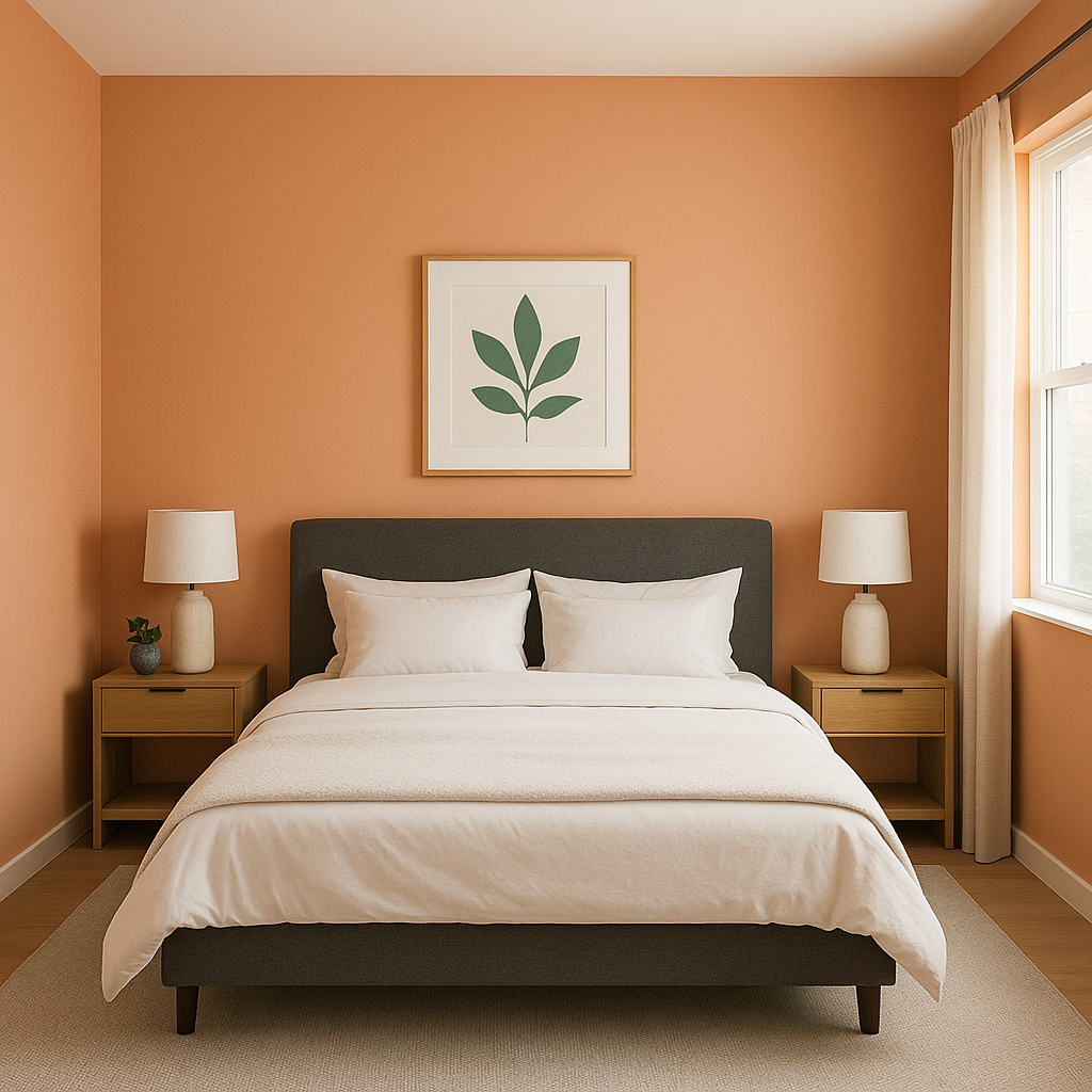
Transform your bedroom into a peaceful haven by using Succulent as an accent wall behind the bed. Its subdued green tones evoke serenity, making it ideal for relaxation. Coordinate with soft linens in neutral or muted shades for a calming atmosphere.
Succulent's earthy richness works beautifully in dining rooms, creating a warm and intimate ambiance. Pair it with wooden dining furniture and metallic accents like brushed gold or antique brass to elevate the space.
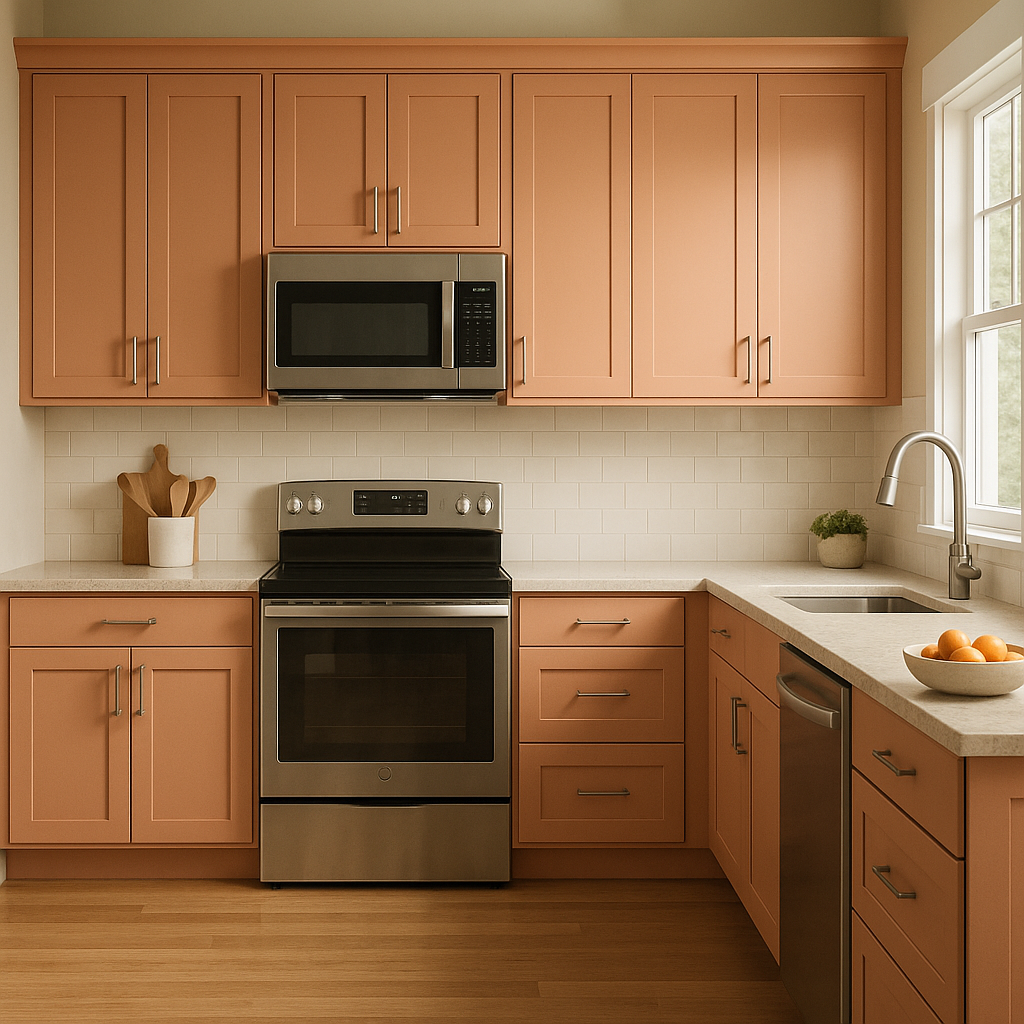
In kitchens, Succulent can be used for cabinetry or walls to infuse a sense of grounded elegance. Pair it with white countertops and subway tiles for a fresh, modern look. For bathrooms, consider using Succulent for vanity cabinets or as a feature wall to bring a spa-like feel to the space.
If you're designing a home office, Succulent can help create a space that feels calm and focused. Use it on the walls or as a backdrop for shelving to inspire productivity while maintaining a sense of style.
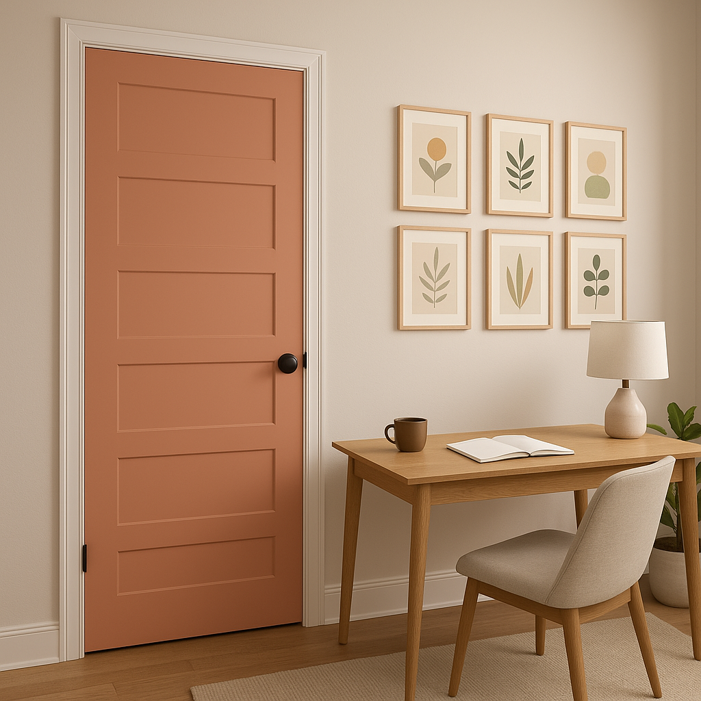
Succulent is also a fantastic choice for exterior applications, such as front doors or shutters. Its earthy tone blends beautifully with surrounding landscapes, making it an excellent option for homes with lush gardens or natural stonework.
Benjamin Moore Succulent (068) is more than just a paint color—it's an experience. Its rich, grounding qualities bring depth and character to any space, making it a favorite among designers and homeowners alike. Whether you're creating a tranquil retreat or a bold, statement-making interior, Succulent offers endless possibilities for elevating your home's aesthetic. Pair it with complementary hues and textures, and watch your space transform into an elegant sanctuary infused with natural beauty.
View Colors Only by Brand (No Imagery):
Sherwin-Williams
|
Benjamin-Moore
|
Behr
|
Valspar
Live on the Eastern Slope of Colorado and looking for a local painting professional, check out all our painting services and reach out for a free estimate.
Copyright © 2026 : Wild Fox Painting Inc. : 12435 Mead Way, Littleton, CO 80125


