Benjamin Moore Amber (073) is a captivating, warm golden hue that evokes a sense of comfort and understated elegance. This rich, amber-inspired color offers a perfect balance of earthy warmth and luxurious depth, making it an excellent choice for creating inviting spaces that feel both grounded and refined.
Amber (073) features warm, golden undertones that are subtly infused with hints of brown and ochre. These undertones lend the color a natural, organic quality, reminiscent of sunlit autumn leaves or the soft glow of candlelight. The golden-brown base makes Amber (073) versatile, allowing it to seamlessly adapt to various design styles, from rustic and traditional to modern and eclectic.
To enhance the beauty of Benjamin Moore Amber (073), pair it with coordinating hues that complement its warmth and depth. Some excellent options include:
Neutral Pairings:
Soft neutrals like Benjamin Moore White Dove (OC-17) or Simply White (OC-117) create a harmonious balance and provide a crisp, clean contrast to Amber's richness.
Earthy Accents:
Deep, earthy tones such as Kendall Charcoal (HC-166) or Amherst Gray (HC-167) amplify Amber's organic feel while adding grounding sophistication to the palette.
Bold and Vibrant Choices:
Jewel tones like Benjamin Moore Hale Navy (HC-154) or Caliente (AF-290) can create a striking contrast, offering dramatic flair while preserving Amber's warm undertones.
Soft Pastels:
Pale shades like Gray Owl (OC-52) or Palladian Blue (HC-144) introduce a refreshing lightness, infusing spaces with a serene and airy atmosphere.
Amber (073) is an incredibly versatile color that can be used in various ways to create distinctive and memorable interiors. Here are some ideas for incorporating it into your design:
Living Rooms:
Amber’s warmth makes it an excellent choice for communal spaces like living rooms. Use it as the primary wall color to create a cozy, inviting atmosphere or as an accent wall to add depth and character. Pair it with plush textiles and wood accents to enhance its natural appeal.
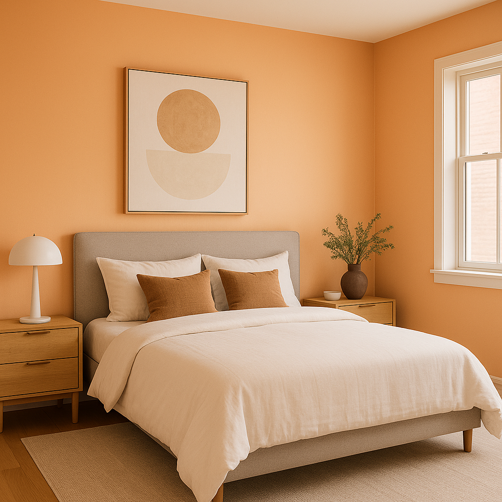
Bedrooms:
In bedrooms, Amber (073) fosters a sense of serenity and comfort. Combine it with soft white linens and muted gold accents to craft a space that feels intimate yet sophisticated.
Dining Areas:
Amber’s golden undertones are perfect for dining rooms, where they evoke a sense of warmth and conviviality. Pair it with dark wood furniture and metallic details for a classic, elegant look.
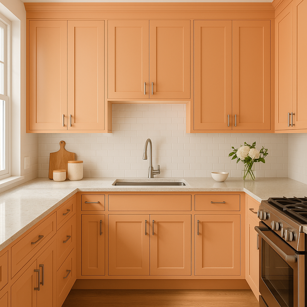
Kitchens:
For a unique take on kitchen design, use Amber on cabinetry or as a backsplash color. Its earthy richness pairs beautifully with natural stone countertops and stainless steel appliances.
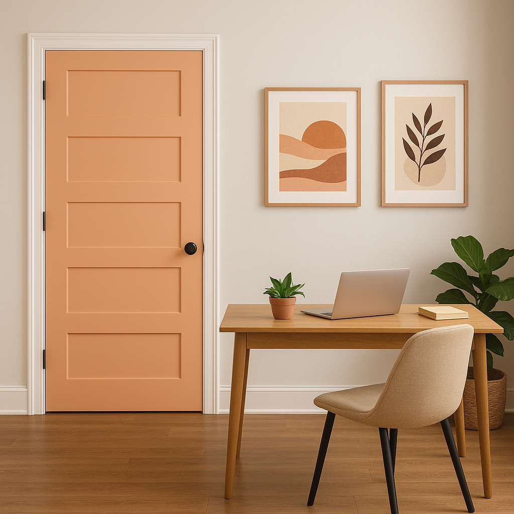
Accent Elements:
If you’re hesitant to commit to Amber for entire walls, consider using it for accent pieces like furniture, doors, or decorative accessories. A painted bookshelf, console table, or set of chairs in Amber can add a pop of color without overwhelming the space.
Because Amber (073) is a warm, mid-tone color, it can appear slightly different depending on the lighting in the space. Natural light enhances its golden qualities, creating a radiant and lively effect. In dimmer artificial lighting, Amber tends to deepen, offering a richer and more intimate feel. Be sure to test the color in your space at different times of the day to ensure it complements your desired mood.
Amber (073) is more than just a color—it's a mood enhancer that brings warmth, depth, and sophistication to interiors. Whether you're designing a cozy family room, a luxurious bedroom retreat, or a statement-making accent wall, this versatile hue adapts beautifully to a wide range of styles and applications. With its earthy undertones and timeless appeal, Amber (073) is a choice that will stand the test of time while keeping your home stylish and inviting.
View Colors Only by Brand (No Imagery):
Sherwin-Williams
|
Benjamin-Moore
|
Behr
|
Valspar
Live on the Eastern Slope of Colorado and looking for a local painting professional, check out all our painting services and reach out for a free estimate.
Copyright © 2026 : Wild Fox Painting Inc. : 12435 Mead Way, Littleton, CO 80125


