Benjamin Moore Coconut (1029) is a versatile, creamy neutral that exudes effortless sophistication. With its soft, warm undertones, this shade is a fantastic choice for creating a serene and inviting atmosphere in any space. Whether you want to brighten up a room or provide a calming backdrop for bold decor, Coconut strikes the perfect balance between understated elegance and adaptability.
Coconut is a warm off-white with beige undertones that add depth and richness without overpowering the space. Its subtle warmth prevents it from feeling stark or sterile, making it ideal for interiors where comfort and coziness are paramount. The beige undertones also give it a creamy quality, making it a softer alternative to pure whites or cooler neutral tones.
This hue is particularly well-suited for spaces with natural light, as its warm undertones interact beautifully with sunlight, creating a soft, glowing effect. However, Coconut also holds its own in rooms with artificial lighting, maintaining its warm and welcoming vibe.
Benjamin Moore Coconut pairs seamlessly with a wide range of colors, making it a favorite among interior designers who value its flexibility. Here are some coordinating colors that work exceptionally well with Coconut:
The versatility of Benjamin Moore Coconut makes it suitable for a variety of applications, from walls to ceilings to trim. Here are some ways to incorporate this timeless neutral into your home:
Coconut’s warm, creamy tone creates a welcoming ambiance, making it ideal for living rooms where relaxation and connection are key. Pair it with plush furniture in soft textures and natural wood accents for a cozy yet elegant space.
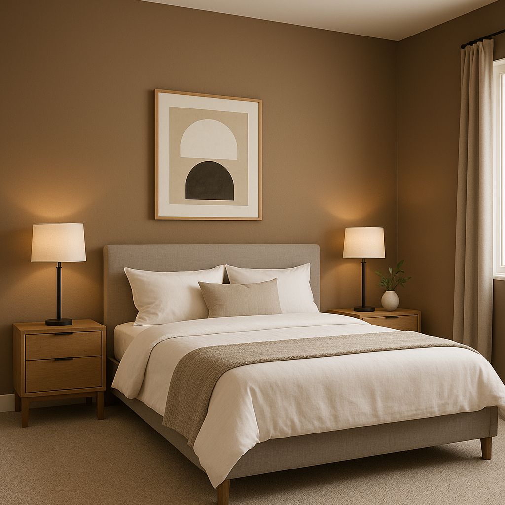
In bedrooms, Coconut fosters a serene and restful atmosphere. Use it as the main wall color and combine it with muted blues or greens in bedding and decor to enhance the calming effect.
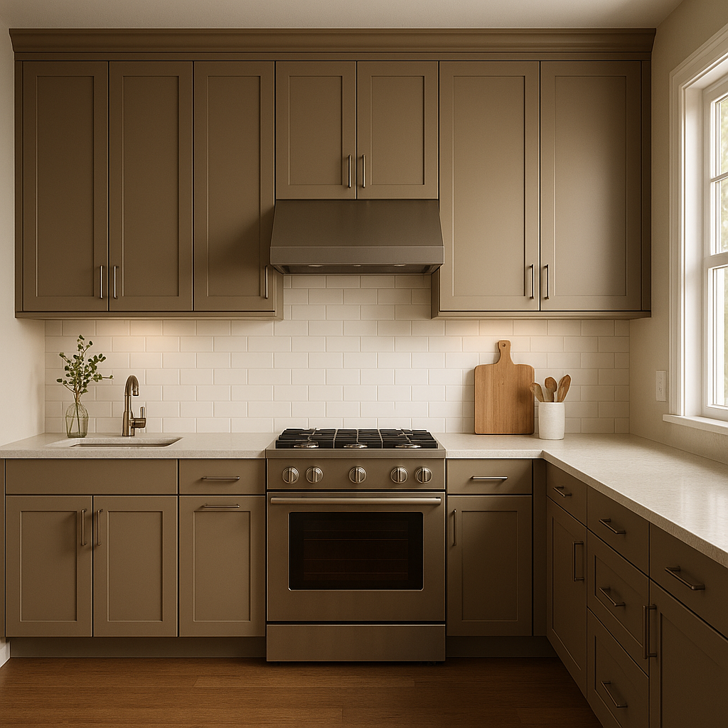
Coconut shines in kitchens, especially when paired with white cabinetry or natural wood finishes. Its warmth adds a touch of comfort to these often-busy spaces, while its neutrality allows countertops, hardware, and backsplash designs to stand out.
For bathrooms, Coconut’s soft beige undertones create a spa-like retreat. Pair it with polished chrome fixtures and marble accents for a clean yet inviting look.
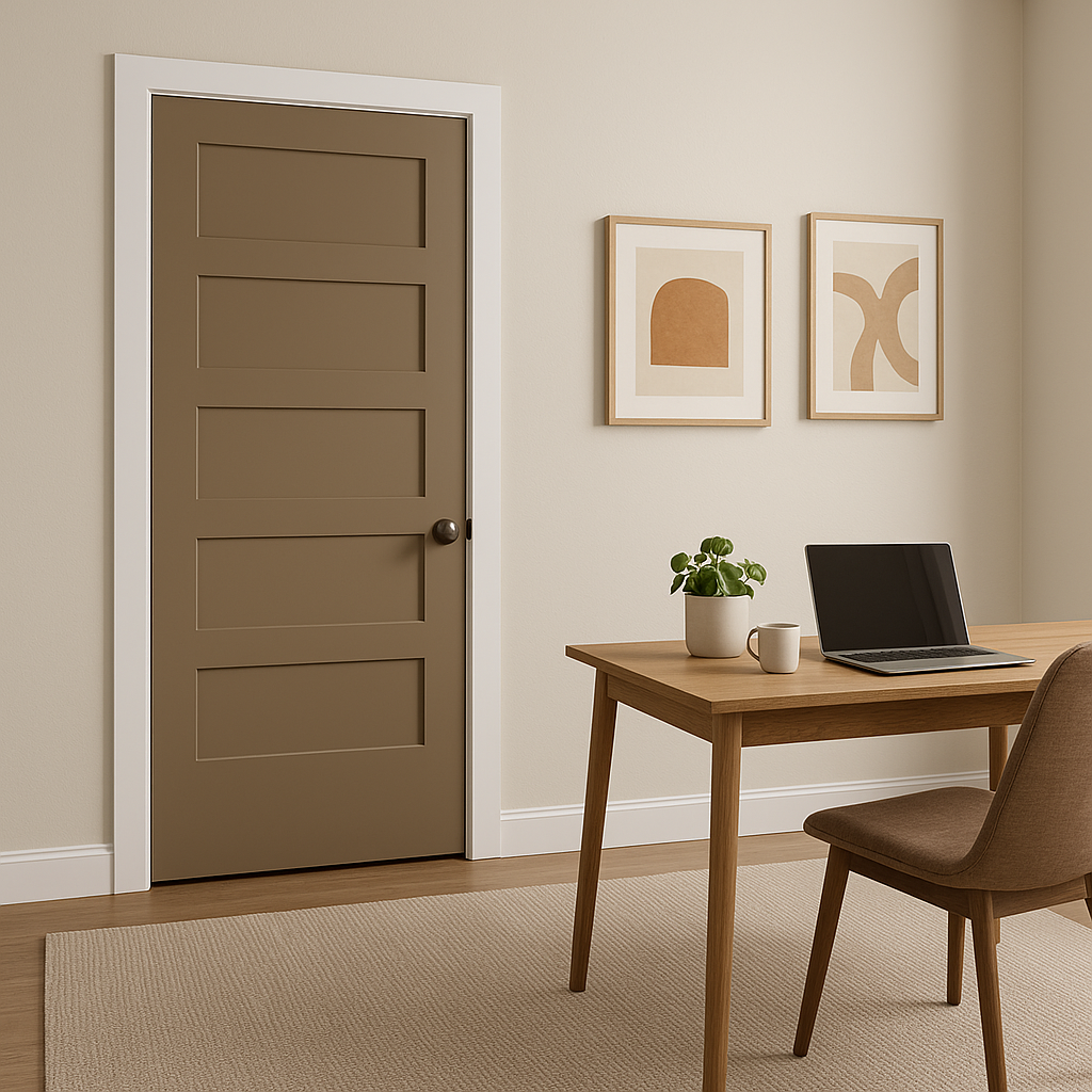
If you’re looking for an alternative to stark white ceilings and trim, Coconut provides a subtle, warmer option. Its understated elegance complements both light and dark wall colors, creating a cohesive and polished finish.
In open-concept spaces, Coconut serves as an excellent unifying color. Its neutrality allows it to flow effortlessly between rooms while providing a consistent, warm backdrop for varied design elements.
Benjamin Moore Coconut is more than just a neutral paint color—it’s a foundation for timeless design. Its warm, creamy undertones make it approachable and versatile, while its ability to coordinate with a wide range of colors ensures it fits seamlessly into any style of decor, from traditional to modern. Whether you’re looking to refresh a single room or tie together an entire home, Coconut is a reliable choice that will stand the test of time.
View Colors Only by Brand (No Imagery):
Sherwin-Williams
|
Benjamin-Moore
|
Behr
|
Valspar
Live on the Eastern Slope of Colorado and looking for a local painting professional, check out all our painting services and reach out for a free estimate.
Copyright © 2026 : Wild Fox Painting Inc. : 12435 Mead Way, Littleton, CO 80125


