Benjamin Moore Brunswick (1061) is a distinguished and versatile paint color that brings elegance and depth to any space. This refined green hue strikes a perfect balance between boldness and subtlety, making it an ideal choice for homeowners and designers seeking a timeless, grounding color that complements a variety of styles. Brunswick is a rich, deep green with classic appeal, offering an understated yet impactful presence that elevates interiors with its sophisticated energy.
Brunswick (1061) is rooted in a deep green base with subtle, muted undertones of gray. The gray undertone tempers the vibrancy of the green, giving it a slightly smoky or vintage quality, which enhances its versatility. This nuanced balance allows Brunswick to adapt beautifully to different lighting conditions. In natural light, the richness of the green is emphasized, while artificial lighting can draw out its subdued, earthy qualities.
Its undertones make it a chameleon-like shade that pairs well with other colors, whether you're aiming for a moody, dramatic aesthetic or a softer, classic look. The color’s restrained depth ensures it won’t overpower, making it an excellent choice for both accent walls and full-room applications.
Benjamin Moore Brunswick (1061) pairs harmoniously with a variety of coordinating colors, allowing you to craft a cohesive and visually appealing palette for your home. Here are some recommendations for complementary hues:
Neutral Pairings:
Bold Accents:
Warm Complements:
Brunswick (1061) is a versatile green that works beautifully in a variety of spaces and design applications. Its rich yet balanced tone makes it suitable for both residential and commercial interiors.
Brunswick’s grounding quality makes it an excellent choice for living rooms and dens. Whether painted on all four walls or used as an accent, it creates a cozy, refined atmosphere. Pair it with wood furniture and neutral upholstery for a classic aesthetic or layer it with metallic accents like brass or gold for a modern touch.
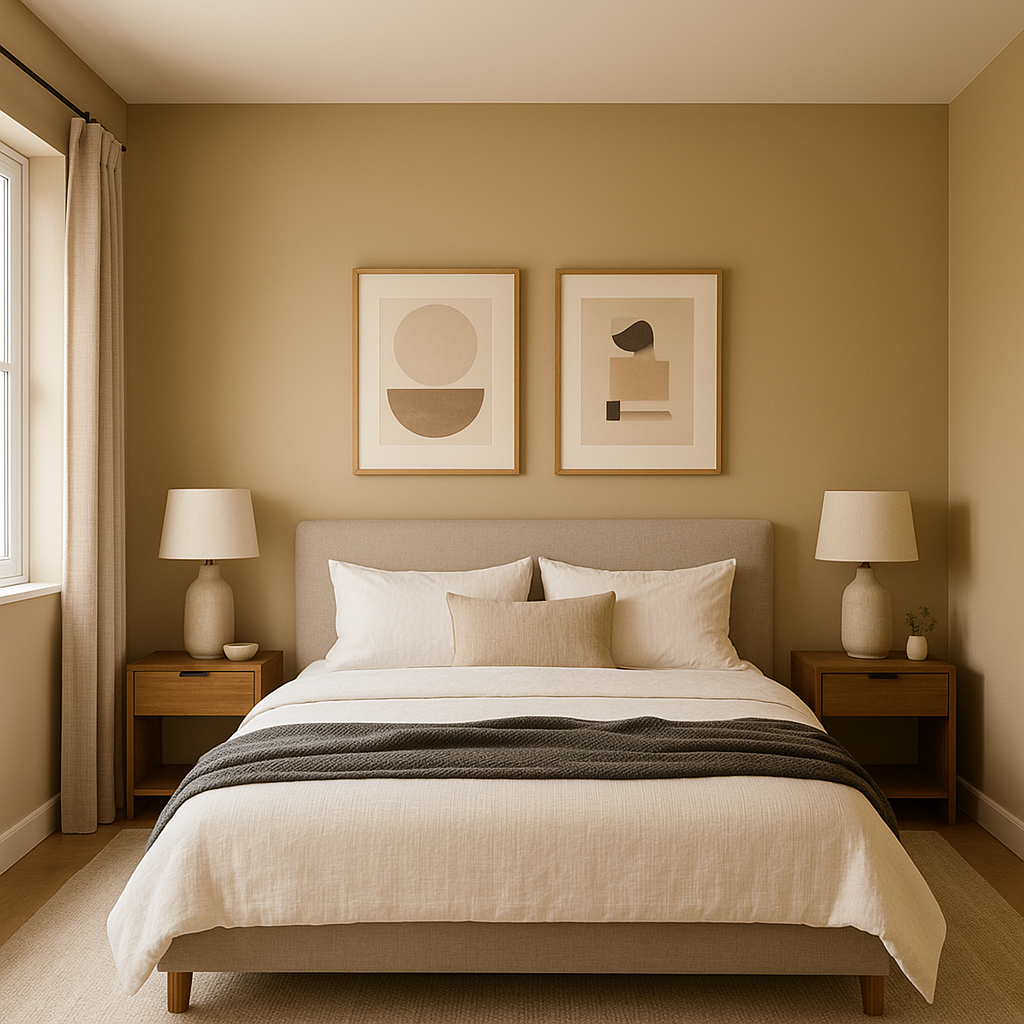
For bedrooms, Brunswick evokes a calming and serene vibe, ideal for restful spaces. Pair it with soft linens in cream or beige for a tranquil retreat, or add pops of navy and mustard for a more eclectic style.
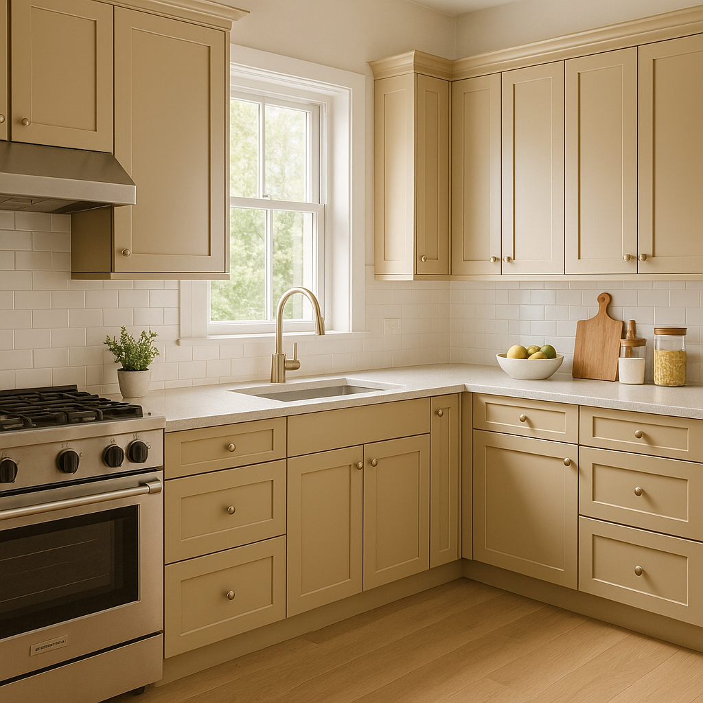
As a sophisticated green, Brunswick works wonderfully in kitchens and dining areas, particularly when paired with natural wood cabinets or marble countertops. It adds a sense of richness and timeless charm, perfect for creating a space that feels both welcoming and luxurious.
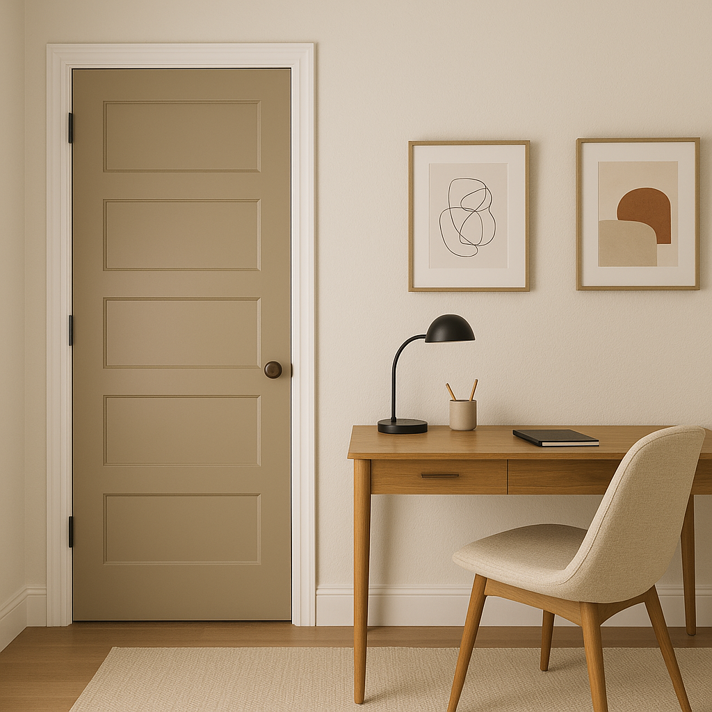
Brunswick shines as an accent color in spaces that need a touch of drama. Use it on a feature wall in a home office, powder room, or entryway to make a bold yet tasteful statement.
For a unique and stylish touch, consider Brunswick for cabinetry or furniture. From kitchen islands to built-in bookshelves, this deep green adds character and sophistication without overwhelming the space.
Brunswick (1061) transforms beautifully with changes in lighting. In spaces with ample natural light, the green appears vibrant and rich, while in dimmer or artificial lighting, its gray undertones emerge, creating a more subdued and moody effect. To maximize its versatility, test Brunswick in your space at different times of day to ensure it complements your lighting setup.
Benjamin Moore Brunswick (1061) is a masterful blend of elegance and adaptability. Its deep yet balanced green tone, enhanced by gray undertones, makes it a timeless choice for a range of applications. Whether you're designing a cozy living space, a serene bedroom, or an inviting kitchen, Brunswick offers the versatility and sophistication needed to create a truly memorable interior.
View Colors Only by Brand (No Imagery):
Sherwin-Williams
|
Benjamin-Moore
|
Behr
|
Valspar
Live on the Eastern Slope of Colorado and looking for a local painting professional, check out all our painting services and reach out for a free estimate.
Copyright © 2026 : Wild Fox Painting Inc. : 12435 Mead Way, Littleton, CO 80125


