Benjamin Moore Bayshore (1079) is a versatile and understated neutral shade that exudes warmth and elegance. This soft hue sits comfortably between beige and taupe, offering a subtle sophistication that works beautifully in a variety of interior styles, from contemporary to traditional. Bayshore’s timeless appeal makes it an ideal choice for homeowners seeking a balanced and serene backdrop that complements a wide range of decor elements.
Bayshore (1079) features gentle warm undertones that lean toward creamy beige, with a hint of muted gray. These undertones create a welcoming and peaceful atmosphere, making the color feel grounded yet airy. Its slightly warm base ensures that spaces painted in Bayshore have a cozy, lived-in feel without appearing overly yellow or golden. The gray undertones help to balance the warmth, allowing it to adapt well to both natural and artificial lighting conditions.
To create a harmonious palette that complements Bayshore, consider pairing it with other versatile neutrals and soft shades. Here are some coordinating colors that work beautifully:
Additionally, Bayshore pairs seamlessly with natural wood tones, brushed metals like brass or nickel, and soft textures like linen and cotton, making it highly flexible for any design scheme.
Bayshore (1079) is a true workhorse color that can be used throughout the home to create a unified and harmonious look. Its warm yet neutral characteristics make it ideal for various applications:
Bayshore’s subtle warmth makes it perfect for living rooms and family spaces where comfort is key. Pair it with plush sofas, natural wood furniture, and soft area rugs to create a cozy yet refined environment.
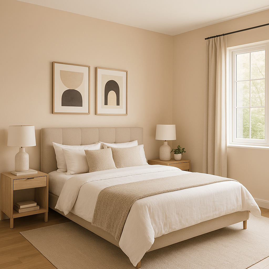
In bedrooms, Bayshore provides a calming backdrop that encourages relaxation. Combine it with soft white bedding, neutral-toned curtains, and accent pillows in muted earth tones for a serene retreat.
This versatile neutral is excellent for hallways and entryways, where it sets the stage for the rest of your home. It pairs effortlessly with dark-stained floors or light-colored tiles and works well with artwork or mirrors in metallic frames.
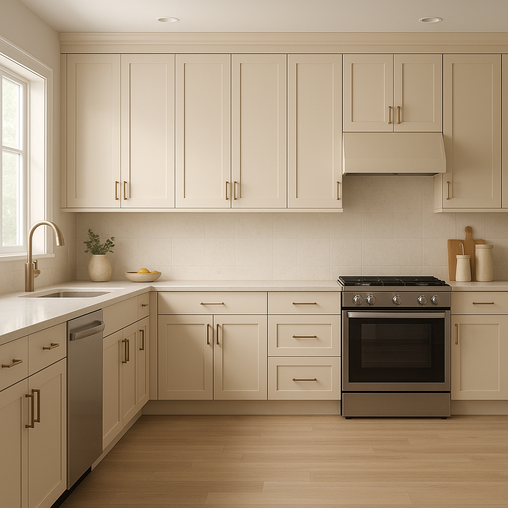
Use Bayshore on walls or cabinetry in kitchens and dining spaces for an elegant and timeless look. Pair it with polished stone countertops, subway tiles, and metallic finishes for a sophisticated style that feels both modern and inviting.
Bayshore shines in bathrooms, especially when combined with crisp white trim, marble surfaces, and brushed metal fixtures. Its warm undertones provide a spa-like ambiance that’s both fresh and relaxing.
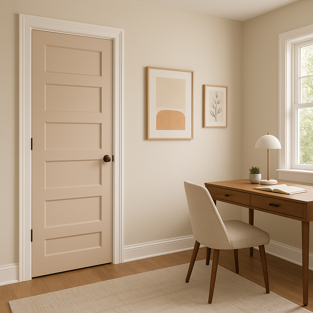
For home offices, Bayshore creates a neutral and productive atmosphere that allows focus and creativity to flourish. Pair it with wooden desks, neutral area rugs, and greenery for a balanced and inspiring workspace.
Benjamin Moore Bayshore (1079) is more than just a paint color—it’s a design element that effortlessly ties a space together. Its adaptability, subtle warmth, and timeless charm make it suitable for nearly any room in your home. Whether you’re going for a minimalist look or layering textures and patterns, Bayshore provides the perfect neutral foundation.
With its ability to complement a broad spectrum of design styles and coordinating colors, Bayshore (1079) is a standout choice for anyone looking to create spaces that feel inviting, balanced, and beautifully curated.
View Colors Only by Brand (No Imagery):
Sherwin-Williams
|
Benjamin-Moore
|
Behr
|
Valspar
Live on the Eastern Slope of Colorado and looking for a local painting professional, check out all our painting services and reach out for a free estimate.
Copyright © 2026 : Wild Fox Painting Inc. : 12435 Mead Way, Littleton, CO 80125


