Benjamin Moore Vero (1085) is a versatile and inviting paint color that exudes warmth and sophistication. Perfectly balanced between beige and taupe, this mid-tone neutral is a favorite among interior designers for its ability to create a serene and welcoming atmosphere. Its understated elegance makes it an ideal choice for a wide range of interior styles, from traditional to modern minimalism.
Vero boasts subtle warm undertones that lean towards golden beige, giving it a cozy and grounded feel. These undertones help soften spaces and create a harmonious connection with other design elements. Unlike cooler neutrals, Vero's warmth ensures it feels inviting without being overpowering. The golden undertones also make it an excellent choice for spaces that need a touch of comfort and intimacy.
Benjamin Moore Vero (1085) pairs beautifully with a variety of complementary hues, allowing for endless design possibilities. Here are some recommended coordinating colors:
These pairings allow Vero to shine equally in soft, neutral palettes or more dynamic, colorful designs.
Vero’s adaptability makes it suitable for a variety of applications throughout the home. Here are some ideas for incorporating this beautiful neutral into your space:
Vero is the perfect backdrop for living rooms, especially those with abundant natural light. Pair it with warm woods, plush textiles, and metallic accents to create a cozy yet refined environment.
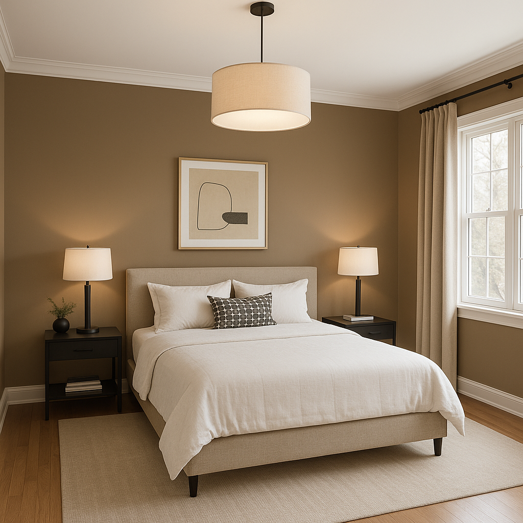
Its soothing undertones make it a great choice for bedrooms, fostering a peaceful and relaxing environment. Layer it with soft whites and muted pastels for a dreamy retreat.
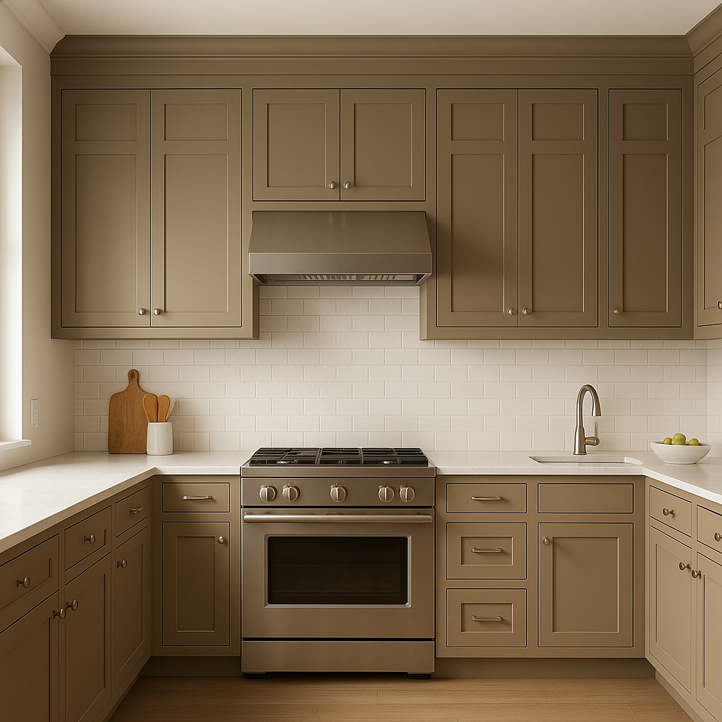
Vero complements both traditional and contemporary cabinetry. It works particularly well with natural wood finishes, brushed metal hardware, or bold accents, such as dark green or navy.
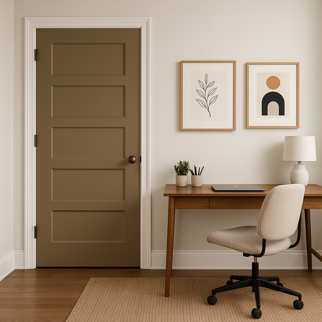
As a neutral with personality, Vero is ideal for high-traffic areas like hallways and entryways. It sets the tone for the rest of your home, offering a warm and welcoming first impression.
Pair Vero with white tiles, gold or brass fixtures, and soft lighting to create a spa-like oasis. Its warm undertones will enhance the feeling of luxury and relaxation.
Benjamin Moore Vero (1085) is more than just a neutral—it’s a color that transforms spaces into elegant, inviting havens. Whether you’re designing a home office, refreshing your living space, or planning a whole-house palette, Vero’s timeless warmth and versatility make it an indispensable choice.
With its ability to complement a diverse range of colors, materials, and styles, Vero is truly a designer’s dream. Its understated yet impactful presence ensures your space feels cohesive, balanced, and effortlessly chic.
View Colors Only by Brand (No Imagery):
Sherwin-Williams
|
Benjamin-Moore
|
Behr
|
Valspar
Live on the Eastern Slope of Colorado and looking for a local painting professional, check out all our painting services and reach out for a free estimate.
Copyright © 2026 : Wild Fox Painting Inc. : 12435 Mead Way, Littleton, CO 80125


