Benjamin Moore Butternut (1090) is a rich, golden-brown hue that embodies warmth and sophistication. This color is as comforting as its name suggests, evoking the earthy tones of autumn leaves or the golden glow of a late afternoon sun. With its unique blend of depth and vibrancy, Butternut serves as an ideal choice for those seeking to create spaces that feel cozy yet refined.
Butternut (1090) carries distinct yellow and orange undertones, giving it a warm, sunny disposition. These undertones are balanced by a subtle brown base that grounds the color and prevents it from appearing overly bright or saturated. The result is a hue that feels both welcoming and sophisticated—perfect for spaces where you want to foster an inviting atmosphere.
The color’s undertones make it adaptable to a range of lighting conditions. In natural sunlight, Butternut reveals its golden side, while in artificial or dim lighting, the deeper brown tones take center stage, adding richness and depth to your space.
Benjamin Moore Butternut pairs beautifully with a variety of complementary and contrasting shades. Here are some ideas for coordinating colors to help you achieve a harmonious design:
The versatility of Benjamin Moore Butternut makes it suitable for a wide range of applications, from accent walls to full-room coverage. Here are some creative ways to incorporate Butternut into your interiors:
Infuse your living room with warmth and elegance by using Butternut on the walls or as an accent color. Pair it with light neutrals for a serene ambiance, or with deep jewel tones for a dramatic, luxurious aesthetic. Add textured throws and warm wood furniture to enhance the cozy vibe.
Create an inviting dining space with Butternut as your primary wall color. It sets the tone for intimate gatherings and complements wood dining furniture beautifully. Pair it with metallic accents, such as brushed gold or bronze, to elevate the space further.
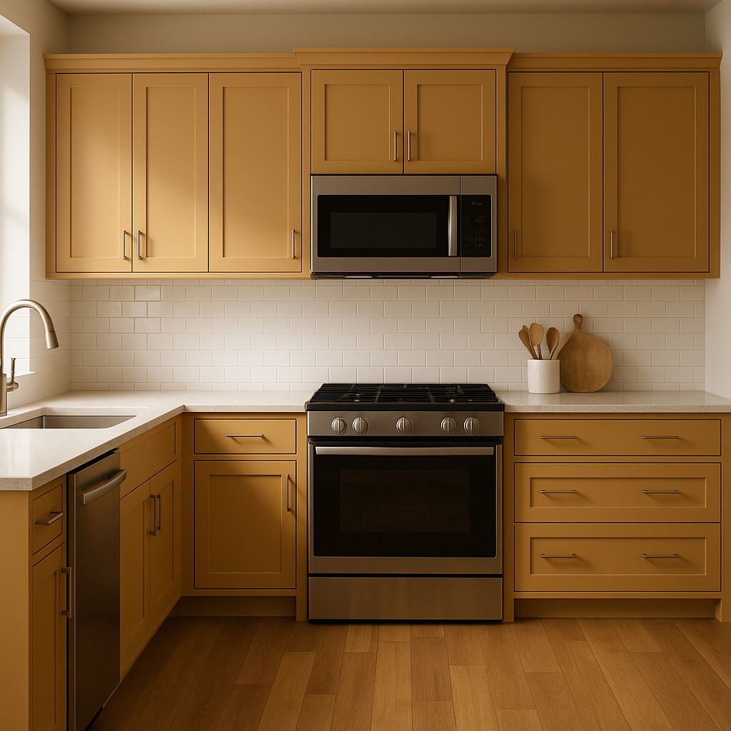
Butternut can bring an unexpected charm to kitchen cabinetry or accent walls. Combine it with crisp white countertops and backsplashes for a modern farmhouse look. Alternatively, pair it with rich navy or forest green for a bold, contemporary aesthetic.
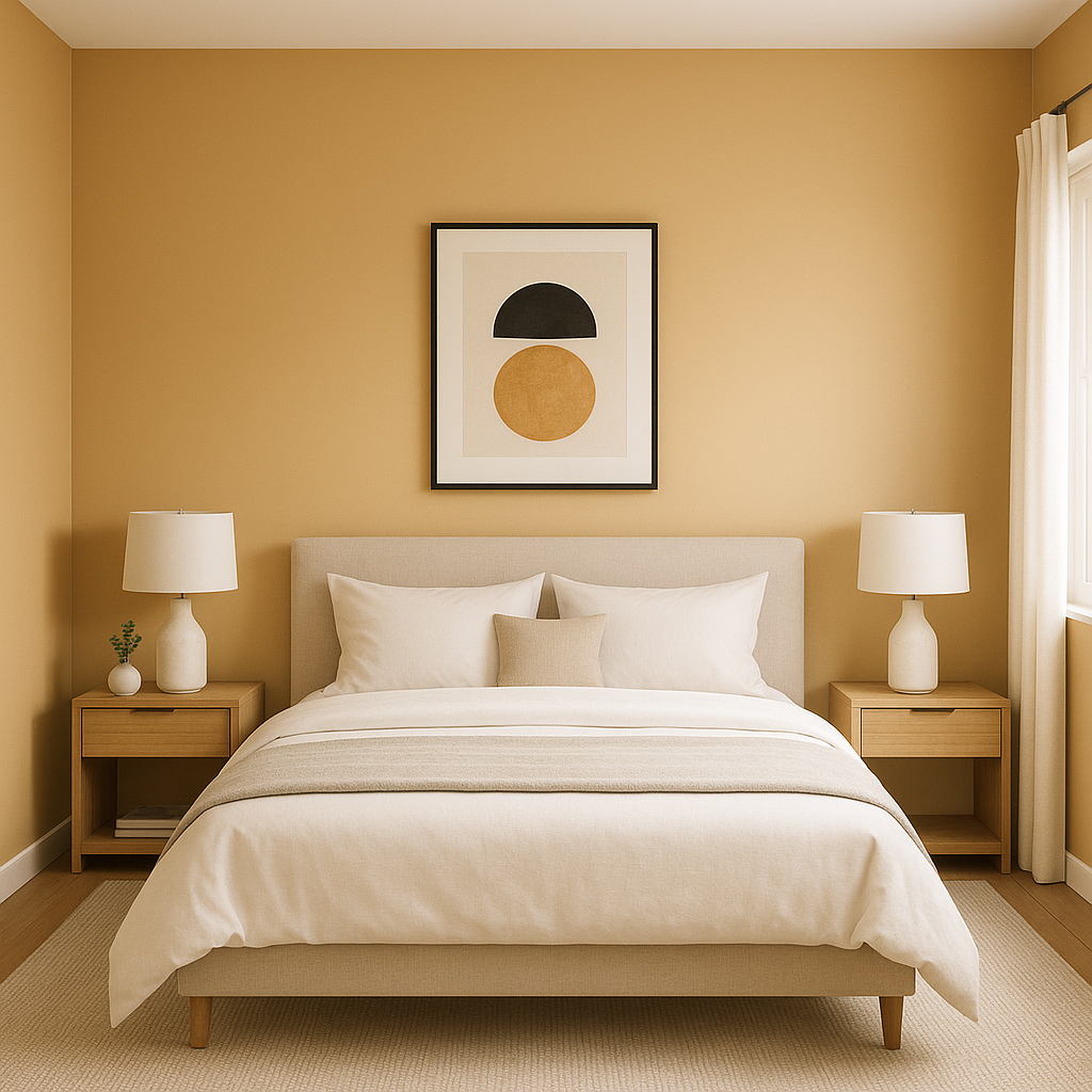
Turn your bedroom into a restful retreat by using Butternut as an accent wall behind the bed. Its warm tones encourage relaxation while maintaining a sense of sophistication. Layer in soft linens and natural textures to complete the look.
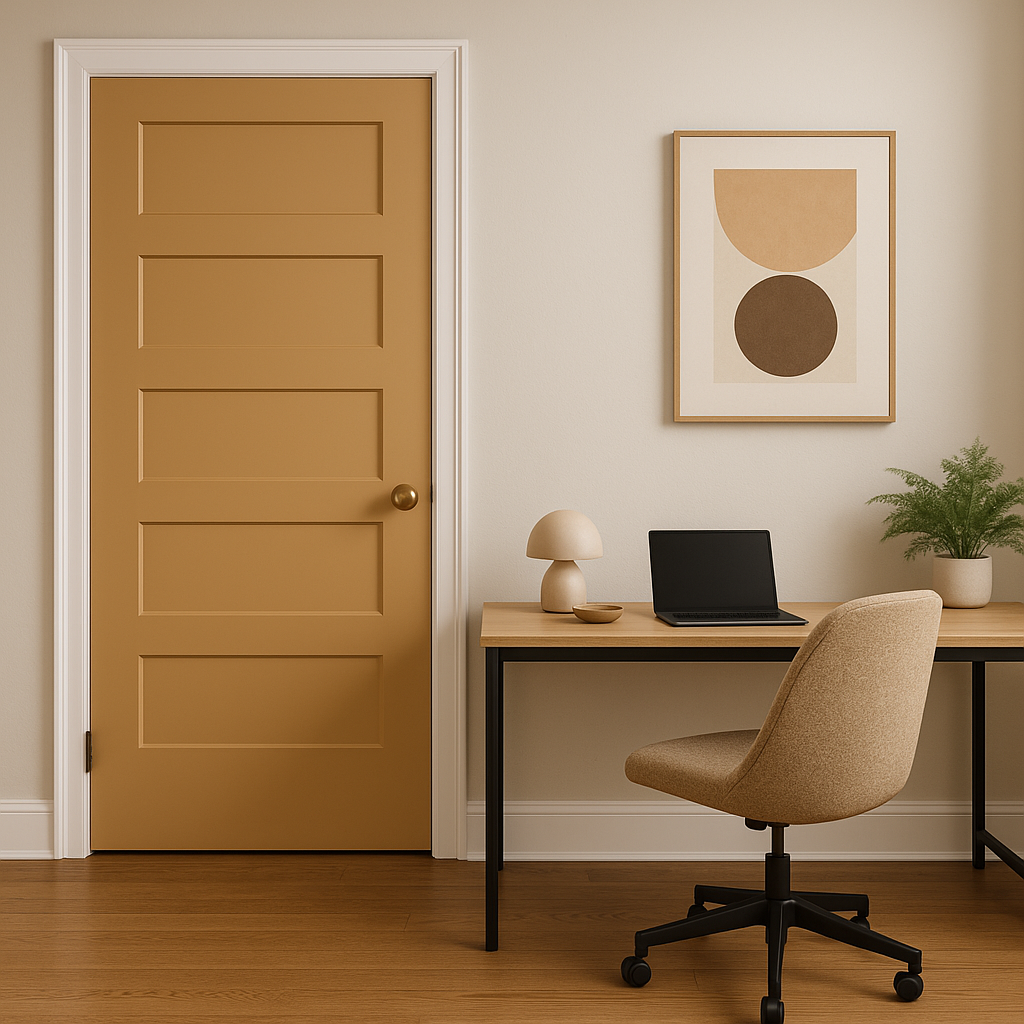
In home offices or libraries, Butternut exudes a sense of comfort and focus. Pair it with dark wood furniture and brass fixtures to create a classic, distinguished atmosphere that inspires productivity.
Benjamin Moore Butternut (1090) is a color that radiates warmth, depth, and timeless beauty. Whether you’re designing a cozy living room, a welcoming dining area, or a serene bedroom, this hue offers endless possibilities for creating spaces that feel both inviting and stylish.
View Colors Only by Brand (No Imagery):
Sherwin-Williams
|
Benjamin-Moore
|
Behr
|
Valspar
Live on the Eastern Slope of Colorado and looking for a local painting professional, check out all our painting services and reach out for a free estimate.
Copyright © 2026 : Wild Fox Painting Inc. : 12435 Mead Way, Littleton, CO 80125


