Benjamin Moore Fort (1119) is a warm, grounding neutral that exudes sophistication and a sense of quiet strength. This color is part of Benjamin Moore’s Classic Color Collection, which is celebrated for offering enduring shades that blend beautifully into a variety of design aesthetics. Fort is an ideal choice for those looking to create a cozy, inviting ambiance without sacrificing elegance or versatility.
Fort is a mid-tone taupe with subtle red and brown undertones, giving it a rich warmth that feels approachable and timeless. The red undertones provide a soft, earthy depth, while the brown base keeps it grounded and ensures it complements a broad spectrum of palettes. In certain lighting conditions, you may notice a faint hint of gray, which adds to its adaptability and makes it suitable for both traditional and modern spaces.
Fort is a highly versatile shade that pairs beautifully with a wide range of colors, making it a designer favorite for creating harmonious palettes. Here are some coordinating colors to consider:
These colors allow you to create a range of moods, from serene and understated to bold and dramatic, depending on your design preferences.
Fort is a highly adaptable color that works beautifully in a variety of applications and spaces. Whether you're designing for a cozy home or a sophisticated commercial space, Fort has the versatility to deliver the desired effect. Here are some ideas for incorporating this shade into your design:
Fort’s warm undertones make it an excellent choice for living spaces, creating a cozy and welcoming environment. Pair it with soft beige or ivory furniture for a monochromatic look, or add pops of color through accessories like throw pillows and artwork.
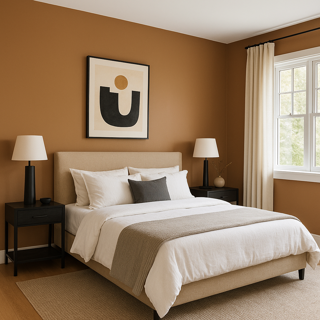
With its soothing, earthy feel, Fort is ideal for bedrooms. It creates a tranquil retreat when paired with soft, neutral bedding and natural materials like wood or linen. For added depth, consider a darker accent wall in a coordinating color like Kendall Charcoal.
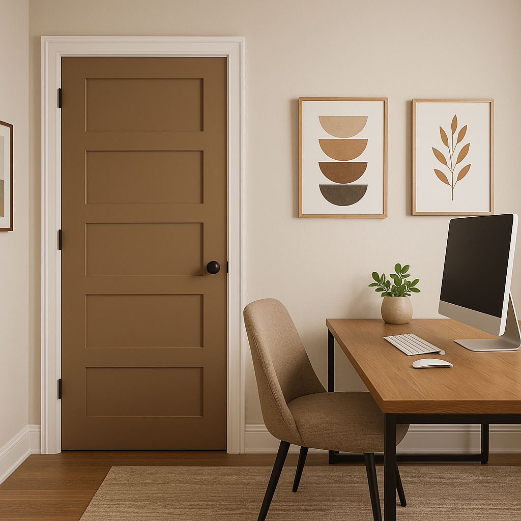
Fort fosters focus and creativity, making it a great option for home offices. Pair it with crisp whites and metallic accents for a clean, professional atmosphere, or incorporate warm woods for a rustic touch.
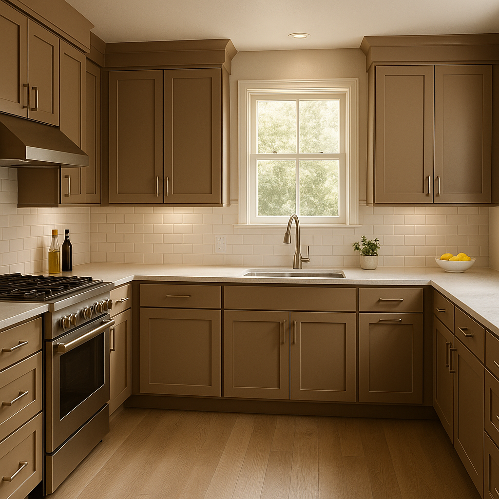
This shade shines in kitchens, especially when paired with natural wood cabinetry or matte black hardware. For a modern farmhouse vibe, consider using Fort on the walls with white subway tile backsplashes and butcher block countertops.
Its understated elegance works equally well in bathrooms, where it can create a spa-like atmosphere. Use it with soft whites and muted blues or greens for a serene, coastal-inspired space.
Fort is a fantastic color for transitional spaces like hallways and entryways, where it sets a warm and inviting tone. Pair it with crisp white trim for a polished, classic look.
Benjamin Moore Fort (1119) is more than just a neutral—it’s a statement of timeless elegance. Its warm undertones and versatility make it suitable for a wide range of styles, from traditional to contemporary. Whether used as a main wall color or as part of a layered palette, Fort offers a sense of balance and warmth that enhances any space.
When choosing Fort, consider your lighting and surrounding colors to bring out its best qualities. It’s a shade that doesn’t shout for attention but quietly elevates the look and feel of your home, making it a go-to choice for interior designers and homeowners alike.
View Colors Only by Brand (No Imagery):
Sherwin-Williams
|
Benjamin-Moore
|
Behr
|
Valspar
Live on the Eastern Slope of Colorado and looking for a local painting professional, check out all our painting services and reach out for a free estimate.
Copyright © 2026 : Wild Fox Painting Inc. : 12435 Mead Way, Littleton, CO 80125


