Benjamin Moore Pumpkin (113) is a rich, warm orange that exudes coziness and charm. Perfect for creating inviting spaces, this color strikes a balance between earthy sophistication and bold vibrancy. Its autumn-inspired tone can imbue any room with a sense of comfort, making it ideal for interiors that aim to feel grounded yet lively.
Pumpkin (113) carries subtle red and brown undertones, giving it a slightly muted yet vibrant appearance. These undertones ensure the color doesn't feel overly bright or overwhelming, making it approachable for a variety of design aesthetics. The brown base adds depth and elegance, while the red notes bring a touch of warmth, making this color exceptionally versatile. These undertones work beautifully in spaces where you want to evoke a cozy, nature-inspired ambiance.
Benjamin Moore Pumpkin pairs effortlessly with a range of complementary and contrasting hues. Here are some suggestions:
Neutral Pairings: To maintain a balanced and timeless look, consider pairing Pumpkin with warm neutrals like Benjamin Moore White Dove (OC-17) or Benjamin Moore Simply White (OC-117). These soft whites allow Pumpkin’s vibrant character to take center stage while keeping the space light and airy.
Earthy Complements: For an organic palette, combine Pumpkin with grounded tones like Benjamin Moore Kendall Charcoal (HC-166) or Benjamin Moore Grant Beige (HC-83). These earthy shades enhance the warm undertones of Pumpkin, creating a harmonious and sophisticated environment.
Contrasting Colors: To make a bold statement, pair Pumpkin with cool blues such as Benjamin Moore Hale Navy (HC-154) or Benjamin Moore Blue Note (2129-30). The contrast between warm orange and deep blue creates a dramatic, eye-catching look that feels modern and dynamic.
Accent Colors: Pumpkin works beautifully as an accent color alongside rich jewel tones like Benjamin Moore Hunter Green (2041-10) or Benjamin Moore Caliente (AF-290). These striking hues complement the warmth of Pumpkin while adding depth and vibrancy to your design.
Pumpkin (113) shines in a variety of applications, whether you’re looking to create a bold focal point or a warm, understated backdrop. Here’s how to incorporate this color into your space:
Living Rooms: Use Pumpkin as a feature wall in living rooms to create a cozy yet energetic atmosphere. Pair it with neutral furniture and natural materials like wood and linen to achieve a balanced, inviting look.
Dining Rooms: Pumpkin is an excellent choice for dining spaces, as its warm undertones encourage a convivial and welcoming feel. Add metallic accents like gold or brass for an elegant touch.
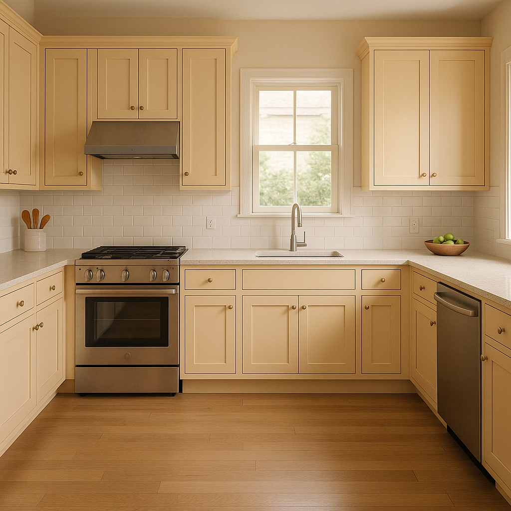
Kitchens: Bring life to your kitchen with Pumpkin-painted cabinetry or walls. It pairs beautifully with white countertops and backsplashes, creating a cheerful and dynamic culinary space.
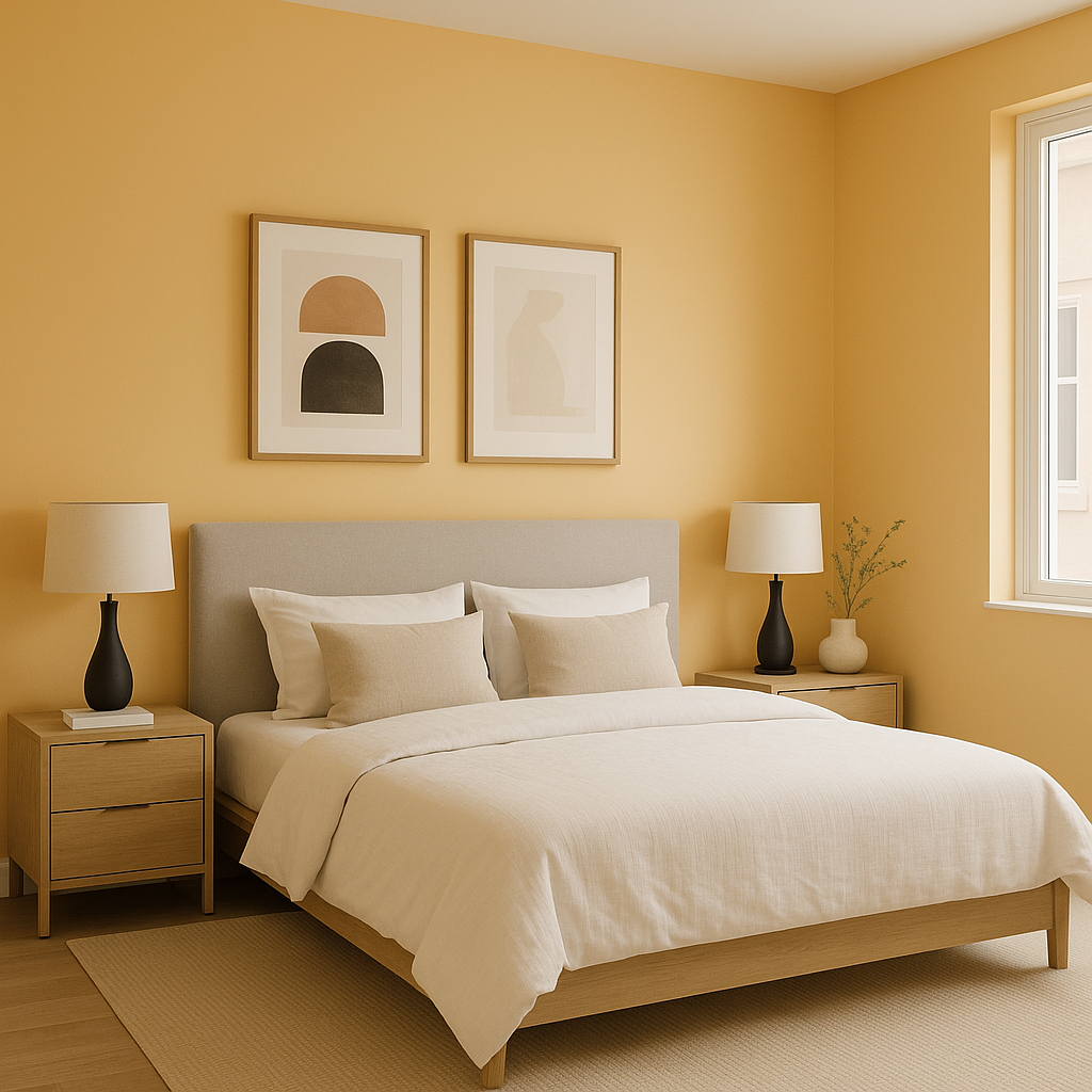
Bedrooms: While bold, Pumpkin can be softened with neutral bedding and muted decor for a warm and relaxing retreat. Consider using it as an accent color for furniture or headboards.
Entryways: Make a lasting first impression by using Pumpkin in entryways or mudrooms. Its warm, inviting hue sets the tone for a welcoming home.
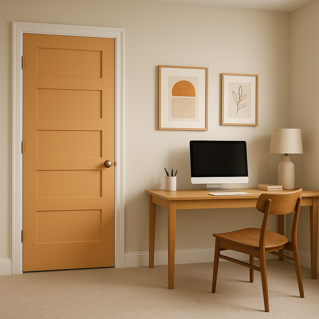
Exteriors: Pumpkin is a fantastic choice for exterior accents like shutters or doors, especially when paired with neutral siding colors. It adds a pop of warmth and personality to curb appeal.
Benjamin Moore Pumpkin (113) is more than just a paint color—it’s a mood-setting, character-rich hue that can elevate any space. Whether used as a bold accent or a grounding backdrop, its warm and inviting nature makes it a timeless choice for homeowners and designers alike.
View Colors Only by Brand (No Imagery):
Sherwin-Williams
|
Benjamin-Moore
|
Behr
|
Valspar
Live on the Eastern Slope of Colorado and looking for a local painting professional, check out all our painting services and reach out for a free estimate.
Copyright © 2026 : Wild Fox Painting Inc. : 12435 Mead Way, Littleton, CO 80125


