Benjamin Moore Creamy (1145) is a sophisticated, warm off-white that embodies subtle elegance while offering incredible versatility. Its soft, creamy appearance makes it an ideal choice for spaces where you want to create a welcoming, serene atmosphere without leaning into stark whites or overly saturated hues. Whether you’re designing a cozy retreat or a bright, airy living space, Creamy offers a neutral foundation that works beautifully in a variety of design styles.
Creamy (1145) is characterized by its delicate yellow undertones, which lend warmth and softness to the color without being overpowering. These undertones prevent it from feeling cold or sterile, making it an excellent option for creating inviting interiors. The subtle warmth ensures it pairs effortlessly with other colors, whether bold or muted. However, it's worth noting that lighting can significantly influence the appearance of the undertones. In natural light, Creamy may appear as a pure warm white, while in artificial lighting, its creamy yellow tones may become slightly more pronounced.
Benjamin Moore Creamy (1145) is remarkably versatile, making it easy to coordinate with a wide range of colors. Here are some suggestions to help you achieve a cohesive look:
Additionally, Creamy works beautifully with wood tones, whether light oak, mid-tone walnut, or dark espresso finishes, making it a versatile partner for cabinetry, furniture, and flooring.
Thanks to its adaptable nature, Benjamin Moore Creamy (1145) is suitable for almost any room in your home. Here are a few popular applications:
Create a cozy yet refined living space by using Creamy on walls. Pair it with soft gray or taupe furniture for a neutral palette, or add pops of color through accent pillows and artwork. Its warmth will make your living room feel inviting and approachable, perfect for entertaining or relaxing.
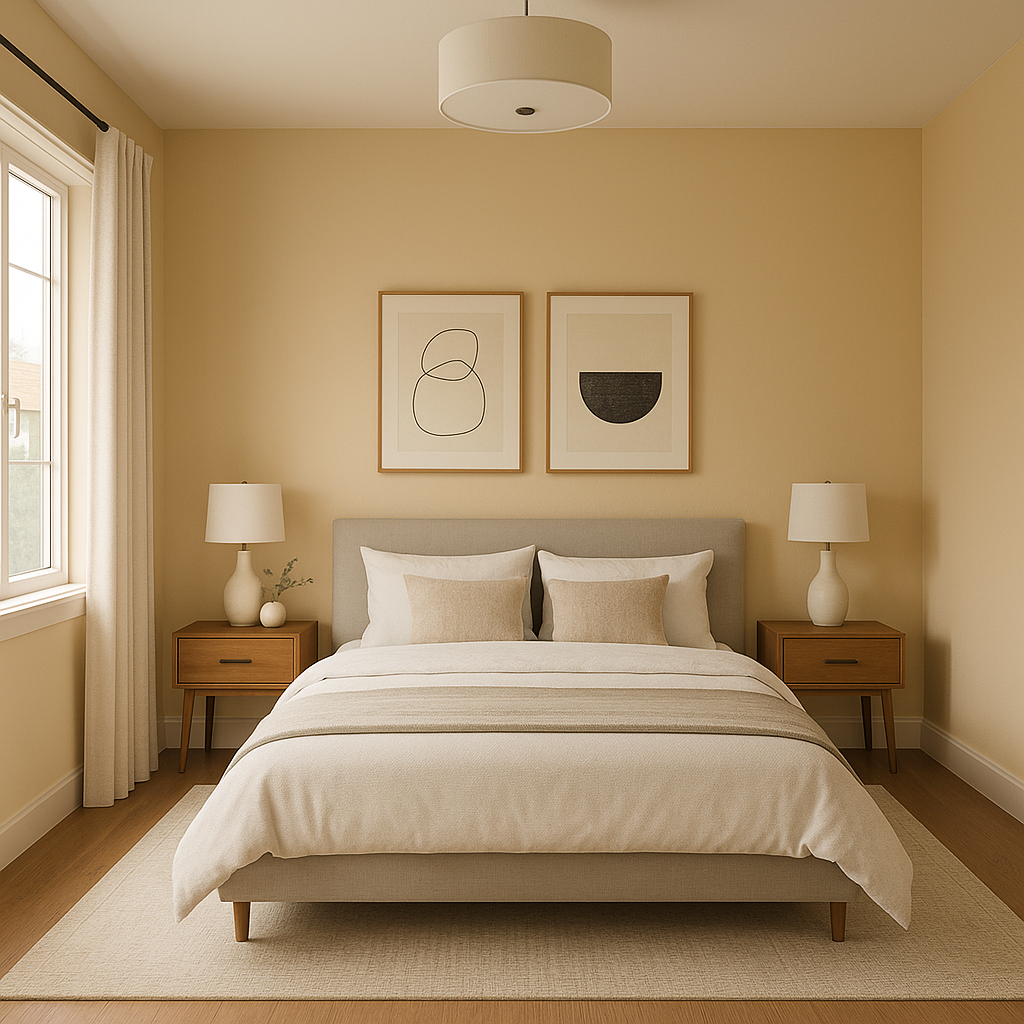
In bedrooms, Creamy provides a tranquil backdrop that encourages relaxation. Combine it with soft linens in muted tones or earthy colors for a restful retreat. Consider adding metallic accents, such as brushed brass or copper, to elevate the space with a touch of luxury.
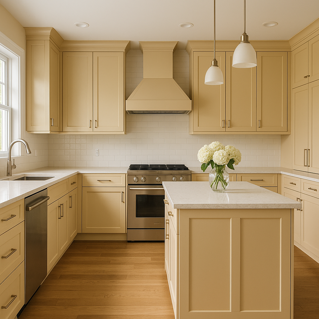
Creamy works beautifully in kitchens, especially when paired with wooden cabinetry or stone countertops. Its soft warmth adds a sense of cleanliness and brightness without feeling sterile. For a classic yet modern look, use Creamy on walls or cabinetry and complement it with subway tiles in white or light gray.
Transform bathrooms into spa-like sanctuaries with Creamy as the main wall color. Its subtle warmth pairs wonderfully with marble countertops, chrome fixtures, and soft, neutral towels. The creamy undertones elevate the space, making it feel both fresh and calming.
Hallways and entryways benefit from Creamy’s ability to brighten small or narrow spaces. Its light-reflecting qualities make it an excellent choice for areas with limited natural light, ensuring these transitional spaces feel open and welcoming.
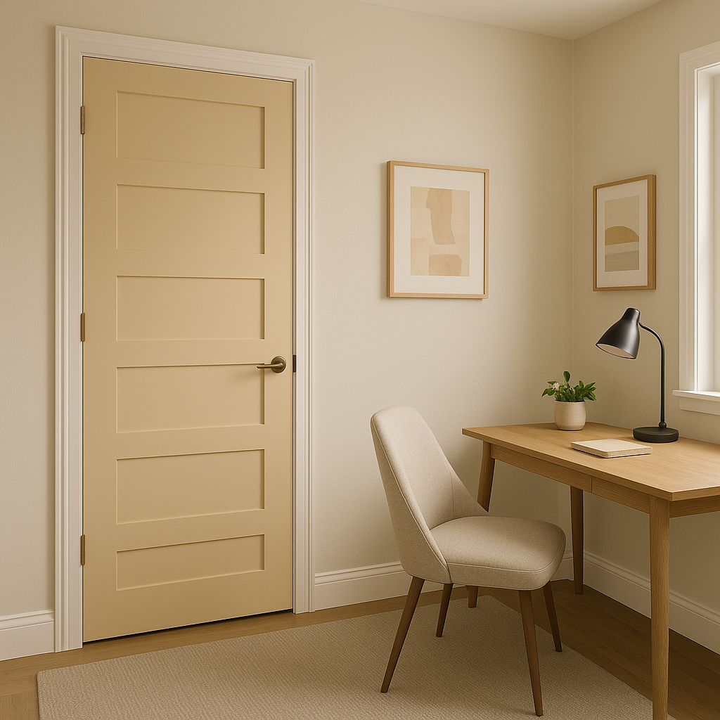
Creamy also works well as a trim color, especially when paired with deeper wall colors. It provides a subtle, warm contrast that frames windows, doors, and baseboards beautifully. Alternatively, use Creamy on accent furniture pieces, such as dressers or bookshelves, for a chic yet understated look.
Benjamin Moore Creamy (1145) is more than just a paint color—it’s a timeless choice that adapts effortlessly to different styles and spaces. Its soft warmth and understated elegance make it ideal for homeowners seeking a neutral palette that feels cozy yet sophisticated. Whether you want to brighten up a room or create a soothing environment, Creamy delivers versatility, beauty, and charm all in one.
With its delicate yellow undertones, ability to pair well with a wide array of coordinating colors, and suitability for various spaces, Benjamin Moore Creamy (1145) is a color that truly stands the test of time.
View Colors Only by Brand (No Imagery):
Sherwin-Williams
|
Benjamin-Moore
|
Behr
|
Valspar
Live on the Eastern Slope of Colorado and looking for a local painting professional, check out all our painting services and reach out for a free estimate.
Copyright © 2026 : Wild Fox Painting Inc. : 12435 Mead Way, Littleton, CO 80125


