Benjamin Moore Butterscotch (1147) is a rich and welcoming paint color that exudes warmth and charm. This golden hue brings an inviting glow to any space, making it a perfect choice for rooms where comfort and coziness are key. Whether you're looking to create a rustic-inspired kitchen, a cheerful living room, or a vibrant accent wall, Butterscotch delivers timeless appeal with its warm undertones and versatile personality.
Butterscotch (1147) is rooted in golden-orange tones, but what truly sets it apart is its blend of warm undertones. It carries a soft amber base with hints of muted brown, which tempers its brightness and ensures it doesn’t overwhelm a space. These undertones make it a color that feels sunlit and earthy, striking the perfect balance between vivid and grounded.
Its warmth makes it particularly suitable for creating a cozy atmosphere, while its golden hue adds a sense of vibrancy and energy. Butterscotch pairs beautifully with natural light, bringing out its sunny characteristics and enhancing the overall ambiance of a room.
Benjamin Moore Butterscotch (1147) harmonizes effortlessly with a variety of colors, allowing you to build a cohesive and stylish palette. Here are some coordinating colors to consider:
Butterscotch (1147) is a versatile color that can elevate various areas of your home. Here are some ideas on how to use it effectively:
Bring a sense of warmth and cheer to your living room by using Butterscotch on the walls. Pair it with soft neutral furniture and accessories like cream-colored throws or beige rugs for a cozy yet sophisticated look. Add navy or deep green accents for visual interest and depth.
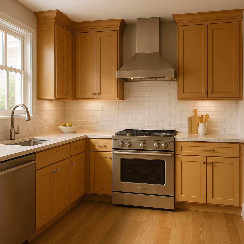
Create a rustic, farmhouse-inspired kitchen by using Butterscotch on cabinetry or walls. Combine it with natural wood finishes and bright whites to emphasize its golden undertones. For a modern twist, pair it with matte black hardware or stainless steel appliances.
Set the stage for intimate gatherings and lively dinners by using Butterscotch as the backdrop in your dining room. It pairs beautifully with dark wood furniture and metallic accents like brass or copper, enhancing the warmth of the space.
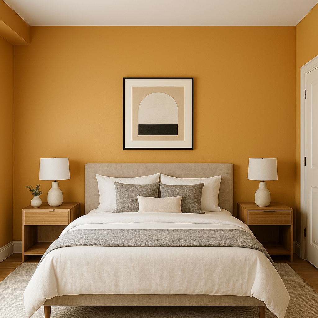
Use Butterscotch as an accent wall to add a touch of vibrancy to your bedroom. Pair it with soft, neutral bedding in whites or grays to keep the atmosphere serene and relaxing.
Make a bold first impression by painting your entryway walls in Butterscotch. Its inviting hue will create a warm and welcoming atmosphere for guests the moment they step inside.
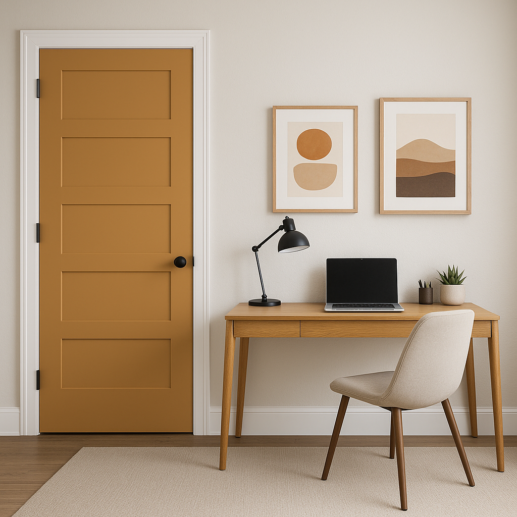
If you're not ready to commit to an entire room in Butterscotch, consider using it on smaller accent pieces like furniture, doors, or shelving. This allows you to bring in its golden warmth without overpowering the space.
Benjamin Moore Butterscotch (1147) is a color that celebrates warmth, comfort, and vibrancy. Its golden undertones and earthy depth make it an ideal choice for creating inviting, sun-kissed spaces that feel timeless and full of personality. Whether you want to add cozy charm to your living room or make a bold statement in your entryway, Butterscotch is a versatile hue that adapts beautifully to your design vision.
View Colors Only by Brand (No Imagery):
Sherwin-Williams
|
Benjamin-Moore
|
Behr
|
Valspar
Live on the Eastern Slope of Colorado and looking for a local painting professional, check out all our painting services and reach out for a free estimate.
Copyright © 2026 : Wild Fox Painting Inc. : 12435 Mead Way, Littleton, CO 80125


