Benjamin Moore Cappuccino (1155) is a sophisticated, medium-tone beige that exudes warmth, comfort, and versatility. With its rich, creamy presence, this paint color is a favorite for creating spaces that feel both inviting and elegant. Whether you're curating a cozy living room, designing a serene bedroom, or updating a professional office, Cappuccino strikes the perfect balance between classic and contemporary.
Cappuccino (1155) is a warm neutral with prominent golden and earthy undertones. These undertones give the color its soft, sunlit character, making it appear slightly warmer in spaces with natural light. In artificial light, the golden notes become more pronounced, adding a gentle glow to the room. This complexity ensures the color feels dynamic and never flat, while maintaining its status as a neutral backdrop.
Benjamin Moore Cappuccino is a highly adaptable shade that pairs beautifully with a variety of colors. Here are some suggestions for coordinating hues to achieve a polished aesthetic:
Trim and Accent Colors: For crisp, clean contrast, pair Cappuccino with Benjamin Moore’s “Simply White” (OC-117) or “Chantilly Lace” (OC-65). These bright whites highlight the warmth of Cappuccino, creating a balanced and timeless look.
Earthy Complements: Enhance the natural feel of Cappuccino by coordinating it with muted greens like “Saybrook Sage” (HC-114) or warm browns such as “Kendall Charcoal” (HC-166). These combinations create a grounded, harmonious palette.
Pops of Color: If you're looking to add a splash of vibrancy, consider jewel tones like “Newburg Green” (HC-158) or “Hale Navy” (HC-154). These deeper hues provide contrast and drama without overshadowing Cappuccino's warmth.
Monochromatic Pairings: For a tonal, layered effect, use lighter neutrals like “Manchester Tan” (HC-81) or darker shades like “Grant Beige” (HC-83). These options create depth while maintaining a cohesive, neutral scheme.
Cappuccino’s approachable warmth and neutral undertones make it a versatile option for a variety of spaces:
Cappuccino is an excellent choice for communal areas where you want to foster comfort and togetherness. Its golden undertones imbue the space with a cozy yet refined ambiance, making it perfect for pairing with warm wood furniture, soft textiles, and plush area rugs.
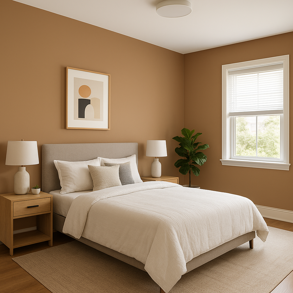
For bedrooms, Cappuccino creates a serene and restful environment. Its soft warmth makes it a natural complement to crisp white linens, light-colored furniture, and subtle metallic accents like brushed gold or bronze.
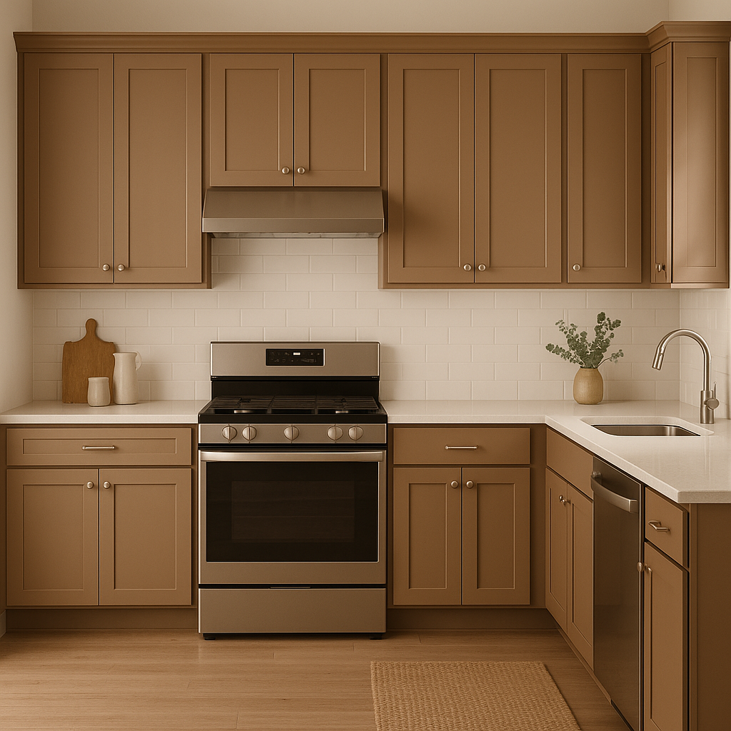
In kitchens and dining rooms, Cappuccino works beautifully alongside natural materials such as stone countertops, wood cabinetry, and stainless steel appliances. Its golden undertones enhance the warmth of these elements, providing a cohesive and inviting look.
Cappuccino’s neutral sophistication makes it a top pick for professional spaces. Its understated elegance promotes focus and productivity, while its warmth ensures the room doesn’t feel sterile.
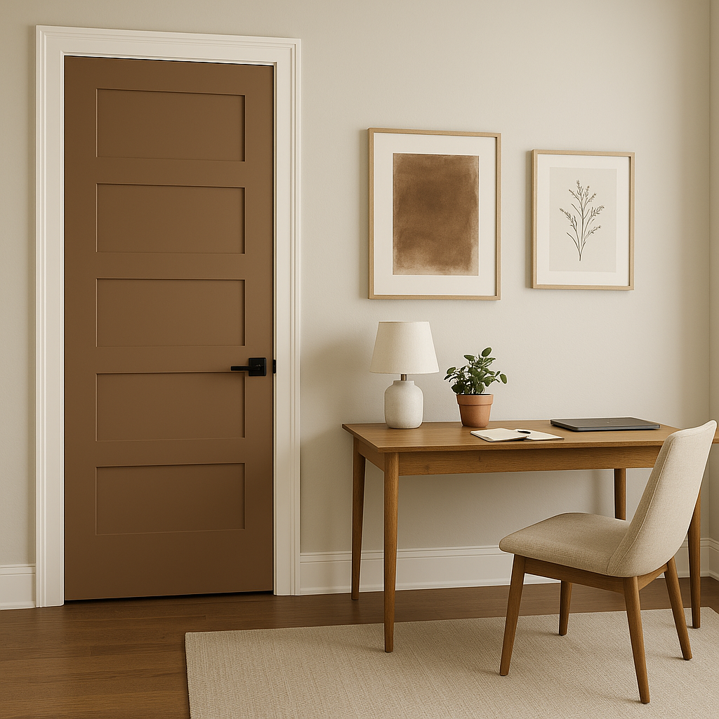
As a transitional color, Cappuccino is ideal for hallways and entryways, where it creates a seamless flow between rooms. Its neutral base allows for easy coordination with surrounding colors, making it a practical yet stylish choice.
Cappuccino’s appearance can vary depending on lighting conditions. In rooms with ample natural light, the color will appear brighter and showcase more of its golden undertones. In dimmer spaces or those with cool artificial lighting, the beige base may feel more subdued and grounded. To maximize its versatility, consider testing a sample in your space under different lighting conditions.
For finish selection:
Benjamin Moore Cappuccino (1155) is more than just a paint color—it’s a timeless design tool for elevating your interiors. Its warm undertones, versatility, and ability to pair effortlessly with a range of colors make it a go-to choice for homeowners and designers alike. Whether you’re seeking an inviting neutral for a cozy retreat or a refined backdrop for a modern aesthetic, Cappuccino delivers understated elegance that stands the test of time.
View Colors Only by Brand (No Imagery):
Sherwin-Williams
|
Benjamin-Moore
|
Behr
|
Valspar
Live on the Eastern Slope of Colorado and looking for a local painting professional, check out all our painting services and reach out for a free estimate.
Copyright © 2026 : Wild Fox Painting Inc. : 12435 Mead Way, Littleton, CO 80125


