Benjamin Moore Pensacola (1184) is a warm, inviting hue that seamlessly blends elegance and versatility. This medium-toned beige brings a sense of refined comfort to any space, making it ideal for homeowners and designers who seek a balanced aesthetic with timeless appeal. Its soft undertones and adaptable nature allow it to serve as both a neutral backdrop and a feature color, depending on the design scheme.
At first glance, Pensacola appears to be a classic beige, but it carries subtle undertones that give it depth and character. It leans slightly towards a golden warmth, making it more inviting than cooler taupes or grays. The faint yellow and sandy undertones infuse the color with a natural, sunlit quality, perfect for creating spaces that feel cozy yet sophisticated. These undertones allow Pensacola to harmonize beautifully with both warm and cool palettes, making it an incredibly versatile choice.
Pensacola (1184) pairs effortlessly with a wide range of colors, offering endless possibilities for creating cohesive designs. Here are some coordinating colors that complement Pensacola beautifully:
Cool contrasts: Pair Pensacola with crisp whites, such as Benjamin Moore White Dove (OC-17), for a clean and modern look. Cooler grays like Stonington Gray (HC-170) can add a touch of sophistication and balance to its warm undertones.
Earthy palettes: For a grounded, natural vibe, combine Pensacola with muted greens like Saybrook Sage (HC-114) or warm browns such as Alexandria Beige (HC-77). These combinations evoke a sense of organic serenity.
Bold accents: Pensacola can serve as a neutral backdrop for bold accent colors. Consider pairing it with deep navy blues like Hale Navy (HC-154) or rich jewel tones such as Newburg Green (HC-158) for a striking contrast that adds energy and drama to your space.
Pensacola’s adaptable nature makes it ideal for a variety of applications, whether you're revamping a single room or designing an entire home. Here are some popular ways to use this versatile shade:
Living rooms: Create a welcoming atmosphere in your living room by using Pensacola on the walls. Its warm undertones complement wood furniture and soft textiles, making it perfect for transitional or traditional spaces.
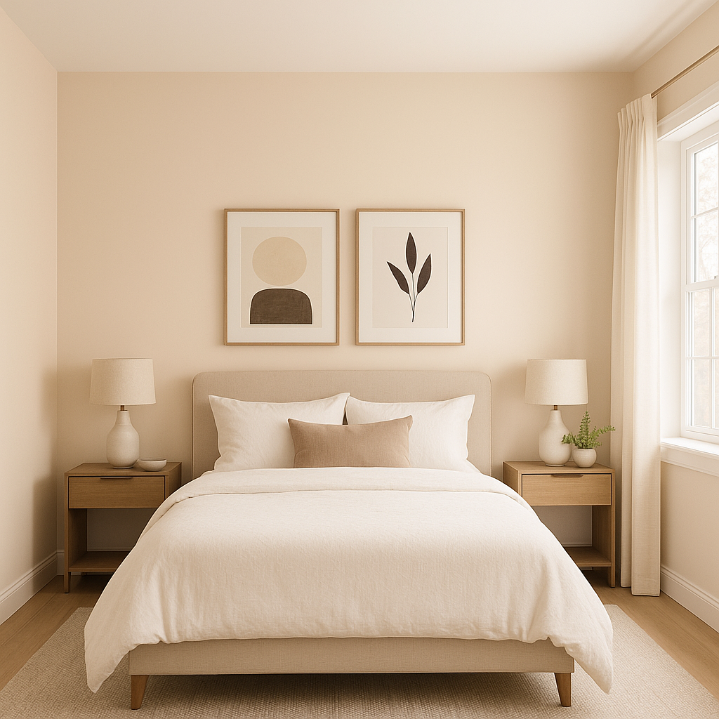
Bedrooms: Pensacola’s soothing qualities make it an excellent choice for bedrooms. Pair it with plush bedding and layered textures to craft a serene retreat.
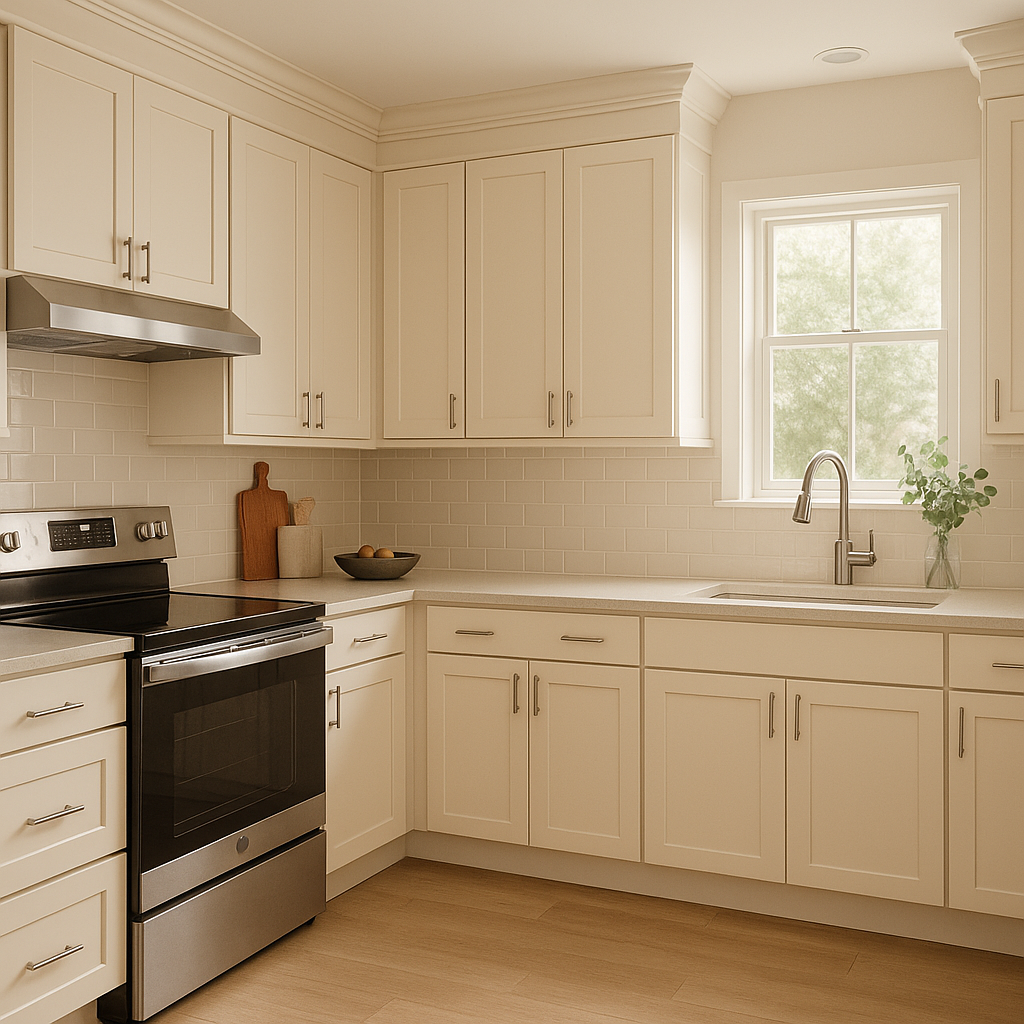
Kitchens: Use Pensacola to add warmth to kitchens, especially those with white cabinetry or stone countertops. It brings an inviting tone that enhances the heart of the home.
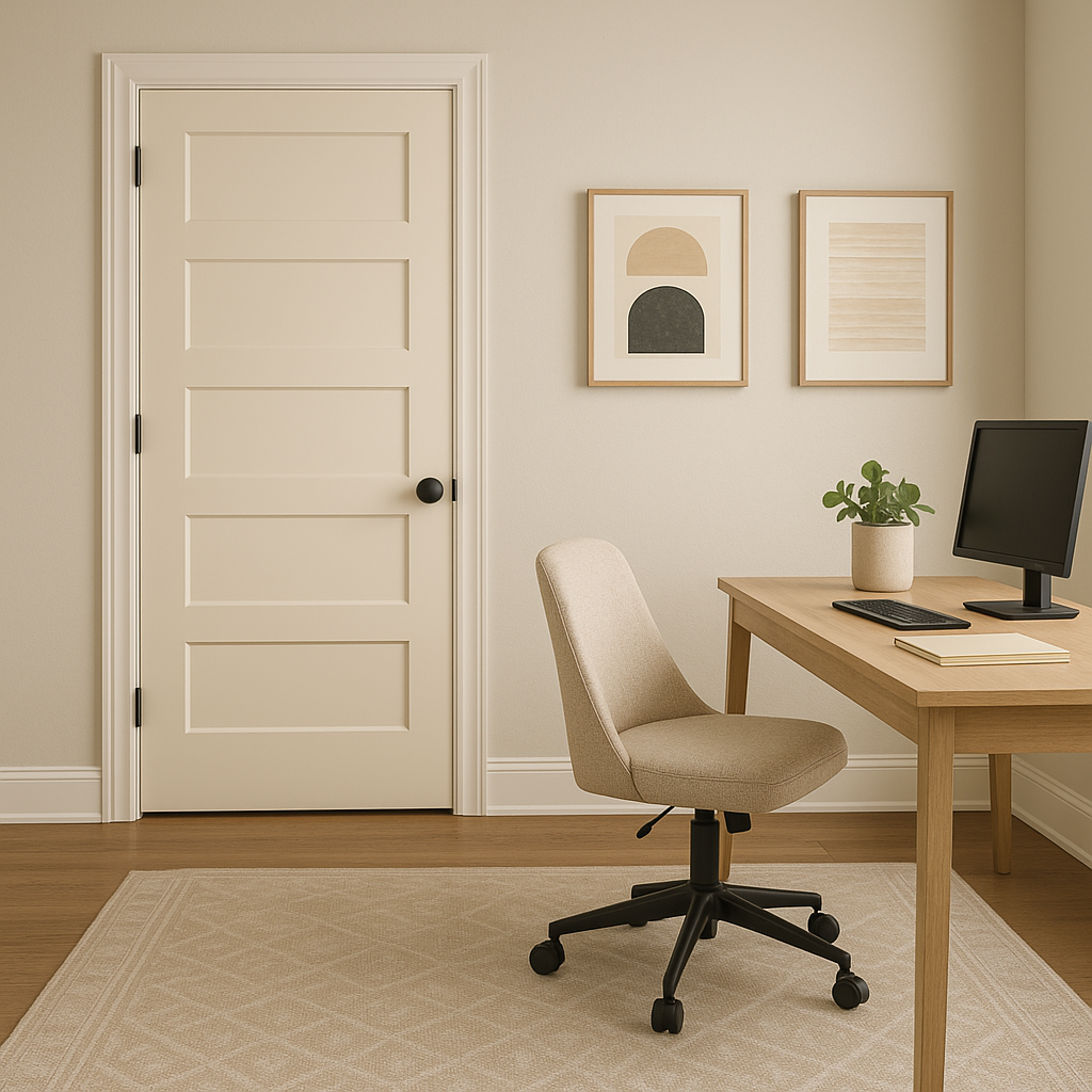
Hallways and entryways: As a medium-toned neutral, Pensacola works beautifully in transitional spaces like hallways and entryways. It creates flow while adding subtle interest.
Accent walls: Highlight architectural features or create visual interest by using Pensacola on an accent wall. Its understated elegance allows it to stand out without overwhelming the space.
Pensacola (1184) is more than just a beige—it’s a timeless canvas that allows your creativity to shine. Its warm undertones and versatility make it an excellent choice for both residential and commercial interiors. Whether you're looking to create a cozy retreat, a polished ambiance, or a harmonious design, Pensacola offers the perfect balance of warmth and sophistication. With its ability to pair seamlessly with a wide range of colors and styles, Pensacola (1184) is a go-to choice for designers and homeowners alike.
View Colors Only by Brand (No Imagery):
Sherwin-Williams
|
Benjamin-Moore
|
Behr
|
Valspar
Live on the Eastern Slope of Colorado and looking for a local painting professional, check out all our painting services and reach out for a free estimate.
Copyright © 2026 : Wild Fox Painting Inc. : 12435 Mead Way, Littleton, CO 80125


