Benjamin Moore Cornucopia (119) is a rich, earthy paint color that exudes warmth and timeless elegance. This medium-toned shade is a blend of golden-brown and terracotta, capturing the essence of autumn harvests and cozy interiors. Cornucopia brings a sense of comfort and luxury to any space, making it a versatile choice for homeowners and designers alike.
Cornucopia has subtle red and orange undertones that give it a warm, inviting character. These undertones help balance its earthy base, resulting in a hue that feels grounded yet dynamic. The slight reddish tint adds depth, while the orange undertones introduce a hint of vibrancy without overwhelming the overall softness of the color. Depending on the lighting, Cornucopia can shift from looking more golden-brown in natural daylight to richer terracotta under warm artificial light.
To create harmonious color palettes with Cornucopia, consider pairing it with complementary or contrasting hues. Here are some coordinating colors to inspire your design:
Neutral Pairings:
Cornucopia works beautifully with warm neutrals like Benjamin Moore White Dove (OC-17) or Benjamin Moore Muslin (OC-12). These creamy whites and light beiges provide a soft contrast that enhances the earthy richness of Cornucopia.
Cool Contrasts:
For a modern twist, pair Cornucopia with cooler tones like Benjamin Moore Gentle Gray (1626) or Benjamin Moore Silver Lake (1598). These subtle blues and grays provide a refreshing counterbalance to Cornucopia's warmth.
Bold Accents:
Amp up the drama by introducing deep jewel tones like Benjamin Moore Black Forest Green (2050-10) or Benjamin Moore Merlot Red (2006-10). These bold shades create a striking visual impact when used alongside Cornucopia.
Earthy Complements:
For a cohesive, organic palette, combine Cornucopia with muted greens like Benjamin Moore Saybrook Sage (HC-114) or soft browns like Benjamin Moore Kingsport Gray (HC-86).
Cornucopia's warm and versatile nature makes it suitable for a variety of interior design applications. Here are some creative ways to incorporate this color into your home:
Living Rooms:
Cornucopia creates a cozy and inviting atmosphere in living spaces. Pair it with plush fabrics, textured rugs, and wooden accents to craft a warm, relaxing retreat.
Dining Rooms:
This hue is perfect for dining areas, as its rich tones encourage a sense of intimacy and connection. Combine it with elegant lighting fixtures and metallic finishes for a sophisticated look.
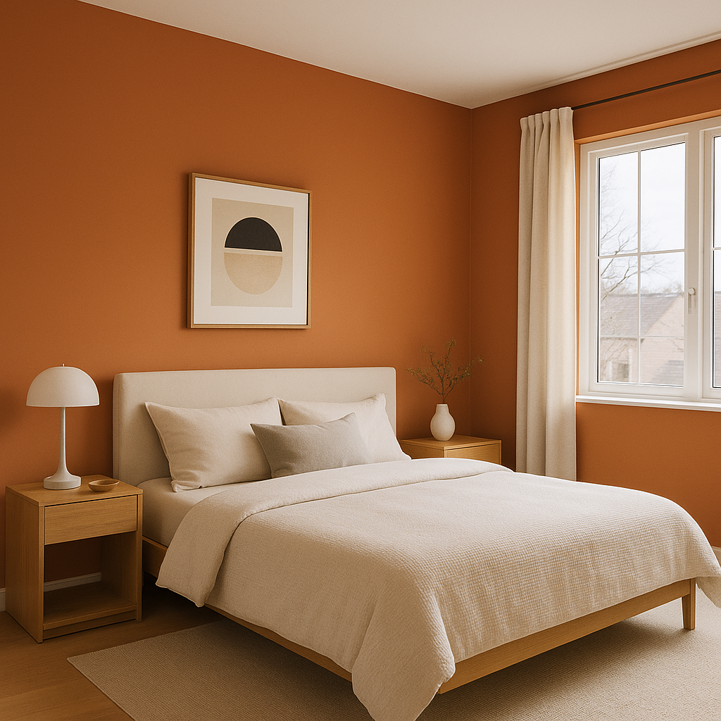
Bedrooms:
Use Cornucopia on feature walls to add depth and warmth to bedrooms. Complement it with soft linens and earthy decor for a serene and stylish sanctuary.
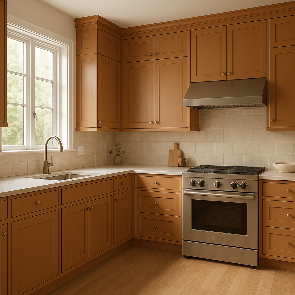
Kitchens:
Cornucopia works well in kitchens, particularly when paired with natural wood cabinetry or stone countertops. It adds a rustic charm while remaining polished and refined.
Accent Walls:
If you’re not ready to commit to Cornucopia for an entire room, try it on an accent wall. It pairs beautifully with lighter tones and can act as a focal point to anchor your design.
Hallways and Entryways:
Welcome guests into your home with Cornucopia’s inviting warmth. Use it in entryways or hallways for a welcoming ambiance that sets the tone for the rest of your interior.
Cornucopia evolves beautifully depending on the lighting conditions. In spaces with abundant natural light, the color takes on a softer golden tone, while artificial lighting can bring out its deeper, terracotta-like richness. To maximize its impact, consider the type of lighting fixtures and bulb temperatures in the room, as they can subtly shift the perception of the color.
Benjamin Moore Cornucopia (119) is a paint color that bridges the gap between traditional and contemporary design, offering a timeless appeal that feels both grounded and inviting. With its warm undertones, versatile pairings, and wide range of applications, this earthy hue is an exceptional choice for any interior space.
View Colors Only by Brand (No Imagery):
Sherwin-Williams
|
Benjamin-Moore
|
Behr
|
Valspar
Live on the Eastern Slope of Colorado and looking for a local painting professional, check out all our painting services and reach out for a free estimate.
Copyright © 2026 : Wild Fox Painting Inc. : 12435 Mead Way, Littleton, CO 80125


