Benjamin Moore Careless (1214) is a soft, muted green with a distinctly tranquil and understated charm. Perfect for creating serene and welcoming spaces, this versatile shade is a blend of subtle sophistication and natural beauty. Its delicate balance of warmth and coolness makes it an excellent choice for a variety of design styles, from modern minimalism to classic elegance. Whether you're refreshing a room or embarking on a full-scale renovation, Careless (1214) is a color that invites harmony and relaxation into your home.
Careless (1214) is a nuanced green that carries subtle gray undertones, lending it a sophisticated and grounding quality. These cool gray undertones prevent the green from feeling overly saturated or vibrant, making it a perfect choice for spaces that require a calming and neutral backdrop. Depending on the lighting in your space, Careless can shift slightly, appearing softer and more muted in low light, or taking on a fresh, airy character in brighter settings. Its versatility makes it adaptable to a variety of environments, whether you're working with natural sunlight or ambient interior lighting.
Benjamin Moore Careless (1214) pairs beautifully with a range of complementary and contrasting tones. Here are some ideal coordinating colors to enhance its beauty:
Neutral Pairings: For a timeless and understated look, pair Careless with soft neutrals like White Dove (OC-17) or Classic Gray (1548). These hues create a clean and elegant contrast, allowing the green to take center stage without overwhelming the space.
Earthy Complements: Bring out the natural essence of Careless by pairing it with warm, earthy tones such as Revere Pewter (HC-172) or Sandy Hook Gray (HC-108). These combinations evoke a grounded and organic feel that's perfect for cozy living rooms or bedrooms.
Bold Accents: For a touch of drama, consider pairing Careless with deep, moody hues like Kendall Charcoal (HC-166) or Black Forest Green (HC-190). These pairings create a striking contrast that adds depth and sophistication.
Soft Pastels: If you're designing a light and airy space, coordinate Careless with pastel tones such as Pale Oak (OC-20) or Woodlawn Blue (HC-147). These pairings result in a breezy and uplifting ambiance, ideal for kitchens, bathrooms, or nurseries.
The versatility of Careless (1214) makes it suitable for a wide range of applications across your home. Here are just a few ways to incorporate this timeless hue into your design:
Living Rooms: Create a soothing and inviting atmosphere by using Careless as a wall color in your living room. Pair it with plush cream upholstery and natural wood accents for a cozy yet elegant vibe.
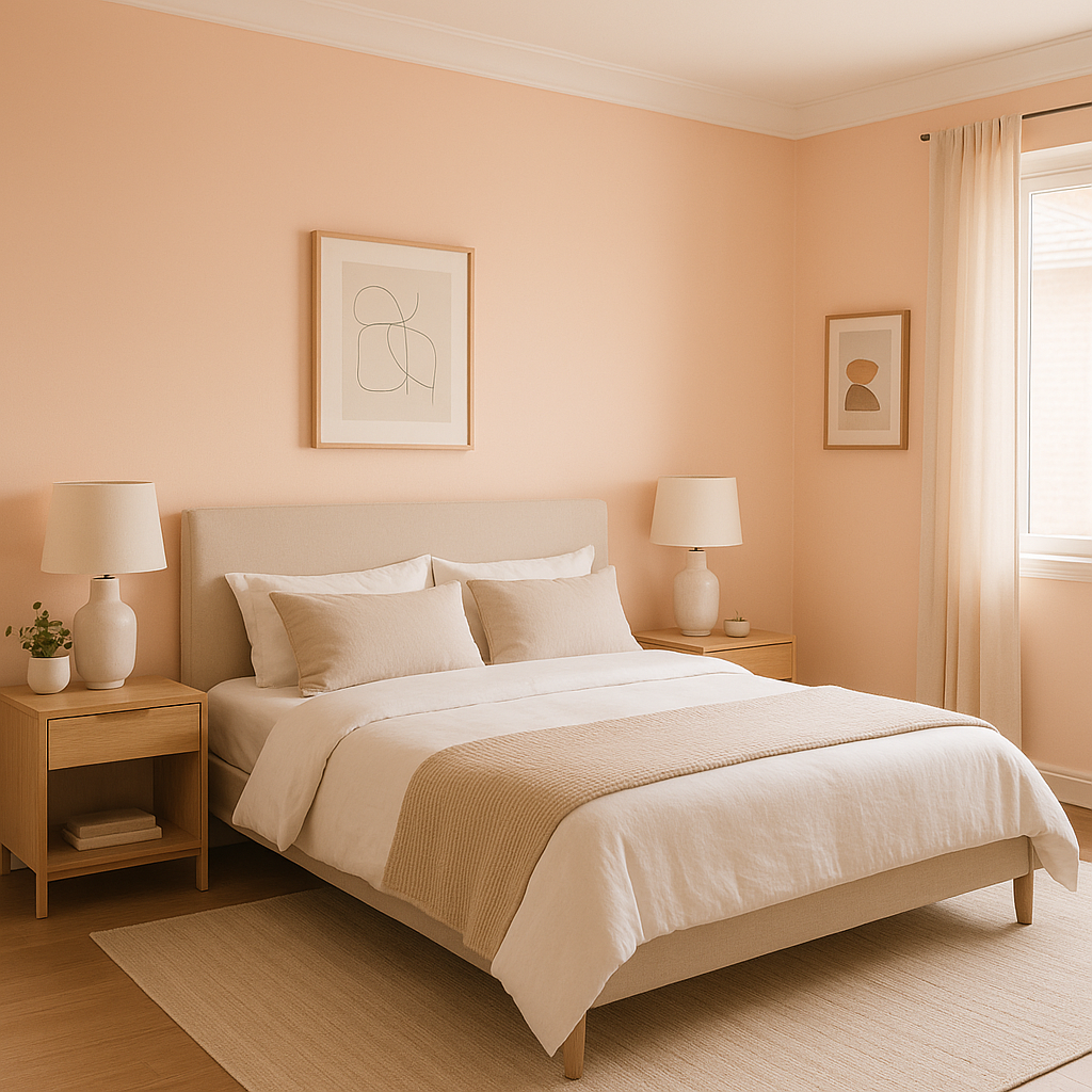
Bedrooms: The muted green tone of Careless is perfect for bedrooms, where serenity is key. Combine it with crisp white linens and soft gray decor for a space that feels like an escape from the outside world.
Bathrooms: Use Careless as a backdrop for bathrooms to evoke a spa-like feel. Pair it with white subway tiles and brushed nickel fixtures for a clean and polished look.
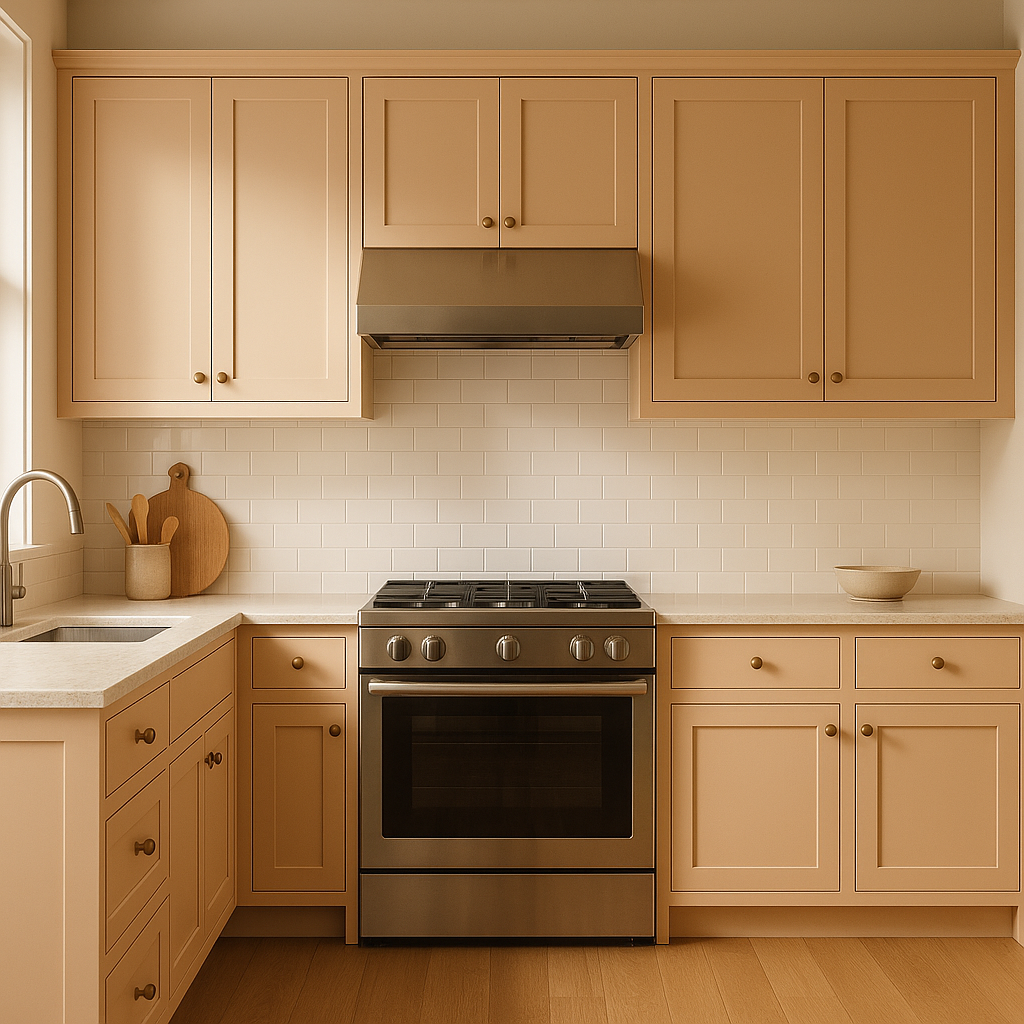
Kitchens: Add a touch of nature to your kitchen by using Careless on cabinets or as an accent wall. Pair it with marble countertops and matte black hardware for a modern twist.
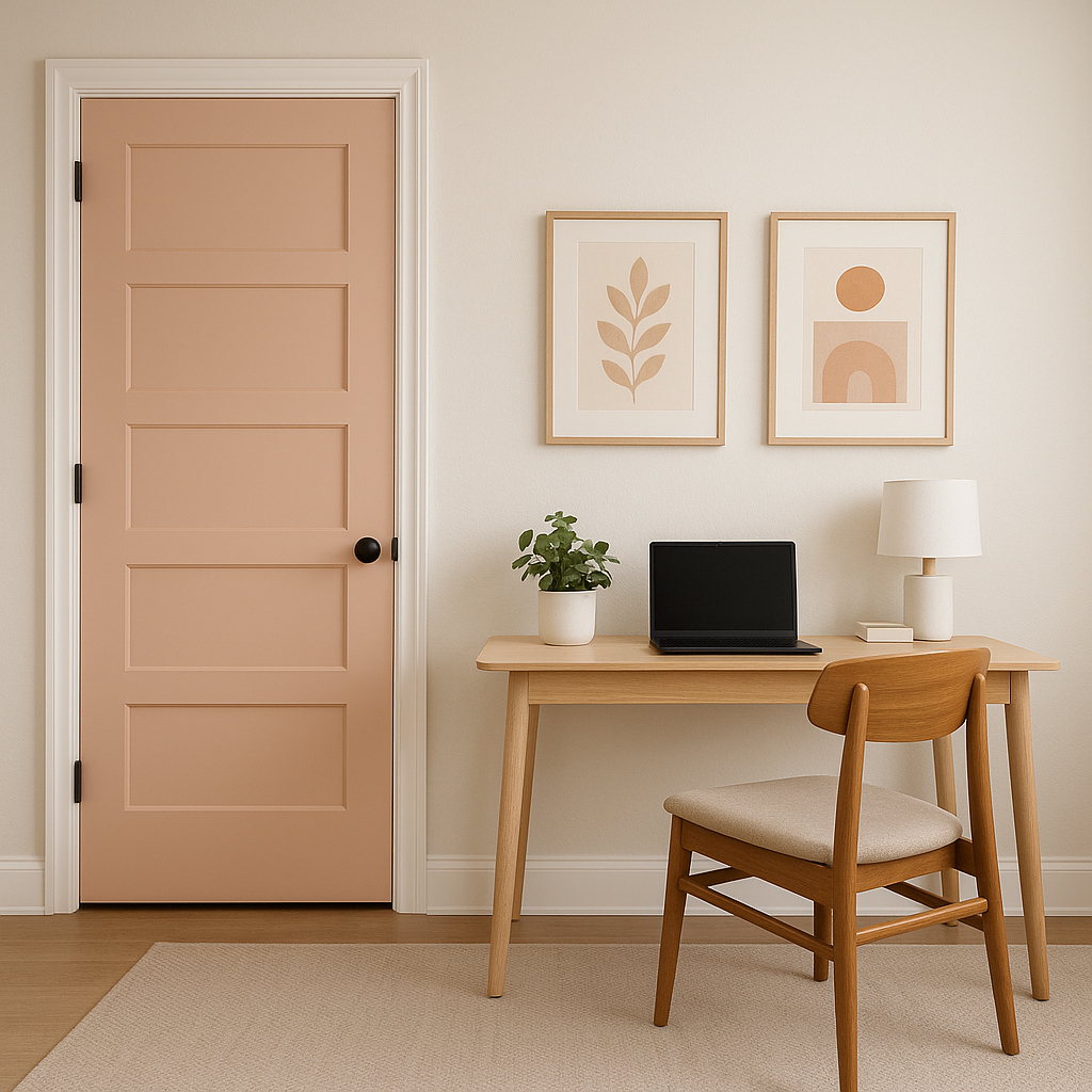
Home Offices: Enhance focus and tranquility in your workspace by painting the walls with Careless. Complement the color with light wood furniture and leafy green plants to inspire productivity and creativity.
Lighting can significantly impact how Careless (1214) appears in your space. In rooms with ample natural light, the green may feel fresh and luminous, while artificial lighting can bring out its subdued gray undertones. Consider testing this color on various walls and observing its behavior throughout the day to ensure it aligns with the mood you're aiming to create.
Benjamin Moore Careless (1214) is a versatile and refined green that effortlessly bridges the gap between soothing elegance and modern sophistication. Whether you're looking to transform an entire room or add subtle charm to a single accent wall, this timeless hue is sure to elevate your space with its calming presence.
View Colors Only by Brand (No Imagery):
Sherwin-Williams
|
Benjamin-Moore
|
Behr
|
Valspar
Live on the Eastern Slope of Colorado and looking for a local painting professional, check out all our painting services and reach out for a free estimate.
Copyright © 2026 : Wild Fox Painting Inc. : 12435 Mead Way, Littleton, CO 80125


