Benjamin Moore Copper (1218) is a rich, inviting paint color that exudes warmth while showcasing the timeless beauty of earthy tones. With its deep terracotta-inspired appearance, this shade is perfect for creating cozy, welcoming spaces that feel elegant yet grounded. Whether you’re designing a rustic retreat or adding depth to a modern aesthetic, Copper (1218) offers endless possibilities for elevating your interiors.
Copper (1218) is a medium-to-dark shade that leans toward a reddish-brown hue, with subtle orange undertones. These warm undertones give the color depth and vitality, making it feel both sophisticated and approachable. The orange influence is soft, preventing the shade from becoming overpowering, while the brown base keeps it grounded and earthy. This harmonious balance ensures that Copper (1218) works beautifully in spaces where you want to create a sense of warmth and connection.
To make the most of Benjamin Moore Copper (1218), consider pairing it with complementary shades that enhance its richness:
Benjamin Moore Copper (1218) is a versatile hue that can be incorporated into various spaces and design styles. Here are some creative ways to use this captivating color:
Copper (1218) is an excellent choice for living rooms and dens where you want to create a cozy, intimate atmosphere. Use it on an accent wall to bring warmth and depth to the space, or paint an entire room for a bold yet refined look. Pair it with leather furniture and natural wood tones to elevate its rustic charm.
This earthy hue is perfect for dining rooms, where it can encourage conversation and evoke feelings of togetherness. Pair it with metallic accents—like bronze or gold fixtures—and a statement chandelier for a sophisticated, elegant ambiance.
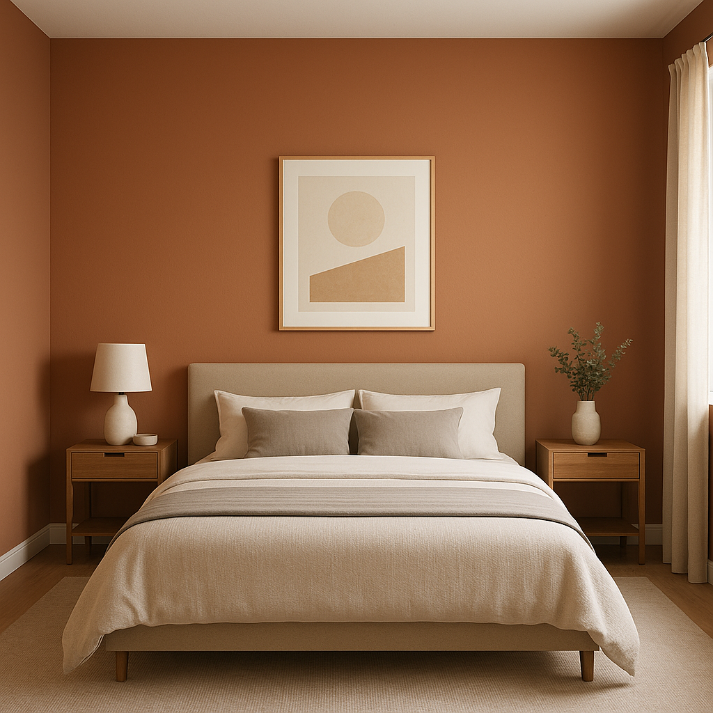
For a bedroom, Copper (1218) can create a cocoon-like effect, ideal for relaxation and comfort. Use soft textiles in neutral tones, such as cream or beige, to balance the color and keep the space serene.
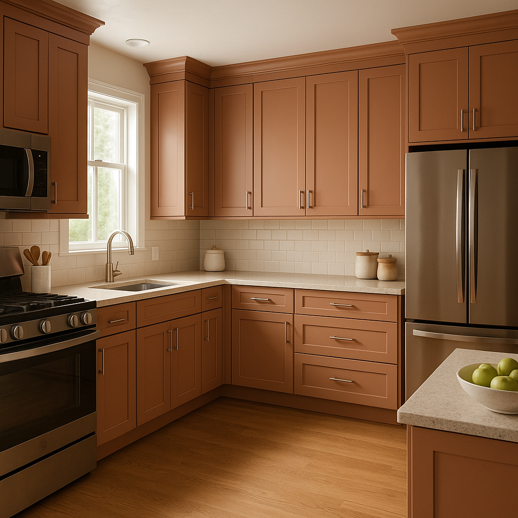
If you’re not ready to commit to a full wall, Copper (1218) works beautifully on furniture or cabinetry. Consider painting a built-in bookshelf, kitchen island, or side table in this shade to add a pop of warmth and character.
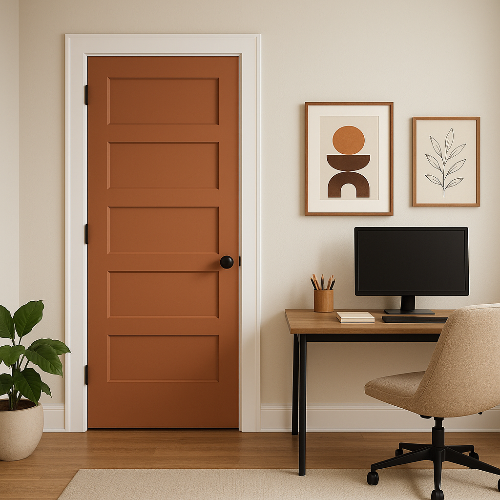
Copper (1218) isn’t just for interiors—it’s a stunning choice for exterior doors or shutters. Its warm, earthy tone can enhance curb appeal and complement natural surroundings, making it a great option for rustic homes or properties with lush landscaping.
Benjamin Moore Copper (1218) is more than just a paint color—it's a statement of warmth, elegance, and timeless style. Its earthy undertones make it adaptable to a variety of design aesthetics, while its versatility allows it to shine in both large and small spaces. Whether used as a focal point or a subtle accent, this shade brings character and charm to your home, creating spaces that feel inviting and sophisticated.
Bring your vision to life with Benjamin Moore Copper (1218), and let its rich, warm tones transform your interiors into a haven of comfort and style.
View Colors Only by Brand (No Imagery):
Sherwin-Williams
|
Benjamin-Moore
|
Behr
|
Valspar
Live on the Eastern Slope of Colorado and looking for a local painting professional, check out all our painting services and reach out for a free estimate.
Copyright © 2026 : Wild Fox Painting Inc. : 12435 Mead Way, Littleton, CO 80125


