Benjamin Moore Potters (1221) is a sophisticated and versatile neutral that exudes understated elegance. This soft, warm hue sits perfectly at the intersection of taupe and gray, offering a harmonious balance that makes it a favorite among interior designers. Its natural, earthy quality feels grounded yet refined, making it an ideal choice for creating serene spaces that invite relaxation and timeless style.
Potters (1221) carries subtle undertones of beige and brown, which lend it a welcoming warmth. Unlike cooler grays that can sometimes feel stark or sterile, this shade has a gentle softness that feels inviting and approachable. The touch of beige ensures the color complements both traditional and modern aesthetics, while the gray undertone provides a sophisticated neutrality that works beautifully in various lighting conditions. Whether bathed in natural sunlight or illuminated by artificial light, Potters maintains its calm and balanced appearance with minimal shifts.
Benjamin Moore Potters (1221) is remarkably versatile and pairs effortlessly with a range of complementary hues. To create a cohesive and layered look, consider the following coordinating colors:
These combinations allow for flexibility in design, whether you're aiming for a monochromatic scheme or introducing subtle pops of color.
Potters (1221) is a highly adaptable color that thrives in a variety of settings. Its warm neutrality makes it suitable for almost any room in the home, from living rooms to bedrooms, kitchens to bathrooms. Here are some creative ways to incorporate this timeless shade into your interior design:
Potters works wonderfully as the primary wall color in living rooms, setting a relaxed yet polished tone. Pair it with plush textiles like velvet or linen in neutral or jewel tones to enhance its inviting quality. Add natural wood furniture or metallic accents for a touch of sophistication.
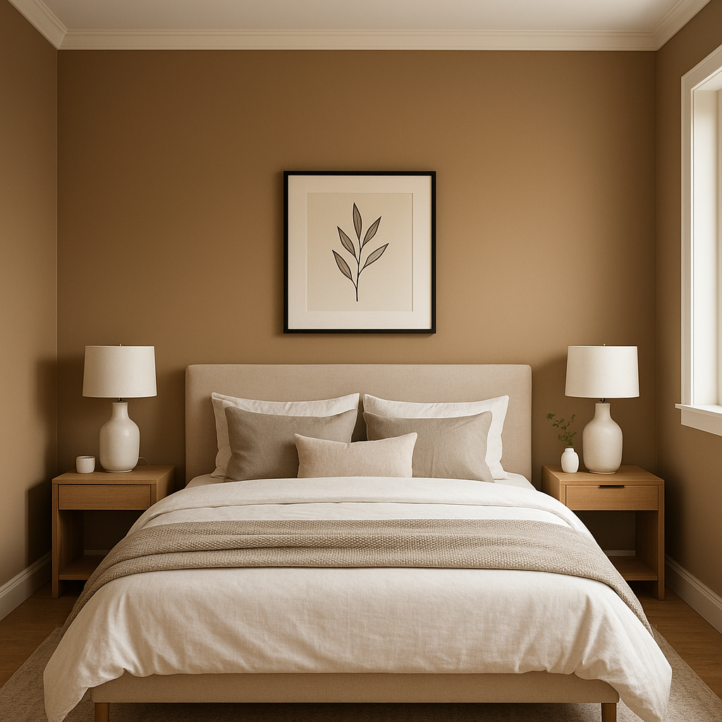
For a calming retreat, Potters is an ideal choice for bedrooms. Its soothing presence pairs beautifully with soft bedding in whites, creams, or muted blues. Layer in textures like chunky knit throws or woven baskets to emphasize its warm undertones.
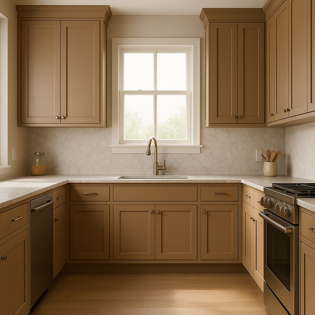
Potters offers a subtle backdrop for kitchens without competing with other design elements. It works beautifully on walls, cabinetry, or even as a base color for a tiled backsplash. Complement it with brushed nickel hardware or natural stone countertops for a cohesive look.
In bathrooms, Potters creates a spa-like ambiance. Pair it with crisp white accents for a clean and classic vibe or introduce soft greens for a nature-inspired palette. Its neutral tone ensures a timeless look that won't go out of style.
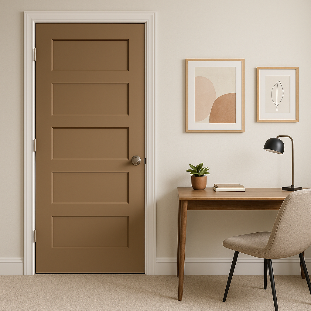
The versatility of Potters makes it an excellent choice for transitional spaces like hallways and entryways. Its warm neutrality can help tie together adjoining rooms with ease, ensuring a seamless flow throughout your home.
Potters (1221) is the epitome of understated elegance, making it a go-to choice for anyone seeking a neutral that feels both timeless and approachable. Its balanced undertones ensure it complements a wide range of design styles, while its ability to adapt to various lighting conditions makes it a reliable choice for any room. Whether you're embarking on a full-scale renovation or looking for a simple refresh, Potters is a versatile hue that effortlessly enhances the beauty of your space.
By choosing Benjamin Moore Potters (1221), you’re investing in a color that brings warmth, sophistication, and a sense of calm to your home.
View Colors Only by Brand (No Imagery):
Sherwin-Williams
|
Benjamin-Moore
|
Behr
|
Valspar
Live on the Eastern Slope of Colorado and looking for a local painting professional, check out all our painting services and reach out for a free estimate.
Copyright © 2026 : Wild Fox Painting Inc. : 12435 Mead Way, Littleton, CO 80125


