Benjamin Moore Crossroads (1226) is a versatile and inviting paint color that exudes warmth and understated sophistication. This creamy beige hue strikes the perfect balance between soft elegance and grounded neutrality, making it a go-to choice for creating welcoming spaces that feel cozy yet refined. Whether you're revamping a living room, refreshing a bedroom, or designing a tranquil office, Crossroads delivers an effortless charm that works well in both modern and traditional interiors.
Crossroads is a warm neutral with subtle yellow and golden undertones. These undertones infuse the shade with a gentle radiance, providing a sense of natural warmth and brightness without becoming overpowering. The delicate warmth of Crossroads makes it ideal for spaces that need a hint of coziness while avoiding the heaviness of deeper beige tones. Its golden undertones pair beautifully with natural light, creating a soft glow that brings life to your interior throughout the day.
Benjamin Moore Crossroads is incredibly versatile and harmonizes well with a variety of color palettes. Here are some coordinating colors to consider:
Crossroads is a true chameleon when it comes to interior design, offering immense flexibility for various applications:
Create an inviting and cozy space by using Crossroads as the main wall color in your living room. Its warm undertones make it an ideal choice for pairing with wood furniture, plush textiles, and natural elements like greenery. Add coordinating colors like soft whites and muted greens for a balanced look that feels both timeless and comfortable.
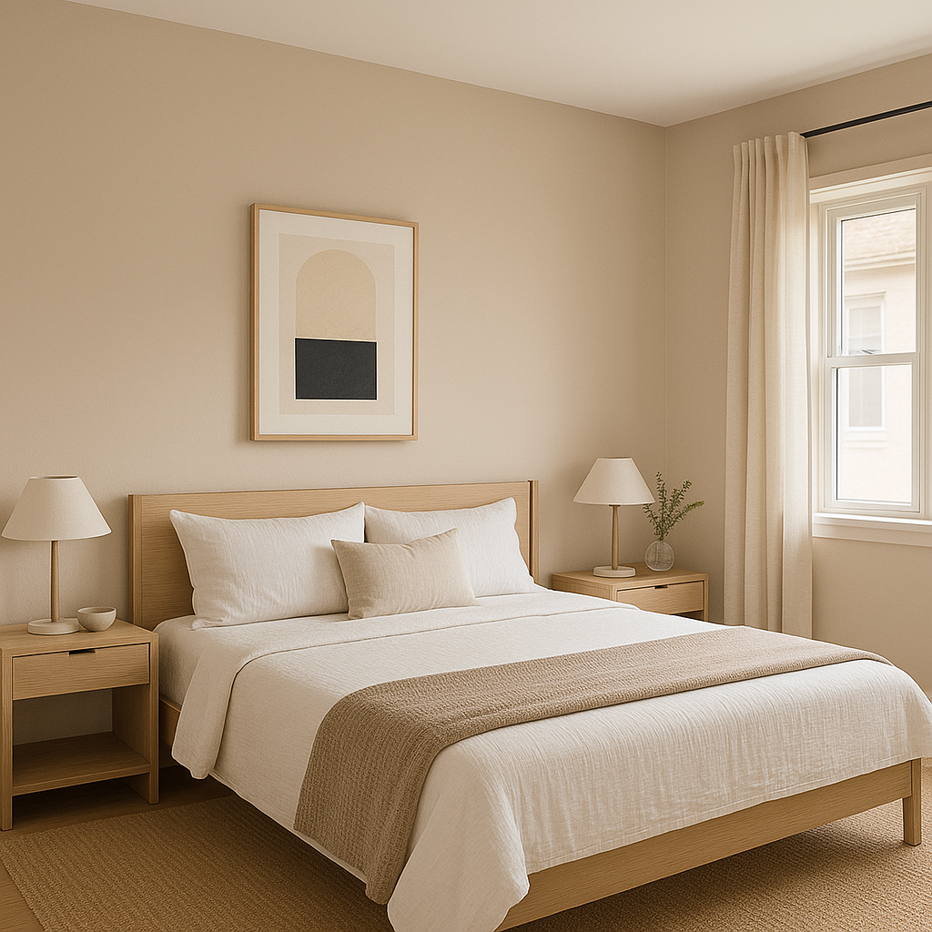
For a restful retreat, Crossroads provides a soothing backdrop that promotes relaxation. Pair it with crisp white bedding and soft accent colors like blush pink or pale gray to achieve a tranquil and elegant atmosphere. Its warmth works beautifully in both small and large bedrooms, ensuring the space feels intimate yet open.
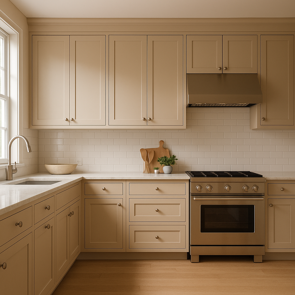
Crossroads shines in kitchens and dining areas, especially when paired with white cabinetry or natural wood finishes. Its creamy tone adds a touch of warmth while maintaining a clean and polished aesthetic. Consider incorporating brass or gold hardware to enhance the golden undertones of the color.
If you're designing a productive home office, Crossroads provides the perfect neutral backdrop for focus and creativity. It pairs well with sleek metallic accents and deep navy tones, creating a sophisticated workspace with a professional edge.
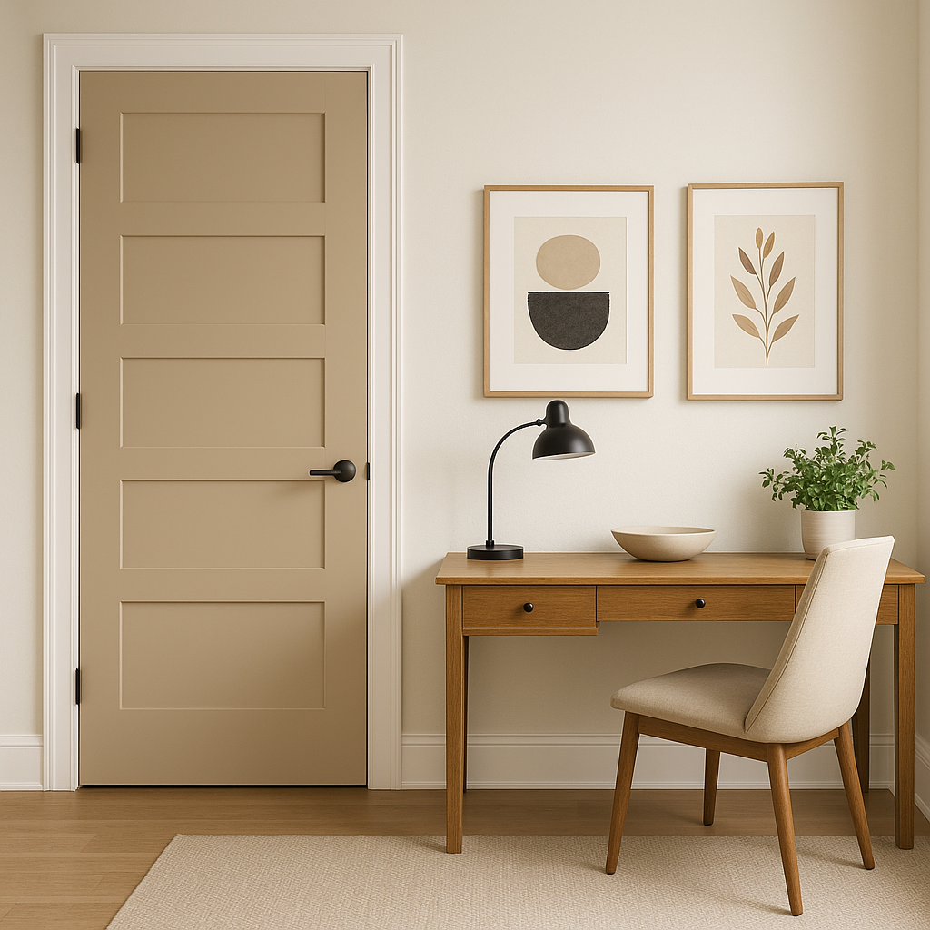
Make a lasting impression in hallways and entryways with Crossroads. Its subtle warmth welcomes guests while seamlessly blending with a variety of decor styles. Pair it with light trim and darker wood flooring for a timeless and polished look.
Benjamin Moore Crossroads (1226) is more than just a neutral; it’s a versatile workhorse that adapts beautifully to different design styles. Its warm undertones ensure a cozy and inviting vibe, while its ability to coordinate with a wide range of colors makes it an indispensable choice for homeowners and designers alike. Whether used as the main wall color or as part of a curated palette, Crossroads has the power to transform spaces into timeless havens of comfort and style.
View Colors Only by Brand (No Imagery):
Sherwin-Williams
|
Benjamin-Moore
|
Behr
|
Valspar
Live on the Eastern Slope of Colorado and looking for a local painting professional, check out all our painting services and reach out for a free estimate.
Copyright © 2026 : Wild Fox Painting Inc. : 12435 Mead Way, Littleton, CO 80125


