Benjamin Moore Cup (1246) is a delightful, soft neutral that exudes warmth and sophistication. This versatile paint color is ideal for creating cozy, welcoming spaces while offering understated elegance. With its subtle cream-beige base and warm undertones, Cup is a perfect choice for those seeking a foundation color that complements various design styles—from traditional and rustic to modern and transitional.
Cup (1246) carries gentle yellow and beige undertones, making it a warm neutral that feels comforting without overpowering the space. These undertones lend the color a quiet richness that works beautifully in areas where you want a soft glow. Its warmth ensures it doesn’t feel flat or stark, making it an excellent choice for rooms with limited natural light or areas that benefit from a cozy ambiance.
Benjamin Moore Cup (1246) harmonizes beautifully with a range of complementary hues, allowing you to craft a cohesive palette. Here are some ideas for coordinating colors:
Benjamin Moore Cup (1246) is a versatile color that can be used throughout the home. Whether you’re designing a serene bedroom, a cozy living room, or a sleek kitchen, Cup provides a warm, neutral canvas. Here are a few ways to incorporate this color into your interiors:
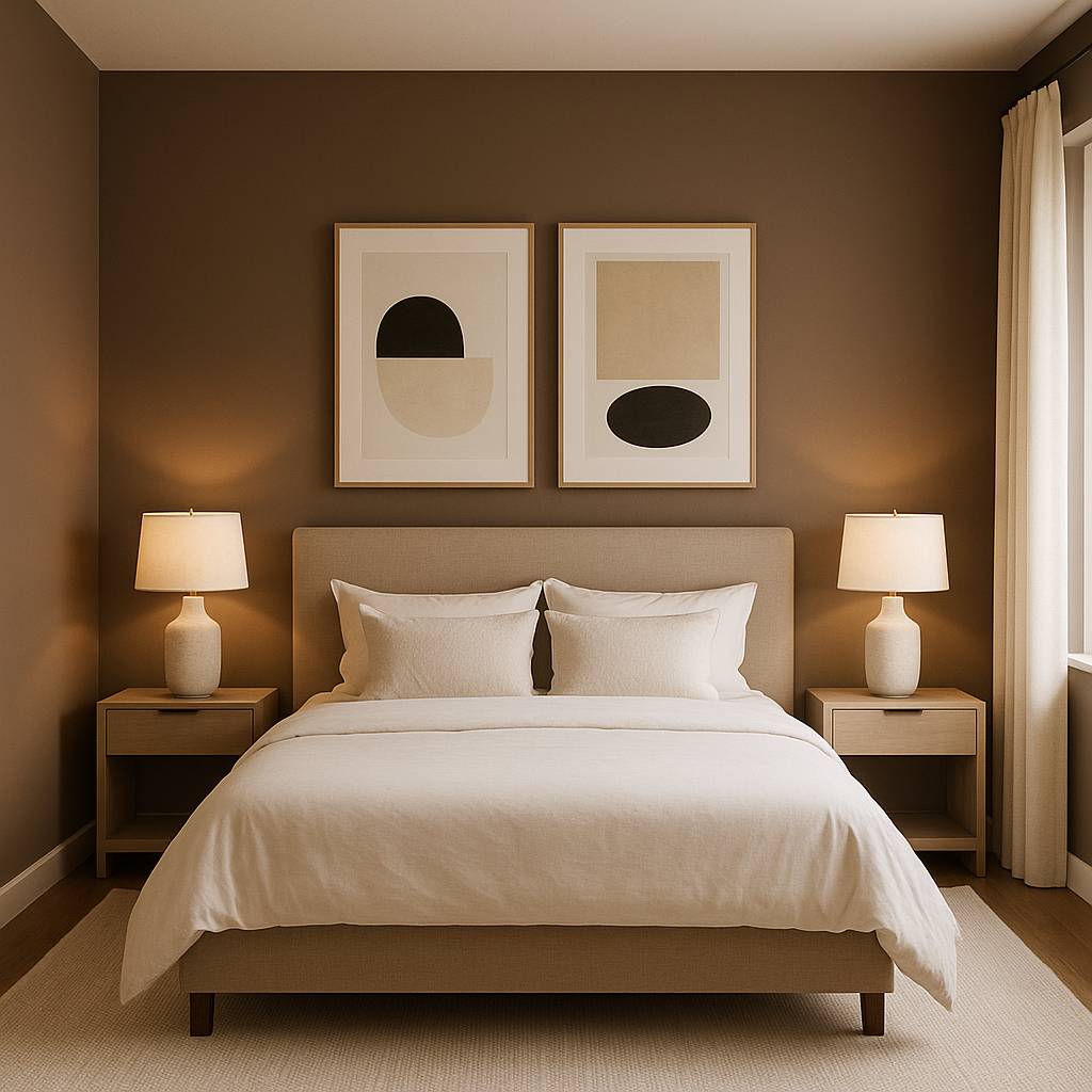
Cup excels as a wall color in larger spaces, such as living rooms or open-concept layouts. Its soft warmth makes it ideal for creating a relaxing environment while providing a neutral backdrop for artwork, furniture, and décor. In smaller spaces, such as bedrooms or bathrooms, Cup evokes a tranquil, spa-like feel, especially when paired with cool-toned accents.
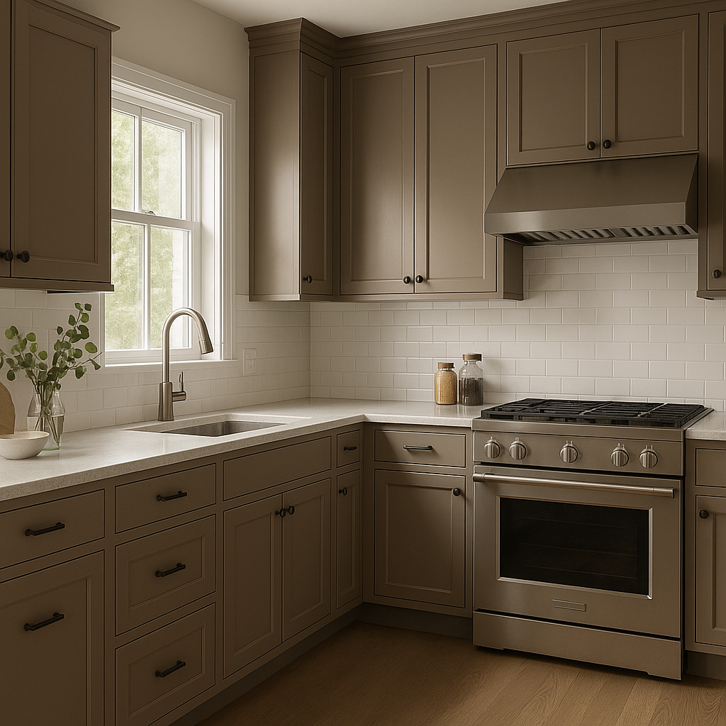
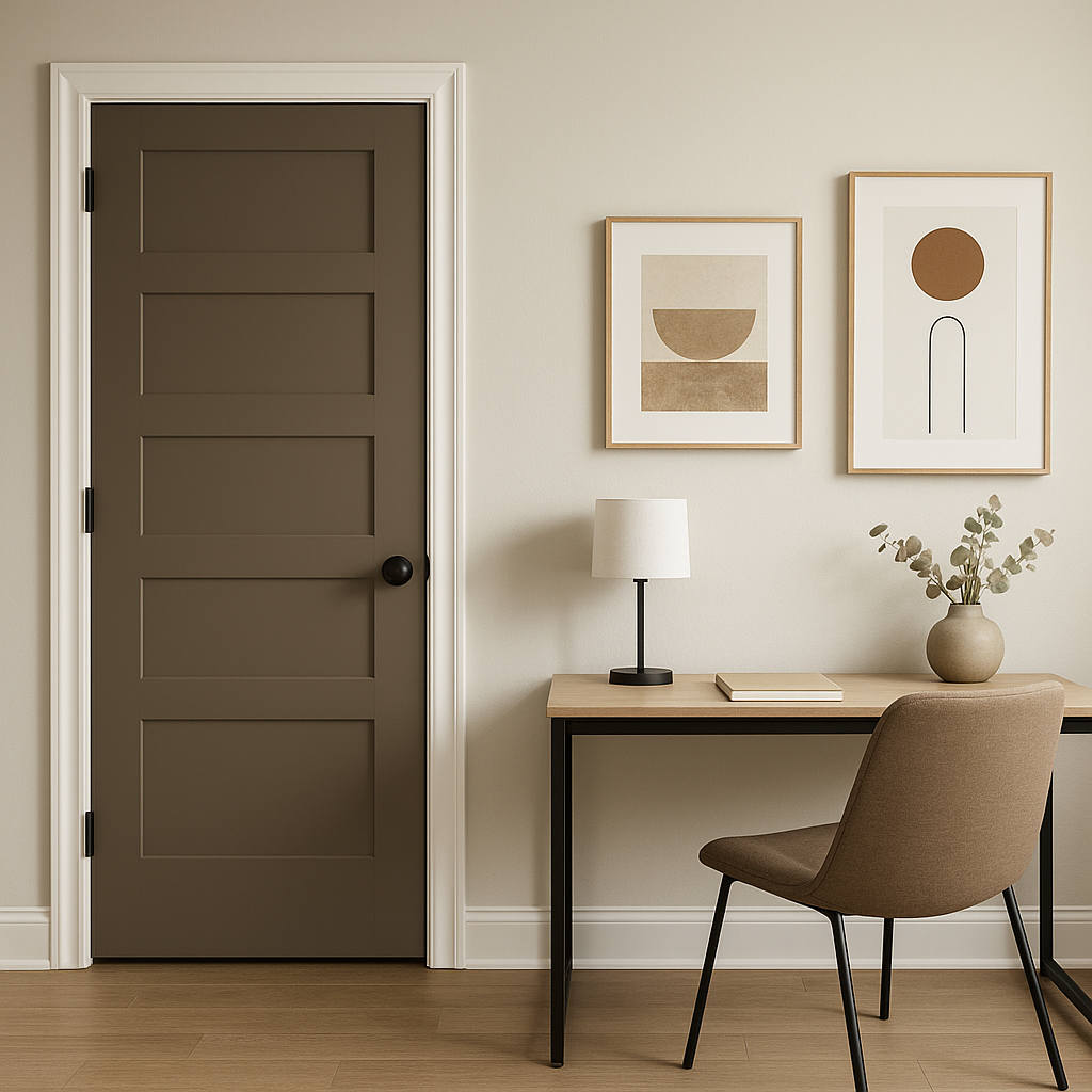
For a seamless monochromatic look, use Cup on cabinetry or trim. It offers a subtle departure from stark white, adding depth and a touch of sophistication. Pair it with brushed gold or matte black hardware to elevate the look further.
In homes with open floor plans, Cup’s versatility allows it to act as a unifying color. It complements wood tones, metal finishes, and upholstered furniture, making it an excellent choice for tying together various elements while maintaining a cohesive feel.
Beyond residential use, Cup is a fantastic option for commercial interiors such as offices, boutiques, or wellness centers. Its approachable warmth creates a welcoming and professional atmosphere that appeals to a wide audience.
The appearance of Benjamin Moore Cup (1246) can shift subtly depending on the lighting in your space. In bright, natural light, its beige undertones become more pronounced, giving off a sunny, inviting vibe. In dim or artificial lighting, its warmer side takes center stage, creating a cozy and intimate feel. To fully appreciate its versatility, test the color in different lighting conditions before committing.
Benjamin Moore Cup (1246) is a masterful neutral that provides a warm, inviting canvas for any interior design project. Its subtle undertones make it adaptable to a variety of palettes, while its timeless appeal ensures it remains stylish for years to come. Whether you’re refreshing a single room or designing an entire home, Cup is a dependable choice that balances warmth, sophistication, and versatility.
View Colors Only by Brand (No Imagery):
Sherwin-Williams
|
Benjamin-Moore
|
Behr
|
Valspar
Live on the Eastern Slope of Colorado and looking for a local painting professional, check out all our painting services and reach out for a free estimate.
Copyright © 2026 : Wild Fox Painting Inc. : 12435 Mead Way, Littleton, CO 80125


