Benjamin Moore Amaryllis (1256) is a striking and energetic shade that brings a sense of vitality and warmth to any interior. This captivating red hue is a perfect choice for those looking to make a bold statement in their home or workspace. Whether used as an accent or as the main color in a room, Amaryllis is guaranteed to add personality and depth to your design.
Amaryllis is a richly saturated red with subtle orange undertones. These warm undertones infuse the color with a lively and inviting quality, making it a versatile choice for various styles and moods. The orange undertones soften the intensity of the red, creating a balanced hue that is vibrant yet approachable. This dynamic blend of red and orange makes Amaryllis an excellent option for spaces where energy and warmth are desired.
Pairing Benjamin Moore Amaryllis with complementary or contrasting shades can enhance its beauty and create a well-designed space. Here are some coordinating color ideas:
Neutrals:
Warm Complements:
Cool Contrasts:
Earth Tones:
Amaryllis is a versatile color that can be used in a variety of spaces and design styles. Here are some ideas for incorporating this bold hue into your home:
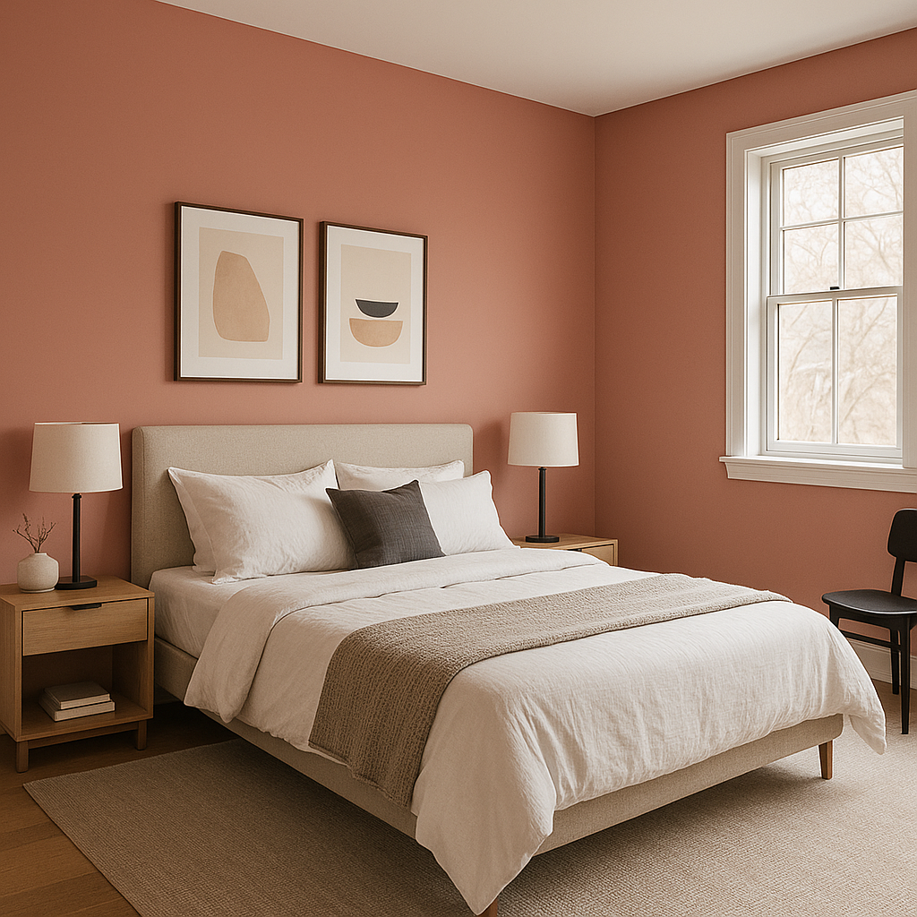
Accent Walls: Create a focal point in living rooms, dining areas, or bedrooms by painting a single wall in Amaryllis. Pair it with neutral walls to let the color stand out without overwhelming the space.
Dining Rooms: Red hues like Amaryllis are known to stimulate appetite and conversation, making them ideal for dining rooms. Combine with warm wood furniture and metallic accents for an inviting and sophisticated dining experience.
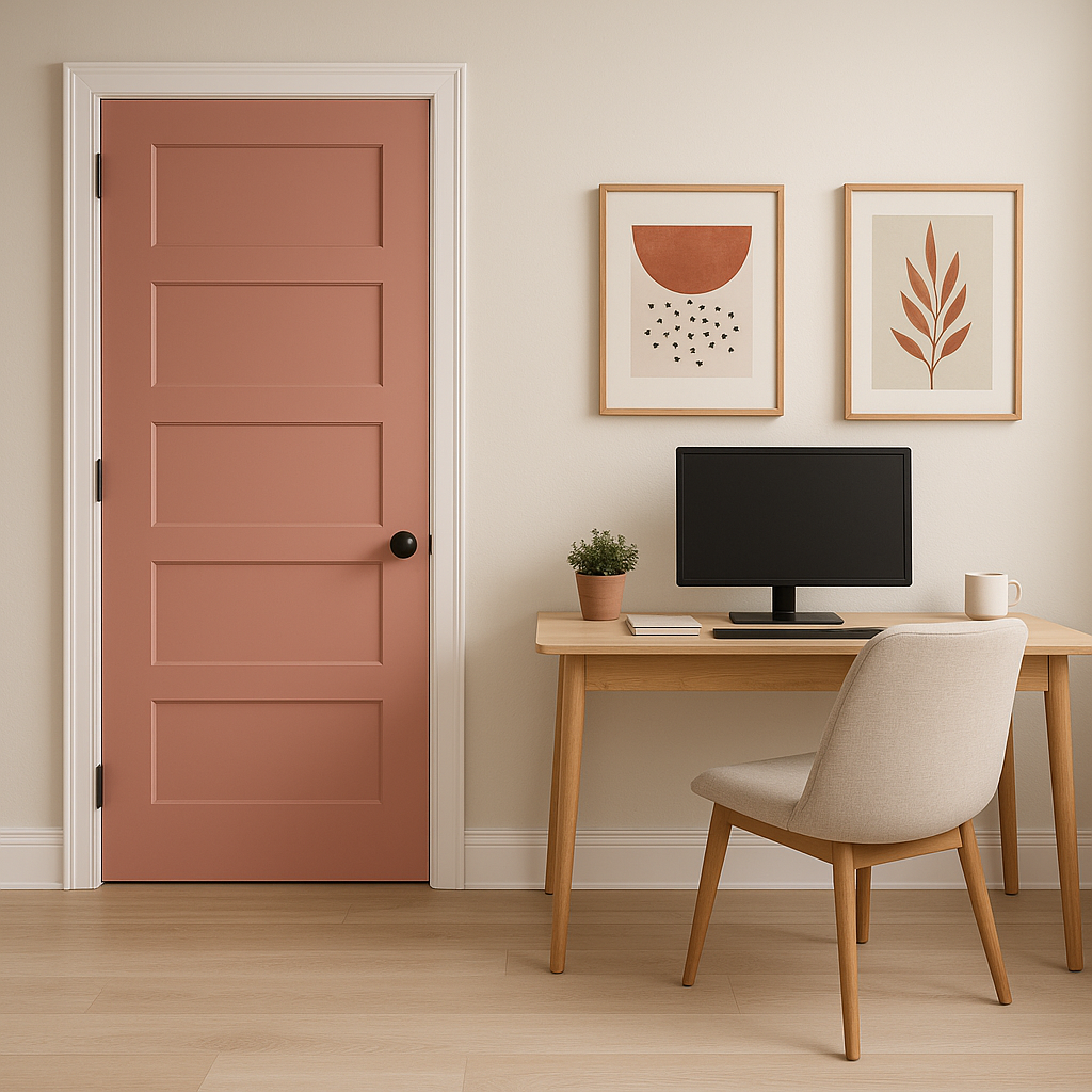
Home Offices: Energize your workspace with Amaryllis to promote creativity and focus. Pair it with sleek black furniture or deep navy accents for a professional yet dynamic feel.
Entryways: Welcome guests with the vibrant warmth of Amaryllis in your entryway or foyer. Pair it with natural textures like wood or rattan for a rustic yet modern look.
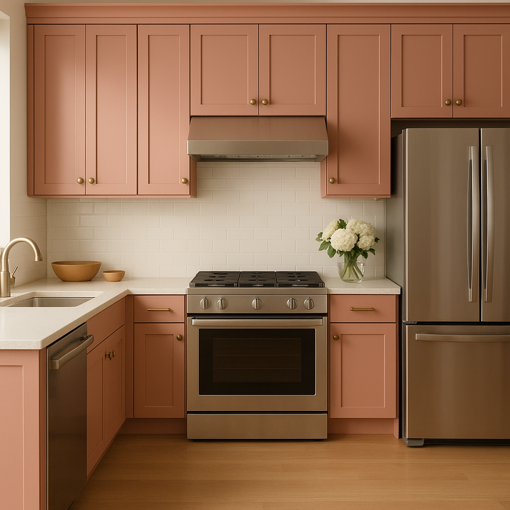
Furniture and Decor: For smaller touches, use Amaryllis on painted furniture pieces, cabinets, or even decor items like picture frames and vases. This way, you can enjoy the boldness of the color without committing to painting entire walls.
Benjamin Moore Amaryllis (1256) is a color for those who embrace bold design and dynamic spaces. Its warm undertones and versatility make it suitable for both modern and traditional interiors. Whether you're looking to energize a room or create a cozy, inviting atmosphere, this vibrant red hue offers endless possibilities.
Experiment with coordinating colors to tailor the mood of your space, and enjoy the transformative power of Benjamin Moore Amaryllis in your home.
View Colors Only by Brand (No Imagery):
Sherwin-Williams
|
Benjamin-Moore
|
Behr
|
Valspar
Live on the Eastern Slope of Colorado and looking for a local painting professional, check out all our painting services and reach out for a free estimate.
Copyright © 2026 : Wild Fox Painting Inc. : 12435 Mead Way, Littleton, CO 80125


