Benjamin Moore Fading (1258) is a sophisticated and understated neutral that effortlessly bridges the gap between warm and cool tones. Perfect for homeowners seeking a versatile backdrop, this shade exudes tranquility and elegance, making it an ideal choice for spaces that call for a calming ambiance. Its balanced composition makes Fading a favorite for both modern and traditional interiors, offering an adaptable foundation for a wide range of design styles.
Benjamin Moore Fading carries delicate undertones that shift between soft beige and muted gray. This gentle warmth ensures the color remains inviting and approachable, while the gray undertones add a refined and contemporary edge. Its versatility allows it to interact beautifully with natural light, slightly warming up in sunlit areas while maintaining a cooler tone in shadowed spaces. This dynamic quality makes Fading a chameleon-like hue that can adapt to varying lighting conditions and design elements.
Fading (1258) serves as a harmonious base for curating complementary color schemes. Pair it with the following shades to create a cohesive and balanced design:
For pops of color, consider pairing Fading with muted earth tones like terracotta or sage green, or even jewel tones like emerald or garnet for a luxurious touch.
Fading (1258) is an incredibly versatile paint color that works well in various spaces throughout your home. Here are a few ideas for incorporating this timeless hue:
Create a serene and inviting living room by using Fading as your wall color. Its neutral warmth allows you to layer textures and patterns effortlessly, from cozy throws to bold area rugs. Pair it with light wood furniture for a Scandinavian-inspired look or incorporate metallic accents like brushed brass for an elegant finish.
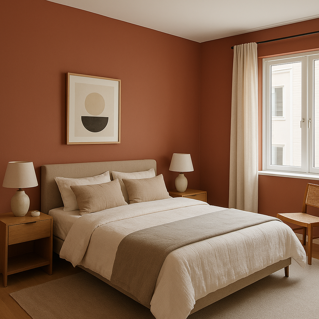
If you're looking to design a restful retreat, Fading is an excellent choice for bedroom walls. Its calming undertones promote relaxation, making it ideal for winding down at the end of the day. Add soft white bedding and natural textiles for a tranquil, spa-like vibe.
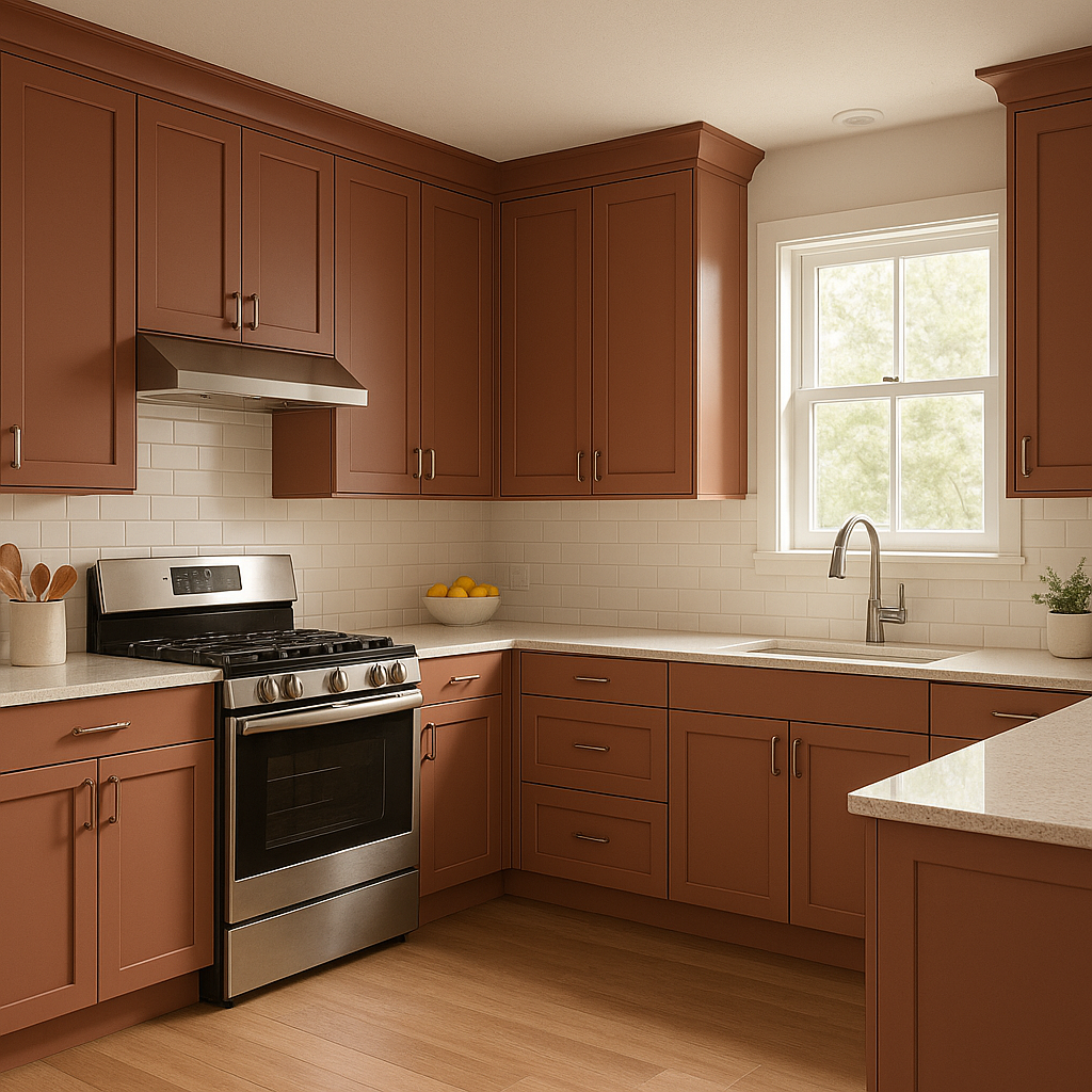
Fading brings understated sophistication to kitchens, whether used on walls, cabinetry, or even kitchen islands. Pair it with marble countertops, subway tile backsplashes, and polished nickel hardware for a classic and timeless design.
Elevate your bathroom with the soothing neutrality of Fading. Its soft beige-gray undertones make it perfect for creating a clean and serene atmosphere. Add white or light gray tiles, along with matte black fixtures, for a modern yet inviting aesthetic.
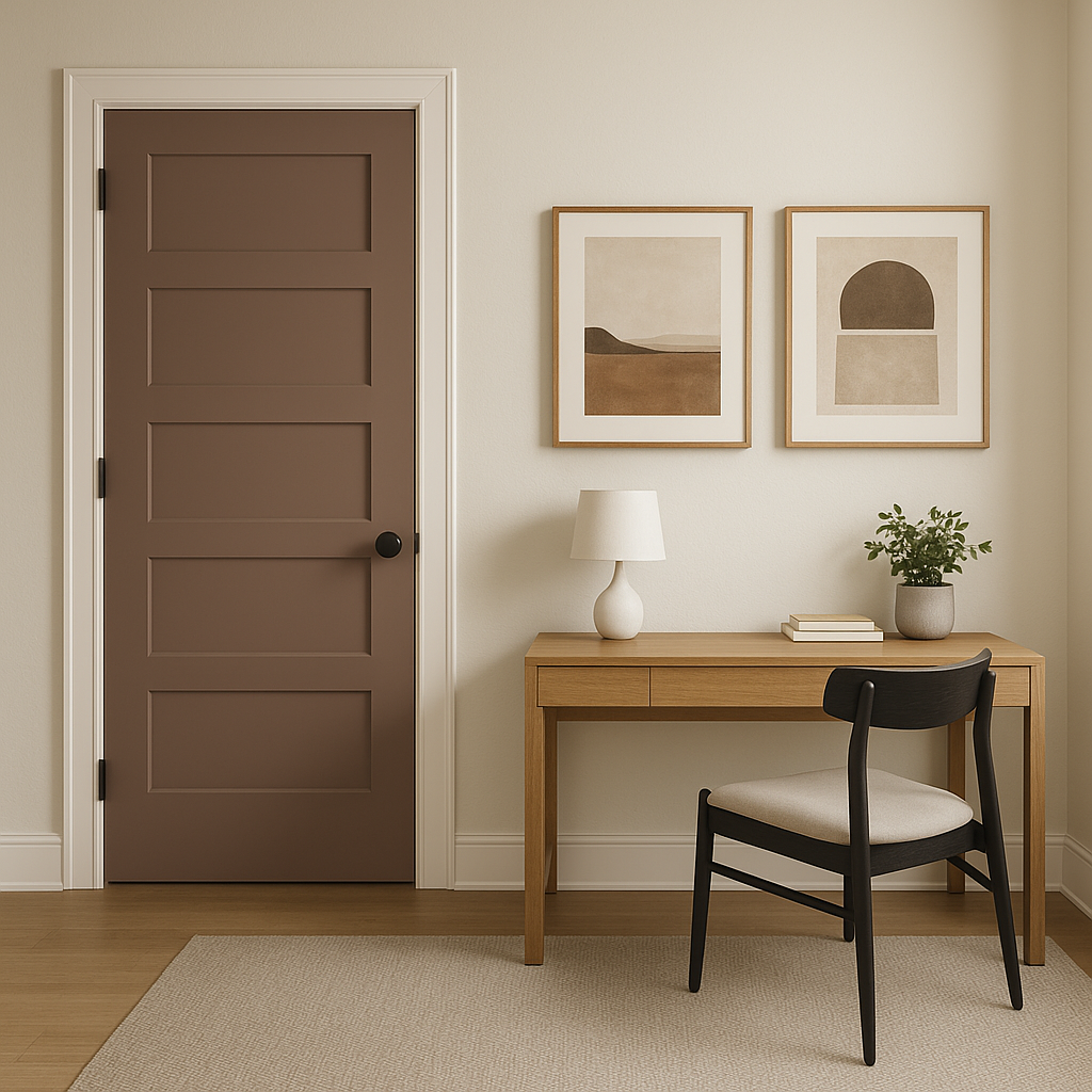
In home offices, Fading fosters focus and calm, serving as a subtle backdrop for productivity. Combine it with natural wood desks and greenery to create a workspace that feels grounded and inspiring.
Benjamin Moore Fading (1258) is more than just a paint color—it's a design tool that enhances and elevates interiors. Whether you're revamping a single room or designing your entire home, its adaptable nature ensures it will blend beautifully with your vision. Use it to create spaces that feel timeless, welcoming, and effortlessly chic.
View Colors Only by Brand (No Imagery):
Sherwin-Williams
|
Benjamin-Moore
|
Behr
|
Valspar
Live on the Eastern Slope of Colorado and looking for a local painting professional, check out all our painting services and reach out for a free estimate.
Copyright © 2026 : Wild Fox Painting Inc. : 12435 Mead Way, Littleton, CO 80125


