Benjamin Moore Pumpkin (126) is a rich, earthy orange that exudes warmth and charm. Its vibrant yet grounded personality makes it a versatile choice for a variety of spaces, bringing a touch of autumnal elegance year-round. Whether you're designing a cozy living room, a welcoming kitchen, or a rustic dining area, Pumpkin (126) can transform your interiors into inviting sanctuaries filled with character.
Pumpkin (126) is more than just a straightforward orange. It carries subtle brown and golden undertones that lend it depth and sophistication. These undertones soften its vibrancy, ensuring that the color feels warm without being overpowering. This balance makes Pumpkin (126) adaptable to both traditional and modern design aesthetics.
The golden undertones add a hint of sunlight, creating a luminous and cheerful effect in spaces with natural light. Meanwhile, the earthy brown undertones provide grounding, making it feel cozy and stable in areas with dimmer lighting.
Pairing colors with Pumpkin (126) can elevate its beauty and create a harmonious color palette. Here are some excellent coordinating options:
Soft Neutrals:
Earthy Accents:
Complementary Colors:
Pumpkin (126) is a versatile hue that can be used in a variety of ways to create different moods and atmospheres:
Pumpkin (126) is perfect for living rooms that aim to feel cozy and welcoming. Use this color on an accent wall to draw attention to a fireplace, bookshelf, or seating area. Pair it with soft beige furniture and warm wood tones to emphasize its autumn-inspired charm.
For dining spaces that encourage conversation and comfort, Pumpkin (126) can be used on all four walls or as a backdrop for rustic wooden furniture. Add coordinating colors like Kendall Charcoal or Tate Olive in the form of table linens or decor to create a layered, textured look.
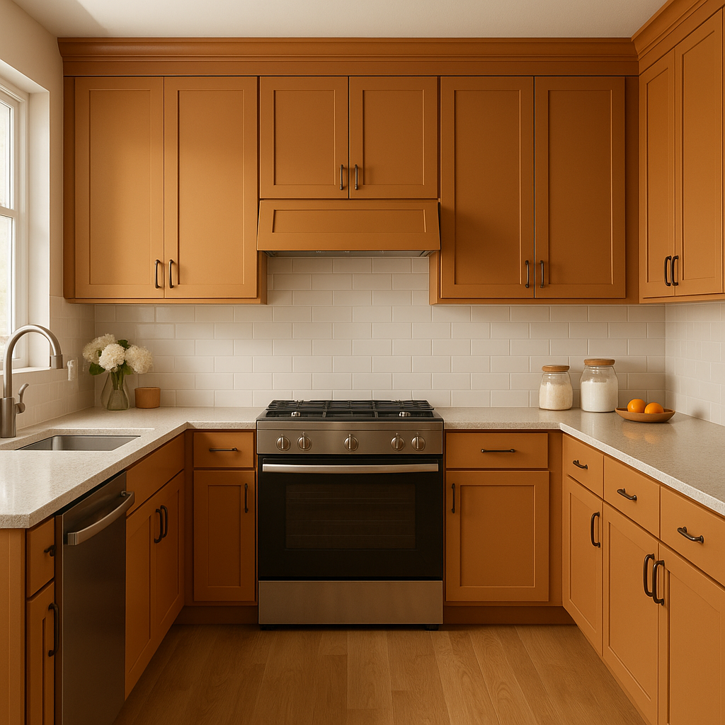
Pumpkin (126) brings a vibrant energy to kitchens, making the space feel lively and dynamic. Consider painting kitchen cabinets or a pantry door in Pumpkin for a bold statement. Pair it with clean white subway tiles and stainless steel fixtures to balance the warmth with modernity.
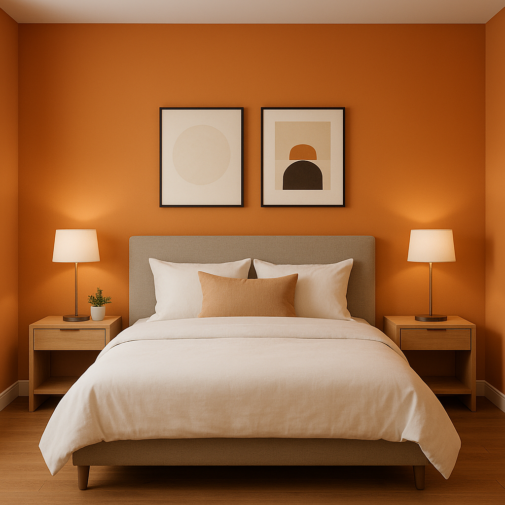
While Pumpkin might not be the first choice for bedrooms, its earthy undertones can create a serene, grounded space when paired with soft neutrals like White Dove. Use it sparingly as an accent color on a headboard, nightstand, or decorative pillows.
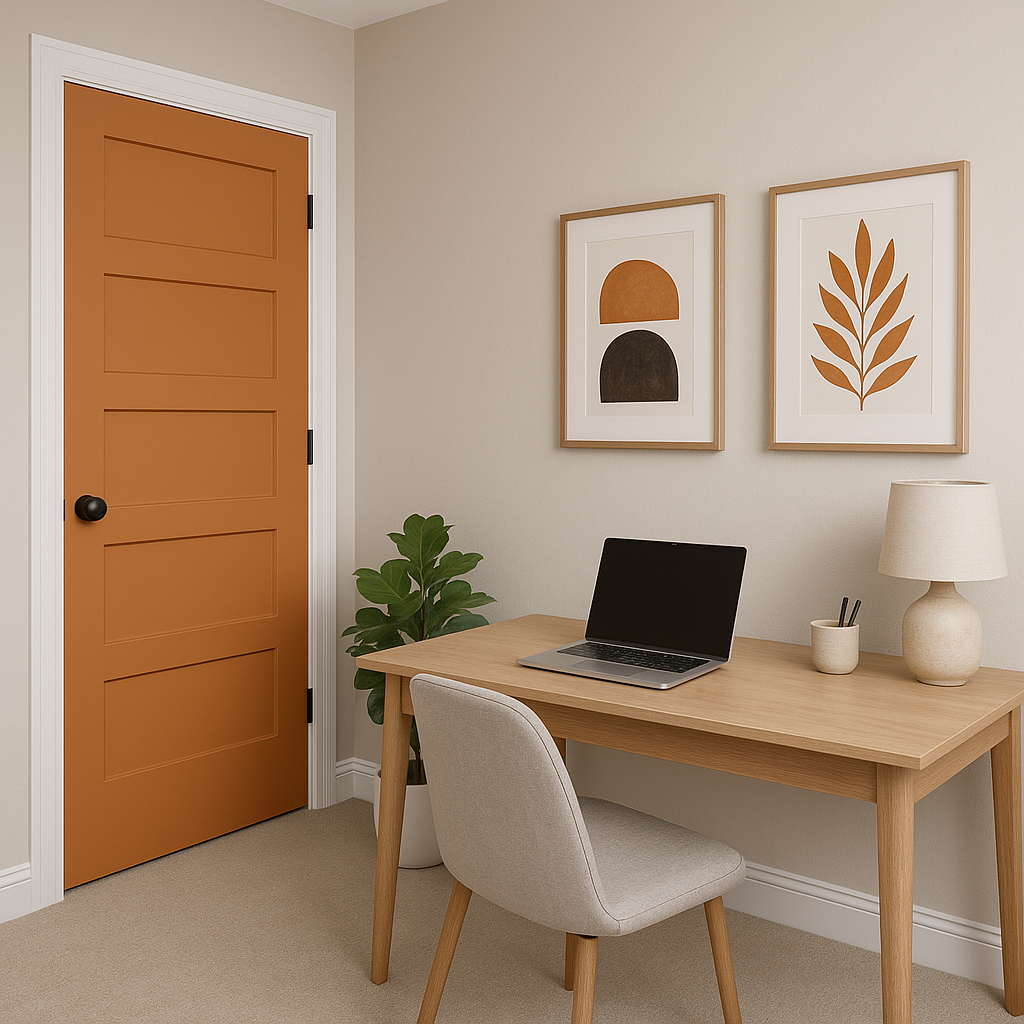
Make a bold first impression with Pumpkin (126) in your entryway. This color works beautifully on a front door or in a foyer, creating an inviting atmosphere for guests. Combine it with Hawthorne Yellow or Deep Ocean for a playful yet sophisticated look.
Benjamin Moore Pumpkin (126) is a color that celebrates warmth, comfort, and versatility. Whether used as a bold accent or a primary color in your palette, it’s a hue that can transform any space into a welcoming retreat filled with character and charm.
View Colors Only by Brand (No Imagery):
Sherwin-Williams
|
Benjamin-Moore
|
Behr
|
Valspar
Live on the Eastern Slope of Colorado and looking for a local painting professional, check out all our painting services and reach out for a free estimate.
Copyright © 2026 : Wild Fox Painting Inc. : 12435 Mead Way, Littleton, CO 80125


