Benjamin Moore Palermo (1278) is a versatile paint color that effortlessly bridges the gap between warm and cool tones, offering a sophisticated and subtle neutral that works in a variety of interiors. This shade is a soft, muted taupe with an understated elegance, making it a choice that feels both timeless and modern. Whether you’re designing a cozy living space, a serene bedroom, or a polished office, Palermo’s adaptability ensures it enhances your design vision.
Palermo carries a harmonious balance of warm gray and beige undertones, giving it a "greige" quality. These undertones allow it to shift beautifully depending on the lighting and surrounding finishes. In natural daylight, Palermo leans slightly warmer, revealing its gentle taupe hues. Under artificial light, it takes on a cooler, more neutral character, making it a chameleon-like shade suitable for both traditional and contemporary designs.
Its undertones make Palermo an excellent choice for those seeking a neutral that doesn’t feel cold or stark but also avoids overly warm or yellowish hues. This balance makes it a versatile backdrop for a wide range of color schemes and design aesthetics.
Benjamin Moore Palermo (1278) pairs seamlessly with a curated palette of complementary colors, allowing for effortless coordination in any space. Here are some suggestions for coordinating shades:
Trim & Ceiling: For crisp contrast, pair Palermo with Benjamin Moore White Dove (OC-17) or Chantilly Lace (OC-65), two clean, soft whites that highlight Palermo’s warm, neutral character.
Accent Colors: Bring depth with darker, moodier shades such as Benjamin Moore Kendall Charcoal (HC-166) or Chelsea Gray (HC-168). These rich grays provide a dramatic contrast while maintaining a cohesive, sophisticated palette.
Soft Complements: Layer subtle, calming hues like Benjamin Moore Revere Pewter (HC-172) or Pale Oak (OC-20) for a serene, tone-on-tone effect.
Pops of Color: For a vibrant twist, introduce accents in muted blues or greens, such as Benjamin Moore Wythe Blue (HC-143) or Saybrook Sage (HC-114). These colors play beautifully with Palermo’s neutral undertones, adding personality and charm.
Palermo’s adaptability makes it suitable for nearly any room in your home or office. Its timeless, understated elegance can create a cohesive flow when used throughout your space, while its neutral undertones provide a soothing backdrop for bold or subtle design elements.
Living Rooms & Open Spaces: Palermo’s warm gray-beige undertones make it an inviting choice for communal areas like living rooms and open-concept layouts. It adds depth and warmth to the space while allowing furniture, artwork, and décor to shine.
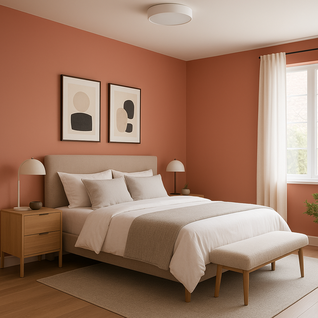
Bedrooms: For bedrooms, Palermo creates a tranquil, cocoon-like atmosphere that promotes relaxation. Pair it with soft textiles and layered lighting for a dreamy retreat.
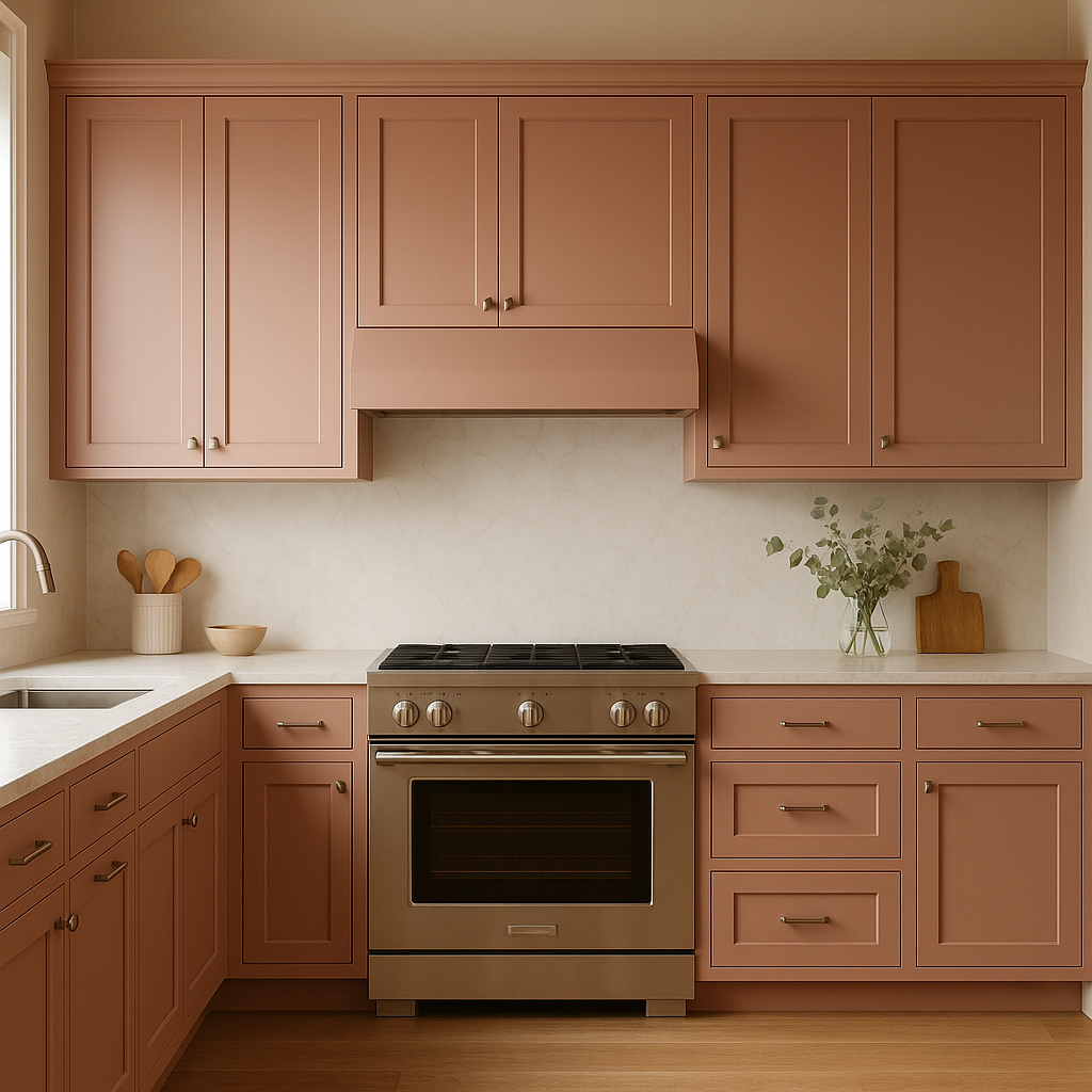
Kitchens & Dining Areas: Palermo works beautifully in kitchens and dining spaces, especially when paired with crisp white cabinetry and natural wood finishes. It provides a neutral canvas for colorful dishware, fabrics, or tile accents.
Bathrooms: Its calming, spa-like quality makes Palermo an excellent choice for bathrooms. Pair it with white or marble finishes for a clean, sophisticated aesthetic.
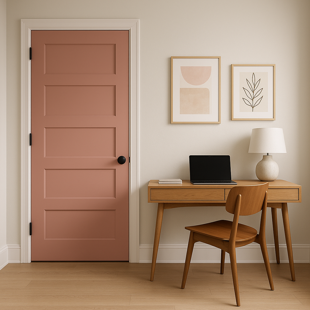
Home Offices: In a home office, Palermo fosters focus and productivity without feeling sterile. Its understated warmth keeps the space comfortable and inviting.
As with any neutral, lighting plays a significant role in how Benjamin Moore Palermo (1278) will appear in your space. In rooms with ample natural light, it leans warmer and more taupe, adding a cozy glow. In spaces with cooler artificial lighting, Palermo takes on a more neutral tone, offering a sophisticated grayish-beige that adapts beautifully to its surroundings. Always test a sample in your space to observe how the light affects this dynamic shade throughout the day.
Benjamin Moore Palermo (1278) is a paint color that transcends trends, offering a soft, neutral foundation for your home. Its balanced undertones, versatility, and ability to coordinate with a wide range of colors make it a designer favorite. Whether you’re creating a minimalist retreat, a polished traditional space, or a contemporary haven, Palermo’s timeless appeal ensures it will remain stylish for years to come.
View Colors Only by Brand (No Imagery):
Sherwin-Williams
|
Benjamin-Moore
|
Behr
|
Valspar
Live on the Eastern Slope of Colorado and looking for a local painting professional, check out all our painting services and reach out for a free estimate.
Copyright © 2026 : Wild Fox Painting Inc. : 12435 Mead Way, Littleton, CO 80125


