Benjamin Moore Burgundy (1280) is a stunning deep red hue that exudes elegance, warmth, and sophistication. Perfect for creating a bold statement or adding a touch of drama to any space, this color is a versatile choice that works beautifully in both classic and modern interiors. With its rich pigmentation and luxurious depth, Burgundy (1280) lends itself to a variety of design styles, making it an enduring favorite among interior designers.
Burgundy (1280) carries subtle undertones of brown and purple, which give the color its deep, grounded quality. These undertones prevent the red from feeling overly vibrant or brash, instead offering a muted and refined character that’s ideal for creating a cozy yet upscale ambiance. The brown undertones add warmth and earthiness, while the hint of purple introduces a touch of richness and sophistication. These undertones make Burgundy (1280) a balanced and versatile shade that can adapt to different lighting conditions and pair beautifully with a range of complementary colors.
Finding the perfect color combinations is key to maximizing the impact of Burgundy (1280). Thanks to its depth and versatility, it harmonizes well with a variety of hues, whether you’re aiming for contrast or cohesion.
For a timeless and understated look, pair Burgundy (1280) with warm neutrals like Benjamin Moore White Dove (OC-17) or creamy tones like Benjamin Moore Simply White (OC-117). These soft whites lighten the space and allow Burgundy to take center stage without feeling overwhelming. For a slightly moodier pairing, consider taupe shades like Benjamin Moore Revere Pewter (HC-172) or greige tones like Benjamin Moore Edgecomb Gray (HC-173). These neutrals complement Burgundy’s warmth while maintaining a balanced, sophisticated palette.
If you're looking to make a bold statement, Burgundy (1280) pairs beautifully with deep navy blues such as Benjamin Moore Hale Navy (HC-154) or charcoal grays like Benjamin Moore Kendall Charcoal (HC-166). These darker shades create a dramatic contrast that highlights Burgundy's richness and depth. For a vibrant pairing, consider mustard yellows or golden tones like Benjamin Moore Concord Ivory (HC-12) to bring out its warmth and create an inviting yet energetic aesthetic.
For a nature-inspired palette, coordinate Burgundy (1280) with muted greens such as Benjamin Moore Saybrook Sage (HC-114) or warm olive tones like Benjamin Moore Gloucester Sage (HC-100). These earthy greens balance Burgundy’s red tones and evoke a sense of harmony and tranquility. Adding touches of soft browns or terracotta shades can further enhance the grounded, organic feel.
Burgundy (1280) is a versatile shade that can be used in various ways to elevate your interior design:
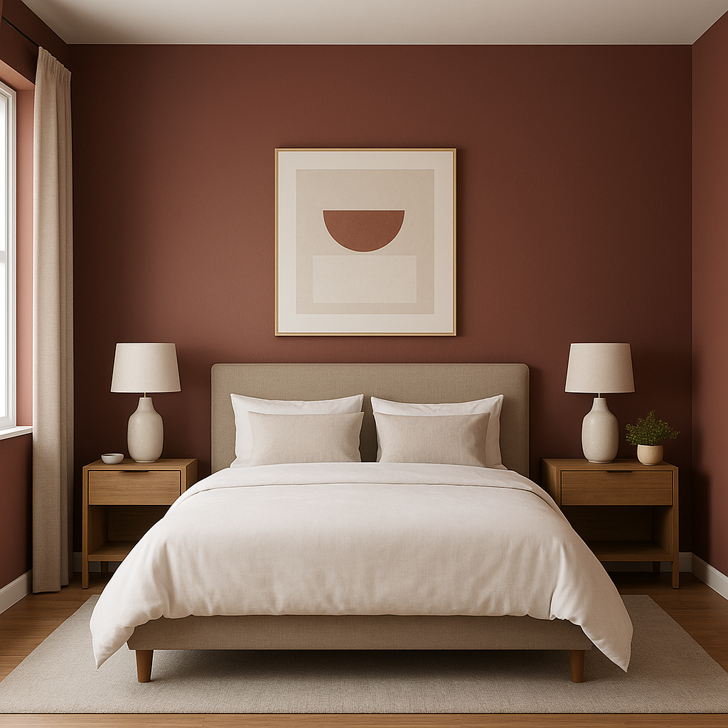
A Burgundy accent wall can transform a room, adding depth and drama while serving as a focal point. This works particularly well in dining rooms, living rooms, or bedrooms where you want to create a cozy, intimate atmosphere.
This rich red is a classic choice for dining spaces, as it stimulates conversation and appetite while creating a warm and inviting environment. Pair it with wooden furniture and metallic accents like brass or gold for a luxe finish.
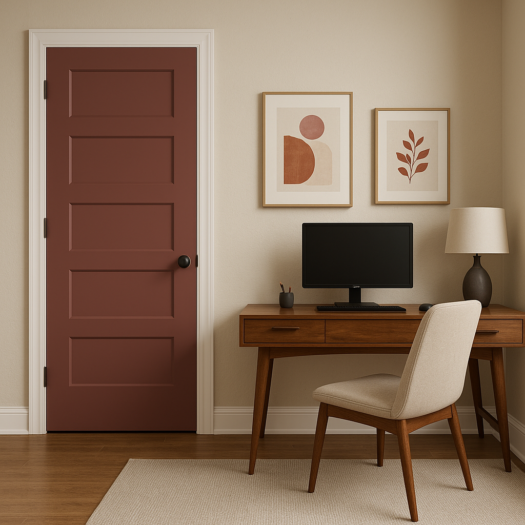
Burgundy (1280) can add a jewel-like richness to small spaces like powder rooms, entryways, or home offices. Its bold nature makes a big impact in these compact areas without overpowering the overall design.
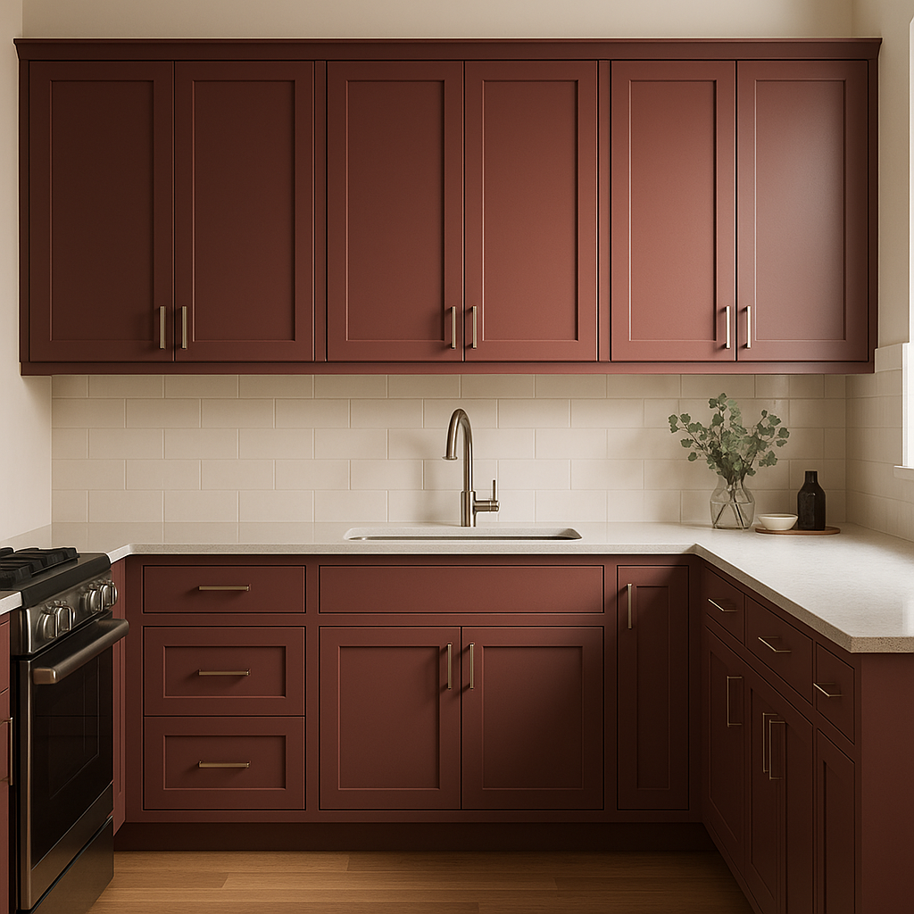
For a unique touch, consider using Burgundy (1280) on cabinetry or furniture. Painted kitchen islands, built-in bookshelves, or statement furniture pieces in this deep red can elevate the space and bring an element of sophistication.
Burgundy (1280) also works beautifully in layered color schemes. Combine it with coordinating colors on textiles, artwork, and accessories to create a cohesive and curated look.
Like all deep, rich shades, Burgundy (1280) will appear differently depending on the lighting in the room. In natural daylight, the brown undertones may be more apparent, offering warmth and earthiness. In dim lighting or artificial light, the purple undertones become more prominent, adding a moody and luxurious depth. Be sure to test the color in your space to see how it interacts with your specific lighting conditions.
Benjamin Moore Burgundy (1280) is more than just a color; it’s a statement. Whether used as an accent, a backdrop, or a main feature, its rich undertones and ability to coordinate with a wide range of hues make it a sophisticated choice for any interior design project. Elevate your home with this timeless shade and enjoy the warmth, elegance, and depth it brings to your space.
View Colors Only by Brand (No Imagery):
Sherwin-Williams
|
Benjamin-Moore
|
Behr
|
Valspar
Live on the Eastern Slope of Colorado and looking for a local painting professional, check out all our painting services and reach out for a free estimate.
Copyright © 2026 : Wild Fox Painting Inc. : 12435 Mead Way, Littleton, CO 80125


