Benjamin Moore Crimson (1299) is a deeply captivating shade of red that exudes warmth, elegance, and sophistication. This dramatic color holds its own in any space, creating a sense of grandeur while maintaining an inviting atmosphere. Perfect for homeowners who want to make a statement, this rich hue is both bold and versatile, lending itself to a variety of interior design styles, from classic to contemporary.
Crimson (1299) is a true red with subtle blue undertones, giving it a cooler edge compared to warmer reds with orange or yellow bases. The blue undertones enhance the depth of the color, making it lush and refined rather than overly vibrant. This balance ensures it works beautifully in spaces where a sophisticated aesthetic is desired. The slightly cool character of Crimson allows it to pair well with neutral tones and cooler shades, while still standing out as a dynamic focal point.
Benjamin Moore Crimson (1299) pairs seamlessly with a wide range of coordinating colors, making it versatile for various palettes:
Warm Neutrals: Pair Crimson with creamy whites like Benjamin Moore White Dove (OC-17) or sandy beiges such as Edgecomb Gray (HC-173) for a classic and harmonious look. These tones balance the boldness of Crimson and create a cozy, welcoming atmosphere.
Cool Grays: For a modern twist, combine Crimson with cool grays like Stonington Gray (HC-170) or Coventry Gray (HC-169). This pairing highlights the blue undertones in Crimson and creates a chic, contemporary vibe.
Deep Blues: Amplify the drama by coordinating Crimson with rich navy blues like Hale Navy (HC-154). This pairing evokes a luxurious and moody aesthetic, perfect for formal dining rooms or libraries.
Golds and Metallics: Crimson shines when paired with metallic accents. Incorporate golds, brass, or bronze finishes to elevate the richness of the color and add a touch of opulence.
Crimson (1299) is ideal for spaces where you want to add drama, energy, and a sense of refinement. Here are some creative ways to use this stunning color:
Crimson makes a bold yet sophisticated choice for an accent wall. Whether in a living room, bedroom, or dining space, it draws the eye and creates a focal point that energizes the room. Pair it with neutral walls to balance its intensity.
Red tones, like Crimson, are known for their ability to stimulate appetite and conversation, making them perfect for dining rooms. Use Crimson to create an intimate and inviting atmosphere that feels both luxurious and welcoming.
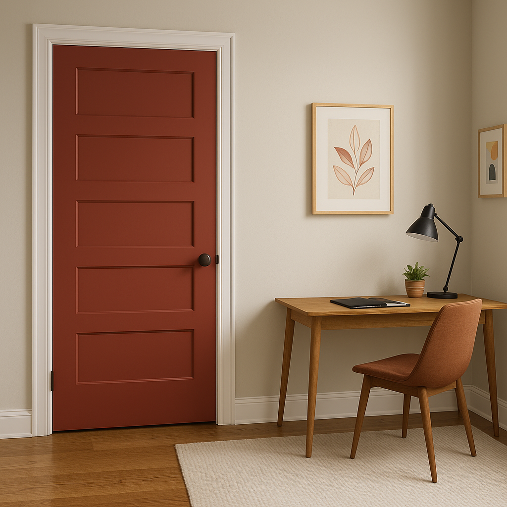
Make a dramatic first impression by using Crimson in your entryway. Its rich hue adds a sense of grandeur that sets the tone for the rest of your home.
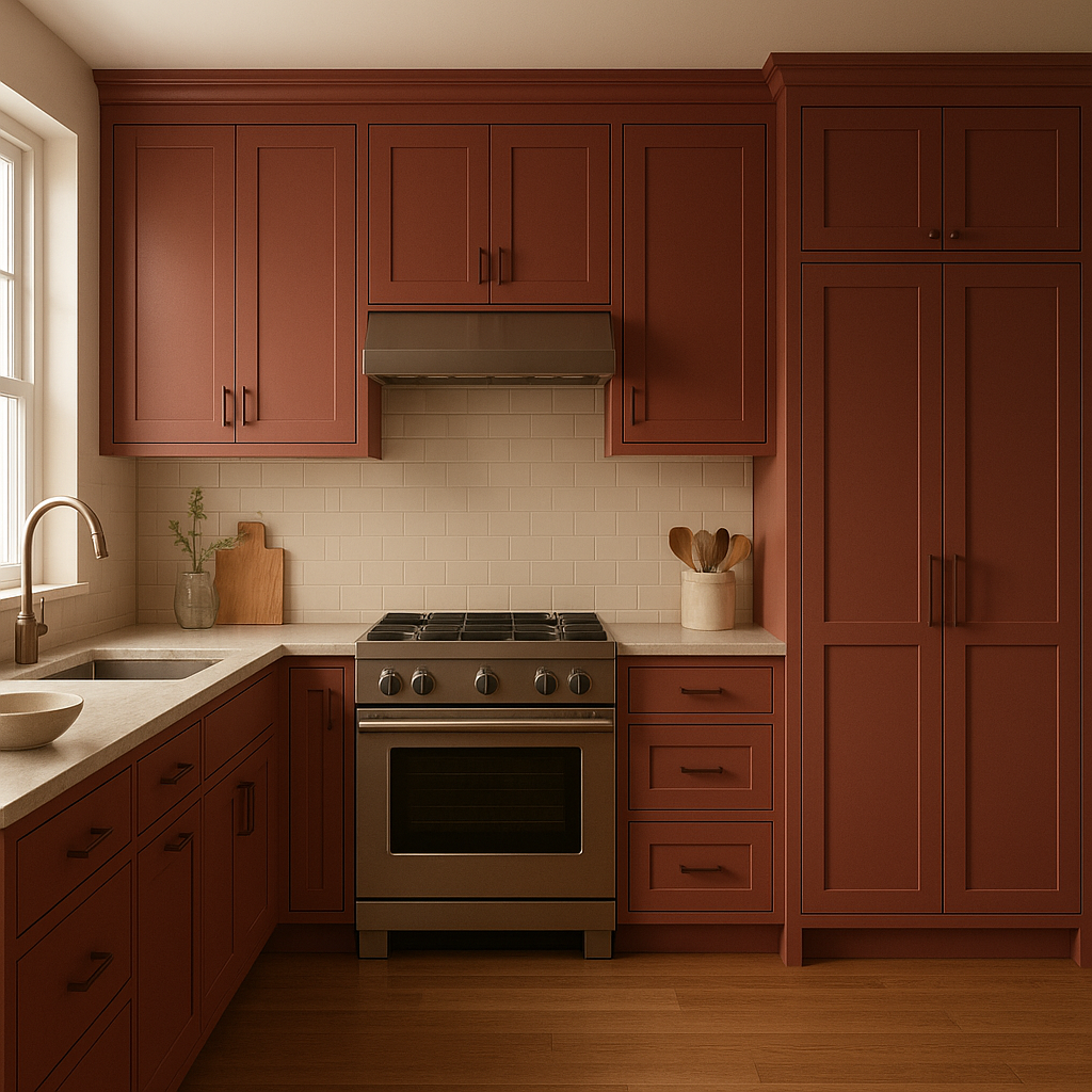
Crimson can be a fabulous choice for painted furniture or cabinetry. A Crimson-painted kitchen island or built-in shelving can add a pop of color while maintaining a sophisticated look.
Creative spaces like studios or home offices benefit from the energy and inspiration that Crimson can evoke. Pair it with neutral furniture and decor to keep the room feeling balanced and productive.
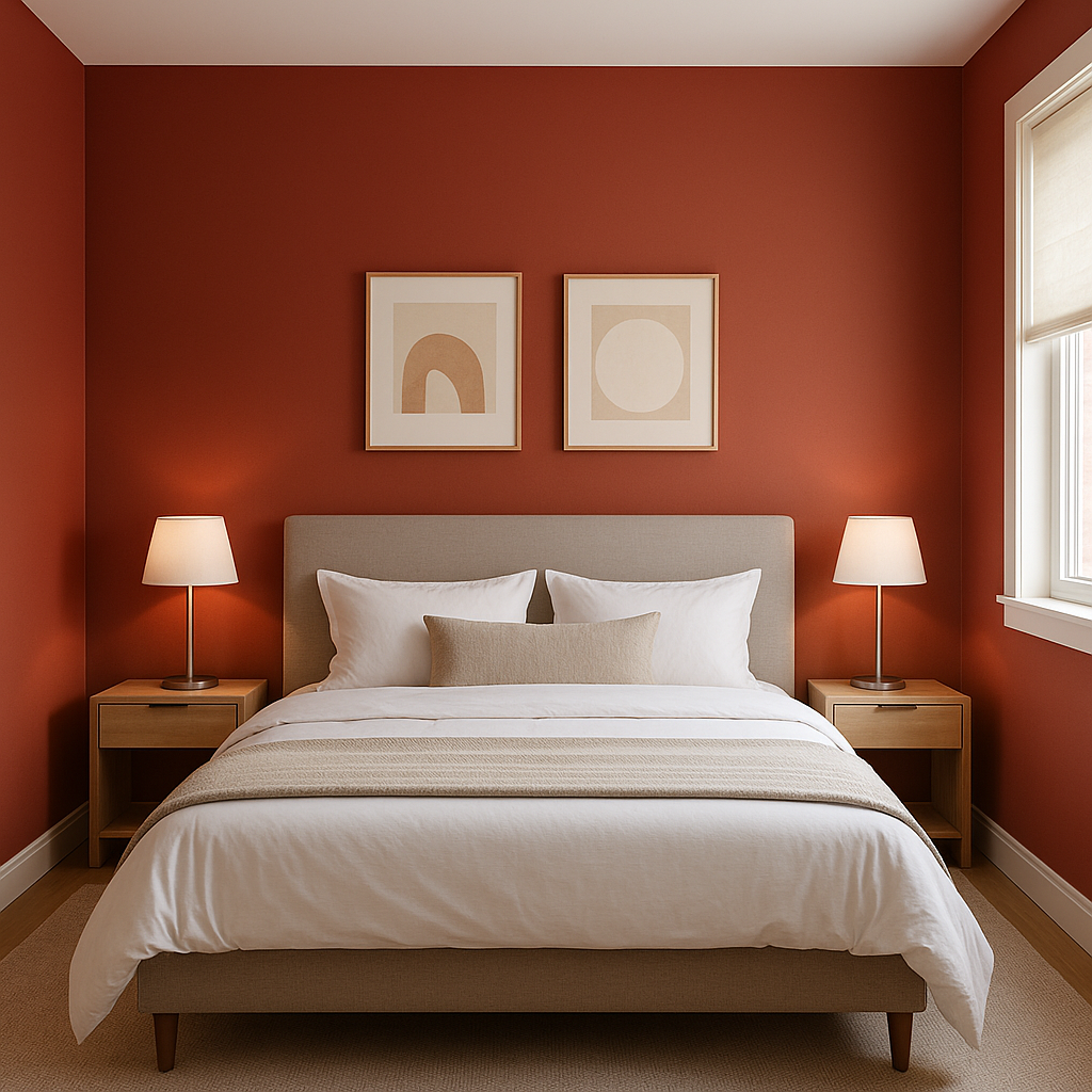
Although bold, Crimson can also work in bedrooms, especially if used sparingly. Consider pairing it with soft linens and muted decor for a dramatic yet serene retreat.
The appearance of Crimson (1299) can vary depending on lighting conditions. In rooms with ample natural light, Crimson will appear vibrant and full-bodied. In spaces with dim or artificial lighting, its blue undertones come forward, adding depth and richness. To ensure the color works well in your space, test it under different lighting conditions before making your final decision.
Benjamin Moore Crimson (1299) is a timeless shade that brings both passion and elegance to any interior. Its versatility, combined with its ability to evoke emotion and style, makes it a go-to choice for designers and homeowners alike. Whether you want to create a bold statement or a subtle accent, this striking color will elevate your space to new levels of beauty and sophistication.
View Colors Only by Brand (No Imagery):
Sherwin-Williams
|
Benjamin-Moore
|
Behr
|
Valspar
Live on the Eastern Slope of Colorado and looking for a local painting professional, check out all our painting services and reach out for a free estimate.
Copyright © 2026 : Wild Fox Painting Inc. : 12435 Mead Way, Littleton, CO 80125


