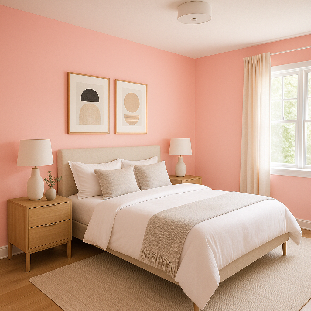
Benjamin Moore Confetti (1311) is an exuberant and lively paint color that instantly infuses any space with energy, cheer, and a sense of whimsy. This dynamic hue is a perfect choice for those looking to make a bold statement without overwhelming the senses. With its unique blend of tones, Confetti offers versatility and charm, making it a standout option for both residential and commercial interiors.
Confetti (1311) is a vibrant coral pink that leans toward a warm spectrum without being overpowering. Its undertones include hints of orange and red, which provide depth and richness to the shade. While undeniably bold, Confetti retains a softness that allows it to work harmoniously in a variety of design settings.
The subtle orange undertones make Confetti feel more grounded and approachable, creating a balance between playful brightness and refined elegance. This duality makes it ideal for spaces that need a pop of color while still maintaining a cohesive and polished look.
Confetti (1311) pairs beautifully with a range of complementary and neutral colors, allowing for creative flexibility when designing your space. Here are some suggested coordinating colors to enhance its impact:
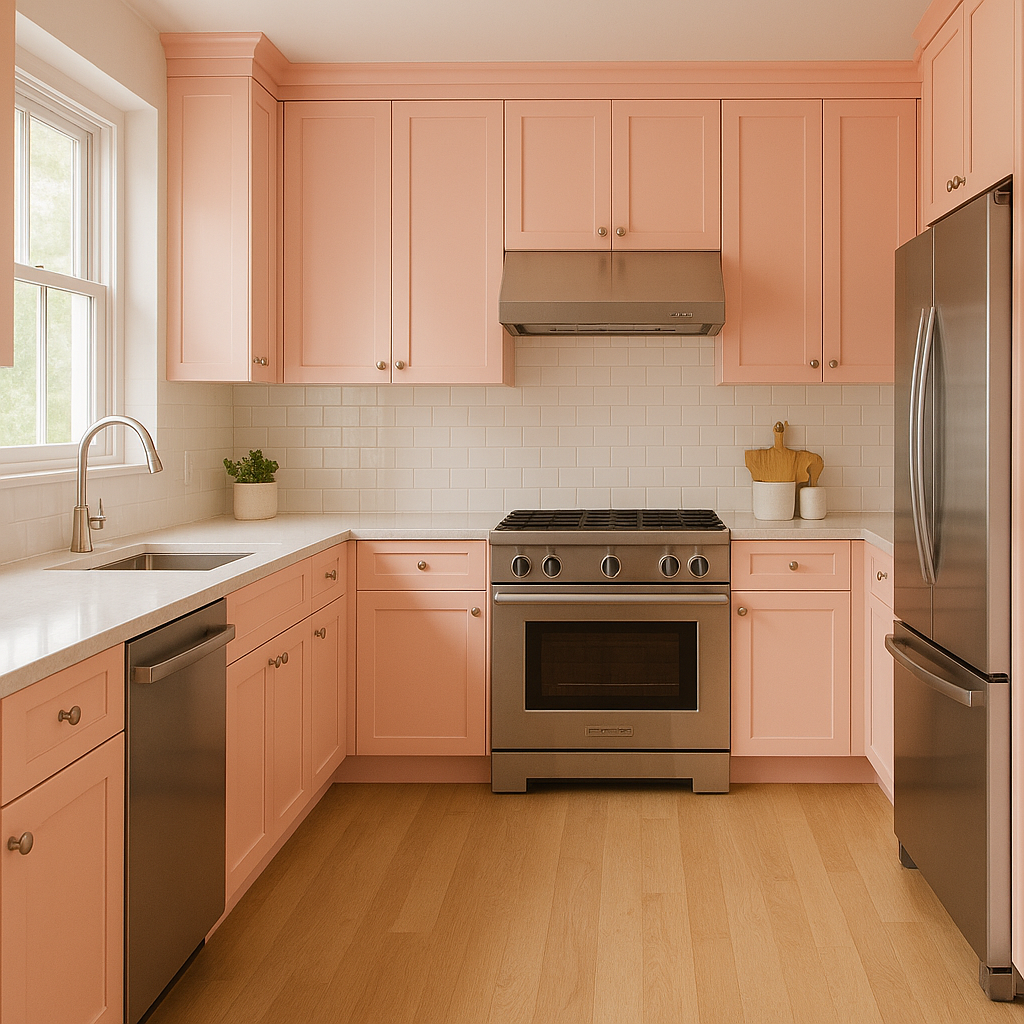
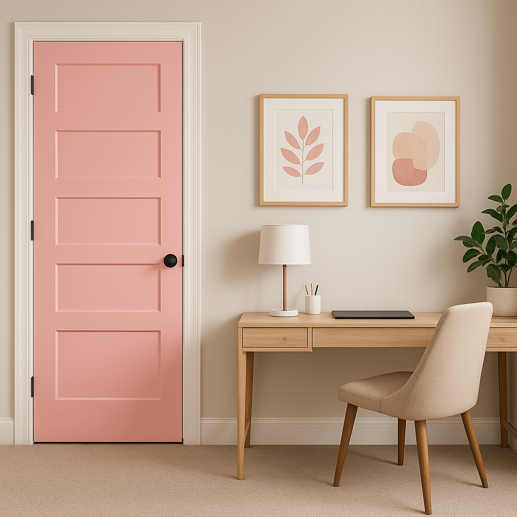
Confetti (1311) is a versatile color that works well in various design contexts, whether you're looking to create a standout accent wall or bring an entire room to life. Here are some spaces and applications where this color truly shines:
Confetti is ideal for creating a focal point in any room. Use it on an accent wall in a living room, bedroom, or dining area to draw attention and energize the space. Pair it with neutral furniture and décor to allow the color to take center stage.
Its playful and lively nature makes Confetti a perfect choice for children’s bedrooms or playrooms. It sparks creativity and joy while remaining sophisticated enough to grow with your child’s tastes.
Infuse your workspace with creativity and energy by incorporating Confetti. Its uplifting tone helps boost mood and productivity, making it a great choice for home offices, studios, or crafting areas.
For smaller spaces like bathrooms or powder rooms, Confetti provides a burst of personality without feeling overwhelming. Pair it with crisp white trim and accessories to create a refreshing and modern look.
Confetti is also a fantastic option for retail stores, cafes, or boutique settings. Its vibrant personality creates a welcoming and memorable atmosphere for customers.
Benjamin Moore Confetti (1311) is more than just a paint color; it’s a mood-lifter, a statement-maker, and a creative spark. Whether used sparingly or boldly, it promises to bring life and personality to any room. Let Confetti inspire your next design project and transform your space into a vibrant masterpiece filled with joy and energy.
View Colors Only by Brand (No Imagery):
Sherwin-Williams
|
Benjamin-Moore
|
Behr
|
Valspar
Live on the Eastern Slope of Colorado and looking for a local painting professional, check out all our painting services and reach out for a free estimate.
Copyright © 2026 : Wild Fox Painting Inc. : 12435 Mead Way, Littleton, CO 80125


