Benjamin Moore Pretty (1334) is a soft, warm pink that embodies timeless sophistication and understated charm. This delicate hue strikes the perfect balance between femininity and modernity, making it an incredibly versatile choice for a variety of design styles, from classic and traditional to contemporary and eclectic. Its subtle nature allows it to enhance spaces without overwhelming them, creating an atmosphere of softness and refinement.
Benjamin Moore Pretty (1334) features gentle peachy undertones that infuse the color with warmth and brightness. These undertones give the shade a welcoming and uplifting quality, making it ideal for spaces where comfort and harmony are paramount. The peachy base ensures this pink doesn’t veer into overly sugary or saccharine territory, keeping it grounded yet luminous.
Pairing Benjamin Moore Pretty with complementary shades can elevate its beauty and create a cohesive design palette. Here are some suggestions for coordinating colors that work beautifully:
Benjamin Moore Pretty (1334) is versatile and can be used in various spaces to evoke different moods:
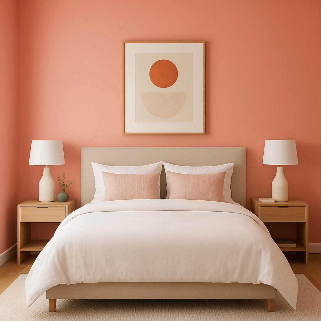
Pretty is an excellent choice for bedrooms because of its calming and soothing qualities. It creates a cocoon-like feel, perfect for relaxing and unwinding. Pair it with soft linens, plush throws, and warm lighting to create a serene sanctuary.
Its delicate pink tone makes it ideal for nurseries or kids’ rooms without feeling too childlike or overly thematic. Add white furniture and whimsical accents for a dreamy, playful space.
For living areas, Pretty can serve as a subtle backdrop that pairs beautifully with upholstered furniture and layered textiles. Use it on walls or even as an accent wall to add an element of warmth and sophistication.
Pretty shines in bathrooms, especially when paired with crisp white tiles and gold fixtures. Its peachy undertones add a touch of elegance, creating a spa-like retreat.
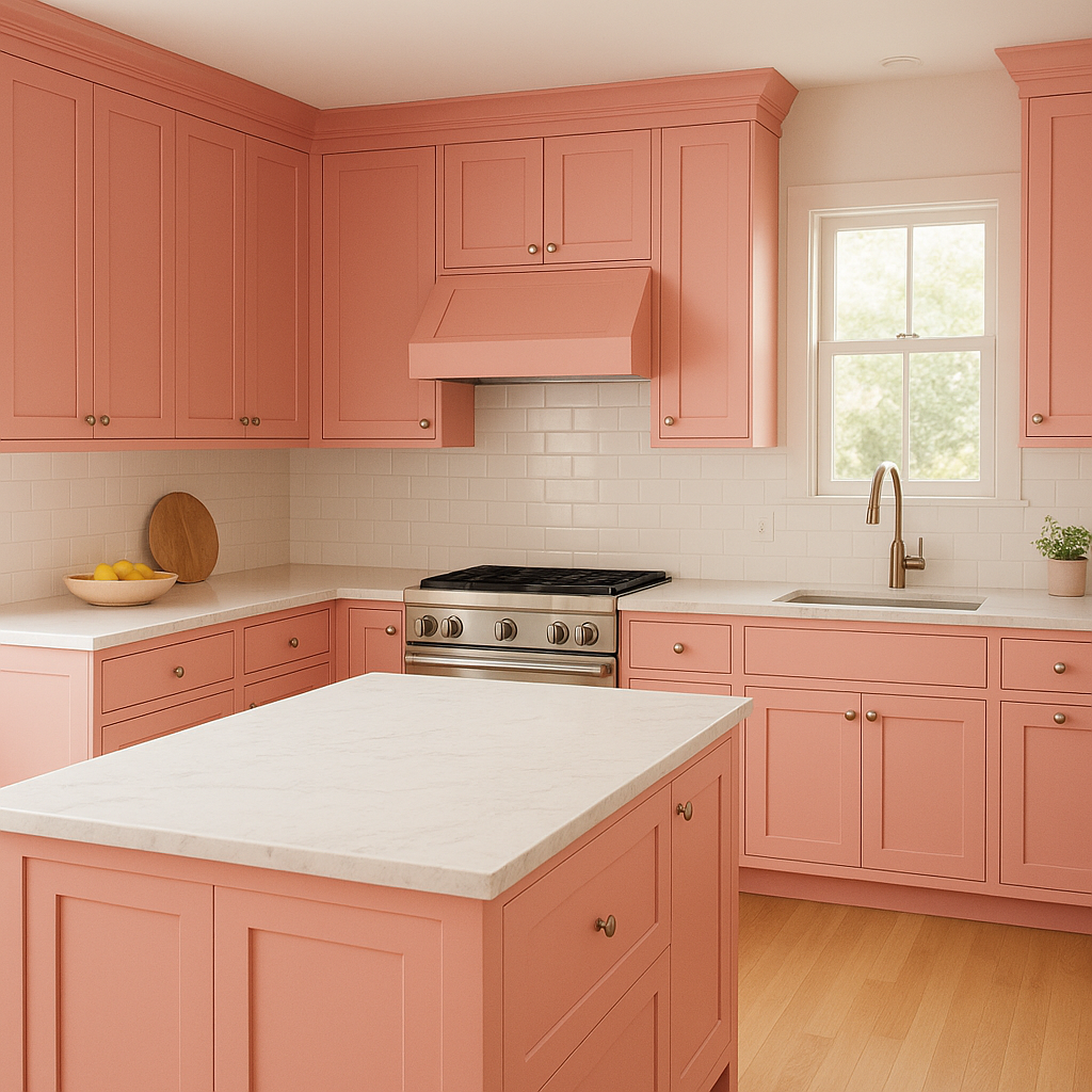
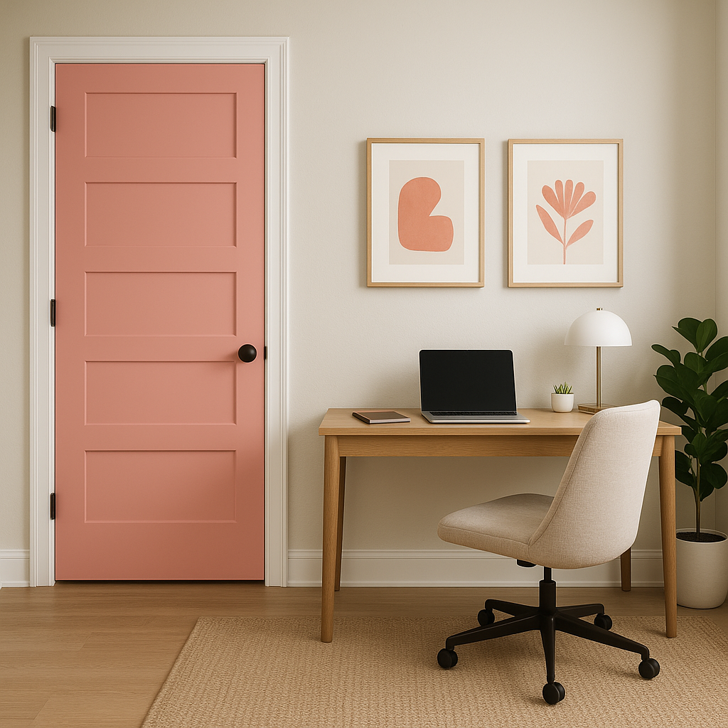
Benjamin Moore Pretty (1334) can be used as an accent color in kitchens, dining rooms, or entryways. Incorporate it into cabinetry, furniture pieces, or even artwork to bring a hint of warmth and charm to the space.
The appearance of Benjamin Moore Pretty (1334) can vary depending on the lighting in your space. In rooms with ample natural light, its peachy undertones will appear brighter and more luminous, while in dim or artificial lighting, it leans toward a softer, muted pink. Consider testing the color in different lighting conditions to ensure it achieves the desired effect in your home.
Benjamin Moore Pretty (1334) is the perfect choice for creating spaces that feel warm, inviting, and effortlessly elegant. Its versatility allows it to complement a wide range of design aesthetics, while its peachy undertones add a subtle glow that enhances the overall ambiance. Whether used as the main wall color or a thoughtful accent, Pretty is guaranteed to transform your home into a haven of beauty and comfort.
View Colors Only by Brand (No Imagery):
Sherwin-Williams
|
Benjamin-Moore
|
Behr
|
Valspar
Live on the Eastern Slope of Colorado and looking for a local painting professional, check out all our painting services and reach out for a free estimate.
Copyright © 2026 : Wild Fox Painting Inc. : 12435 Mead Way, Littleton, CO 80125


