Benjamin Moore Pink (1352) is a refined and elegant blush tone that exudes warmth, charm, and subtle sophistication. This versatile color is perfect for creating interiors that feel inviting yet effortlessly chic. With its delicate balance of softness and vibrancy, Benjamin Moore Pink (1352) is an excellent choice for spaces where a gentle touch of color can transform the atmosphere into one of understated luxury.
The beauty of Benjamin Moore Pink (1352) lies in its well-crafted undertones. This shade features subtle peachy and beige undertones that provide depth and warmth without overpowering the space. The peach undertones lend a cheerful, sunny disposition, while the beige adds a grounding, neutral quality. Together, these undertones create a shade that feels timeless and versatile. This pink is not overly saccharine or juvenile—it strikes a delicate balance that works beautifully in both modern and traditional settings.
To enhance the beauty of Benjamin Moore Pink (1352), pair it with coordinating colors that complement its soft, blush hue. Here are some inspired combinations:
Neutrals:
Benjamin Moore White Dove (OC-17) or Chantilly Lace (OC-65): These crisp whites create a clean and airy contrast, allowing Pink (1352) to stand out as a focal point or blend seamlessly into a serene palette.
Benjamin Moore Edgecomb Gray (HC-173) or Revere Pewter (HC-172): These warm greige tones harmonize with the beige undertones of Pink (1352), creating a sophisticated and cohesive look.
Soft Greens:
Benjamin Moore Pale Avocado (2146-40) or Guilford Green (HC-116): These muted green hues introduce an organic touch, balancing the warmth of Pink (1352) with a fresh, natural vibe.
Deep Accents:
Benjamin Moore Hale Navy (HC-154) or Black Pepper (2130-40): For a dramatic contrast, pair Pink (1352) with bold, dark shades that ground the space and add depth.
Benjamin Moore Pink (1352) is an incredibly versatile color that can be used in a variety of spaces and design styles. Its soft yet sophisticated tone works beautifully in the following applications:
Create an inviting and cozy atmosphere with Pink (1352) as the primary wall color. Pair it with plush neutral furnishings and metallic accents, such as gold or brushed brass, for a touch of glamour.
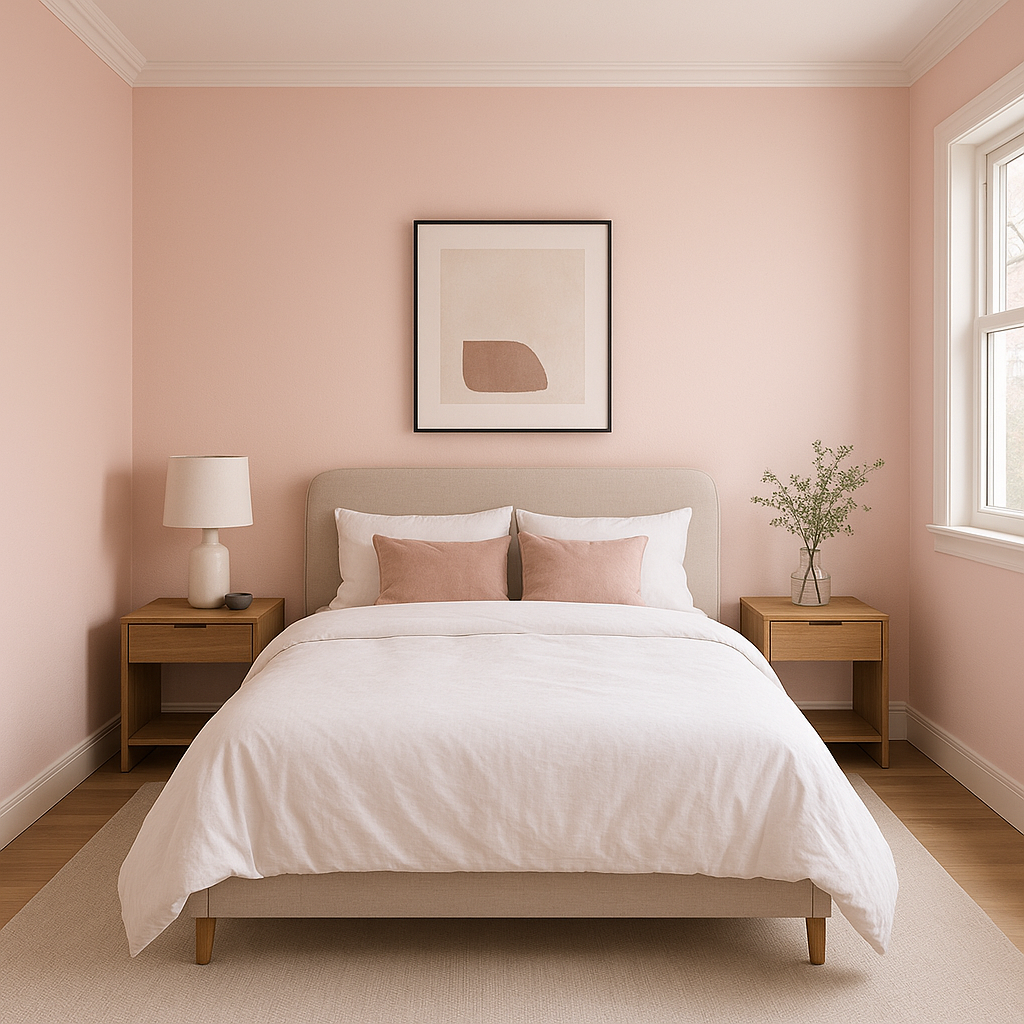
Pink (1352) is a perfect choice for bedrooms, offering a soothing and romantic backdrop. Layer it with crisp white linens, soft gray throws, and floral accents to create a serene retreat.
Its delicate blush tone makes it ideal for nurseries or children's rooms, providing a youthful yet sophisticated touch. Combine it with whimsical patterns or pastel accents to complete the look.
Elevate your bathroom with Pink (1352) for a spa-like feel. Pair it with marble finishes and chrome fixtures to strike the perfect balance between feminine elegance and modern sophistication.
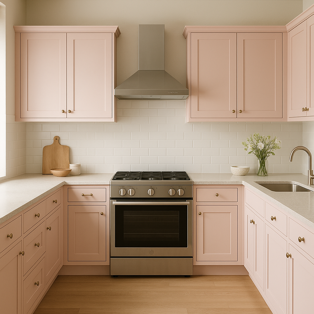
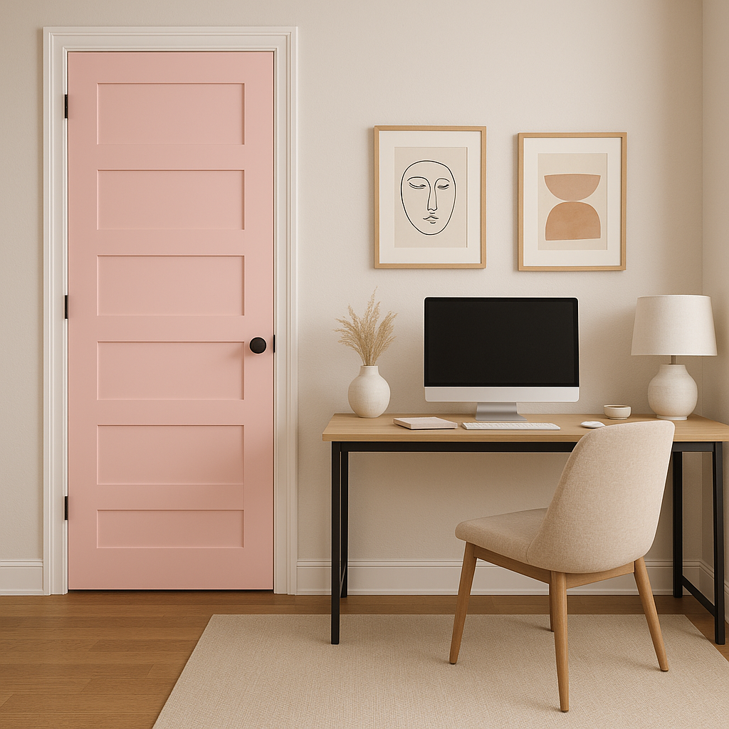
If you’re looking for a subtle pop of color, use Pink (1352) on an accent wall, a piece of furniture, or even cabinetry. Its versatility ensures it can adapt to both bold design statements and understated details.
Benjamin Moore Pink (1352) is a timeless shade that transcends fleeting trends. It brings warmth, charm, and a sense of balance to any interior. Whether used as a primary wall color or an accent, this hue offers an air of sophistication that feels fresh and modern, yet rooted in classic design principles.
Perfectly suited for a variety of spaces and styles, Benjamin Moore Pink (1352) is a go-to choice for designers and homeowners seeking a refined blush tone that transforms interiors into works of art.
View Colors Only by Brand (No Imagery):
Sherwin-Williams
|
Benjamin-Moore
|
Behr
|
Valspar
Live on the Eastern Slope of Colorado and looking for a local painting professional, check out all our painting services and reach out for a free estimate.
Copyright © 2026 : Wild Fox Painting Inc. : 12435 Mead Way, Littleton, CO 80125


