Benjamin Moore Apricot (136) is a delightful, warm hue that brings a sense of comfort and charm to any space. This soft, peachy-orange shade is perfect for creating inviting interiors that feel both sophisticated and approachable. Its subtle vibrancy allows it to act as either a statement color or a complementary accent, making it a versatile choice for a variety of design styles.
Apricot (136) boasts understated golden and orange undertones that give it its signature warmth. These undertones ensure the color remains lively without overwhelming the space. When paired with natural or artificial light, Apricot (136) reflects a soft glow that enhances its cheerful personality. While primarily warm, the color has a gentle neutrality that prevents it from feeling overly saturated, making it an excellent choice for those seeking a balanced palette.
Benjamin Moore Apricot (136) pairs beautifully with an array of complementary hues, allowing you to create harmonious designs with ease. Some coordinating colors to consider include:
These coordinating shades allow you to customize your space depending on the mood and style you wish to achieve, whether it's a bright, cheerful room or a calm, relaxing retreat.
Benjamin Moore Apricot (136) is an incredibly versatile color that can be used in various settings throughout your home. Below are some creative ideas for incorporating this hue into your interiors:
Apricot (136) is perfect for living rooms, where its warmth creates a welcoming atmosphere for gatherings and relaxation. Pair it with soft white trim and beige furnishings for a classic look, or incorporate bold accents like patterned pillows and rugs to add personality.
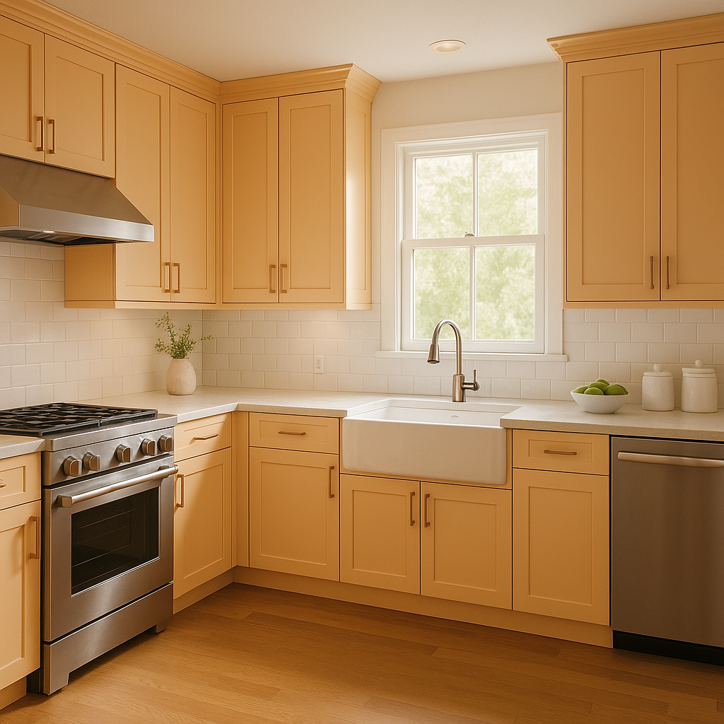
This color is ideal for kitchens and dining rooms, as its sunny disposition encourages a sense of happiness and comfort. Use Apricot on walls or cabinets, and accent with natural wood tones for a farmhouse-inspired design. Alternatively, pair it with stainless steel fixtures for a modern twist.
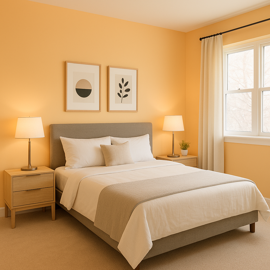
In bedrooms, Apricot (136) creates a soothing environment that's conducive to rest and relaxation. Pair it with muted greens or blues for a tranquil retreat, or layer it with warm browns and golds for a cozier aesthetic.
For a playful space, Apricot (136) shines in children's playrooms and nurseries. Its cheerful tone stimulates creativity without feeling overly bright. Combine it with pastel accents for a whimsical look or bold primary colors for a vibrant atmosphere.
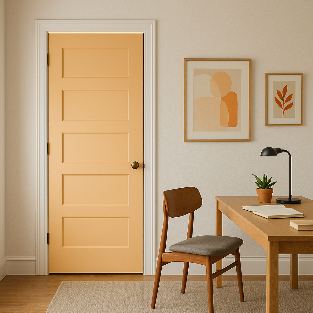
If you're not ready to commit to Apricot (136) throughout an entire room, consider using it as an accent wall. It works wonderfully in neutral spaces, adding a pop of color and personality without overwhelming the overall design.
Benjamin Moore Apricot (136) transforms beautifully depending on the lighting in your space. In rooms with ample natural light, the color leans brighter and more golden, creating an uplifting ambiance. In dimmer spaces or under artificial lighting, Apricot (136) takes on a softer, cozier tone. To ensure the color works well in your desired area, test it with swatches under different lighting conditions.
Benjamin Moore Apricot (136) is a timeless color choice that brings warmth, versatility, and cheer to any interior. Whether you're looking to create a welcoming living area, a serene bedroom, or a vibrant accent wall, this hue offers endless possibilities for personalization and design.
View Colors Only by Brand (No Imagery):
Sherwin-Williams
|
Benjamin-Moore
|
Behr
|
Valspar
Live on the Eastern Slope of Colorado and looking for a local painting professional, check out all our painting services and reach out for a free estimate.
Copyright © 2026 : Wild Fox Painting Inc. : 12435 Mead Way, Littleton, CO 80125


