Benjamin Moore Melrose (1363) is a sophisticated, soft peach hue that exudes warmth and elegance. With its delicate balance of orange and pink tones, Melrose offers a subtle vibrancy that feels both timeless and inviting. This shade is perfect for creating a cozy atmosphere in residential spaces or adding a touch of understated charm to commercial interiors. Whether you're looking to brighten up a room or soften harsh architectural lines, Melrose strikes the perfect balance between playful energy and refined sophistication.
Melrose carries gentle peach undertones that are balanced by a hint of muted coral. These undertones allow the color to feel warm and welcoming without overpowering your space. The subtle interplay of orange and pink provides a depth that makes Melrose versatile across various lighting conditions. In bright, natural light, Melrose leans towards a sunnier peach, while in dimmer settings, it takes on a richer, slightly deeper hue. This adaptability makes it an excellent choice for spaces that transition between day and evening use.
To enhance the beauty of Melrose, consider pairing it with complementary shades that bring out its warm undertones. Here are some coordinating colors:
By incorporating these coordinating colors, you can create a well-rounded design that highlights Melrose’s unique character while maintaining balance and visual interest.
Melrose is an incredibly versatile paint color that can be used in a variety of settings to evoke warmth and charm. Here are some suggestions for its application:
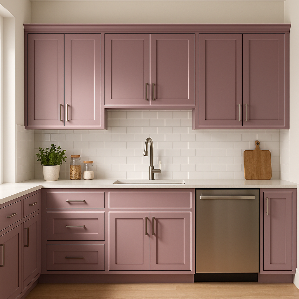
Melrose can be used to create a cozy, welcoming atmosphere in living rooms. Pair it with neutral furniture and natural textures like wood or wicker for a rustic-chic vibe. Alternatively, add metallic accents for a touch of glamour.
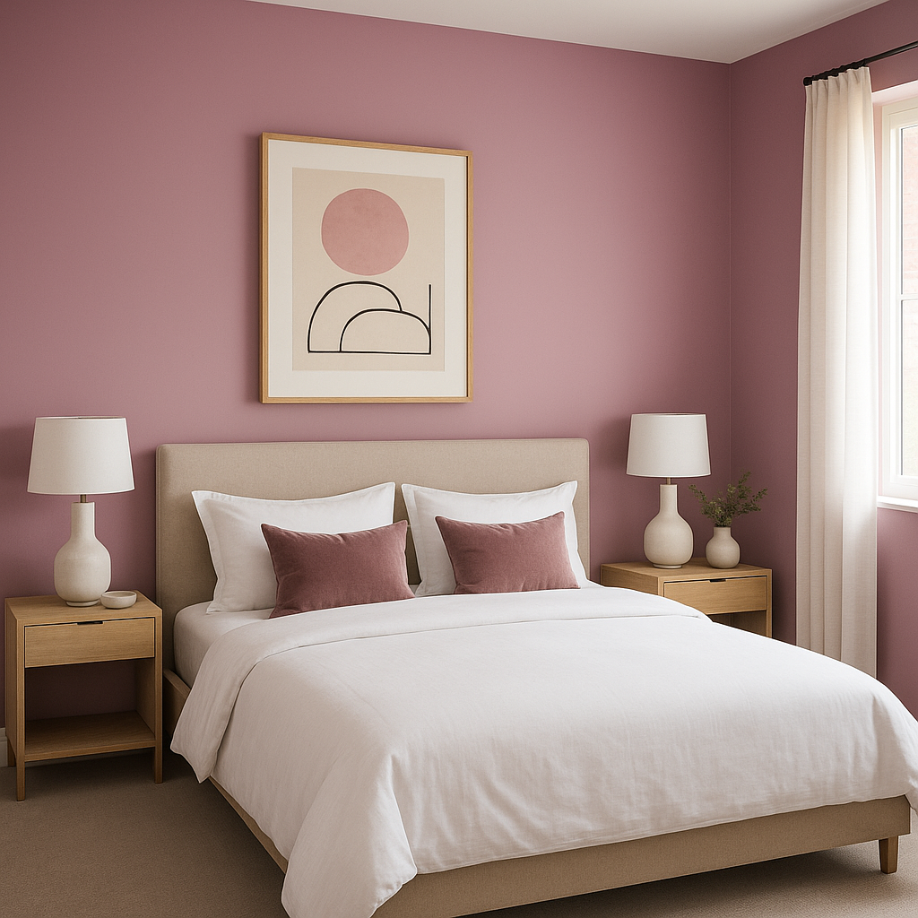
The soft peach tones of Melrose are perfect for crafting a serene and romantic bedroom space. Use it as an accent wall or paint the entire room for a cohesive, soothing environment. Pair it with crisp white linens and soft pastel decor for a dreamy retreat.
Melrose’s playful yet refined nature makes it an ideal choice for nurseries or children’s rooms. It offers a cheerful alternative to traditional pink or yellow, creating a warm and nurturing space.
Transform your bathroom into a spa-like oasis with Melrose. Pair it with white tiles, brushed nickel fixtures, and natural greenery for a fresh and inviting look.
For dining rooms, Melrose can add a touch of warmth that encourages conversation and connection. Pair it with dark wood furniture and soft lighting to create a cozy ambiance perfect for hosting family dinners or intimate gatherings.
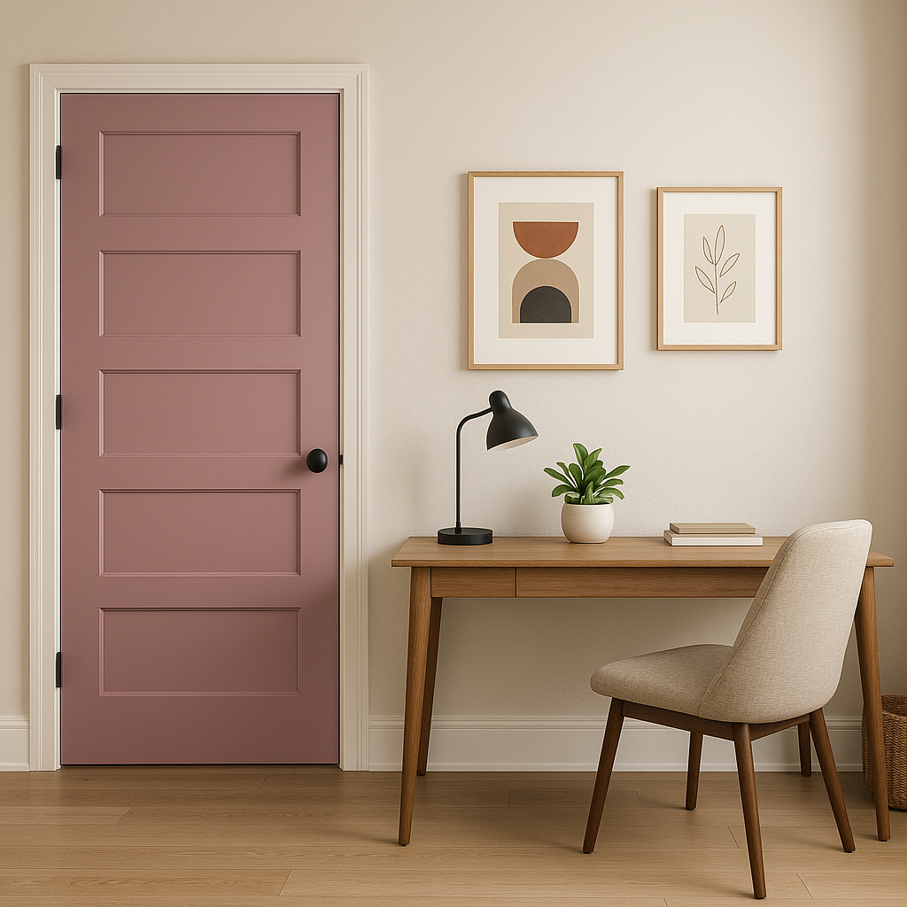
Melrose works beautifully as an accent wall, adding depth and a pop of color to rooms dominated by neutrals. Consider using it in hallways, entryways, or behind a bookshelf to infuse personality into overlooked spaces.
To get the most out of Benjamin Moore Melrose, consider the lighting in your space. In rooms with ample natural light, Melrose will appear brighter and slightly more vibrant, making it ideal for sunlit areas like kitchens or living rooms. In darker spaces, it takes on a softer, more muted tone, adding warmth and coziness to bedrooms or dens. Use warm lighting to enhance its peachy undertones, or cool lighting for a more subdued effect.
Benjamin Moore Melrose (1363) is a versatile, timeless paint color that can elevate spaces with its warm and welcoming peach tone. Its adaptability across different lighting conditions and its ability to pair effortlessly with a variety of complementary shades make it a favorite among interior designers for creating inviting and stylish interiors.
View Colors Only by Brand (No Imagery):
Sherwin-Williams
|
Benjamin-Moore
|
Behr
|
Valspar
Live on the Eastern Slope of Colorado and looking for a local painting professional, check out all our painting services and reach out for a free estimate.
Copyright © 2026 : Wild Fox Painting Inc. : 12435 Mead Way, Littleton, CO 80125


