Wild Fox Painting Logo

Primrose

1367 | benjamin-moore | HEX: #EFD6E0 | RGB: 239, 214, 224

Benjamin Moore Primrose (1367): A Timeless, Warm Yellow for Inviting Spaces

Benjamin Moore Primrose (1367) is a radiant and cheerful shade of yellow that exudes warmth, sophistication, and charm. This versatile color is perfect for creating welcoming spaces that feel both timeless and uplifting. With its golden undertones and subtle richness, Primrose adds a touch of elegance without overwhelming the senses, making it a favorite choice for designers looking to strike the perfect balance between boldness and comfort.

Undertones of Benjamin Moore Primrose (1367)

Primrose features warm golden undertones that give it a sunny disposition, making it feel alive and vibrant. These undertones prevent it from veering into overly bright or neon territory, ensuring a refined and approachable aesthetic. The color carries a hint of earthy softness that grounds its brightness, making it suitable for both traditional and modern interiors alike. Its warmth also allows it to complement a variety of color palettes, offering flexibility in design.

Coordinating Colors

Benjamin Moore Primrose pairs beautifully with a range of coordinating shades, each enhancing its unique qualities:

  • Neutral Companions: Pair Primrose with creamy whites like Benjamin Moore White Dove (OC-17) or soft beiges such as Benjamin Moore Edgecomb Gray (HC-173) for a balanced and understated look. These neutrals tone down the vibrancy of Primrose while maintaining its sunny elegance.
  • Earthy Accents: Bring out the golden warmth of Primrose by pairing it with earthy greens like Benjamin Moore Saybrook Sage (HC-114) or muted browns such as Benjamin Moore Fairview Taupe (HC-85). These combinations evoke a natural, organic feel.
  • Contrasting Cool Tones: For a dynamic and contemporary look, pair Primrose with cool blues like Benjamin Moore Hale Navy (HC-154) or soft grays like Benjamin Moore Coventry Gray (HC-169). This interplay of warm and cool tones creates visual interest and sophistication.
  • Bold Pairings: If you’re looking to add a touch of drama, consider pairing Primrose with rich, jewel tones like Benjamin Moore Caliente (AF-290), a bold red, or Benjamin Moore Black Ink (2127-20) for high contrast and flair.

Uses in Interior Design

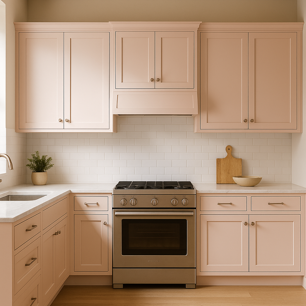
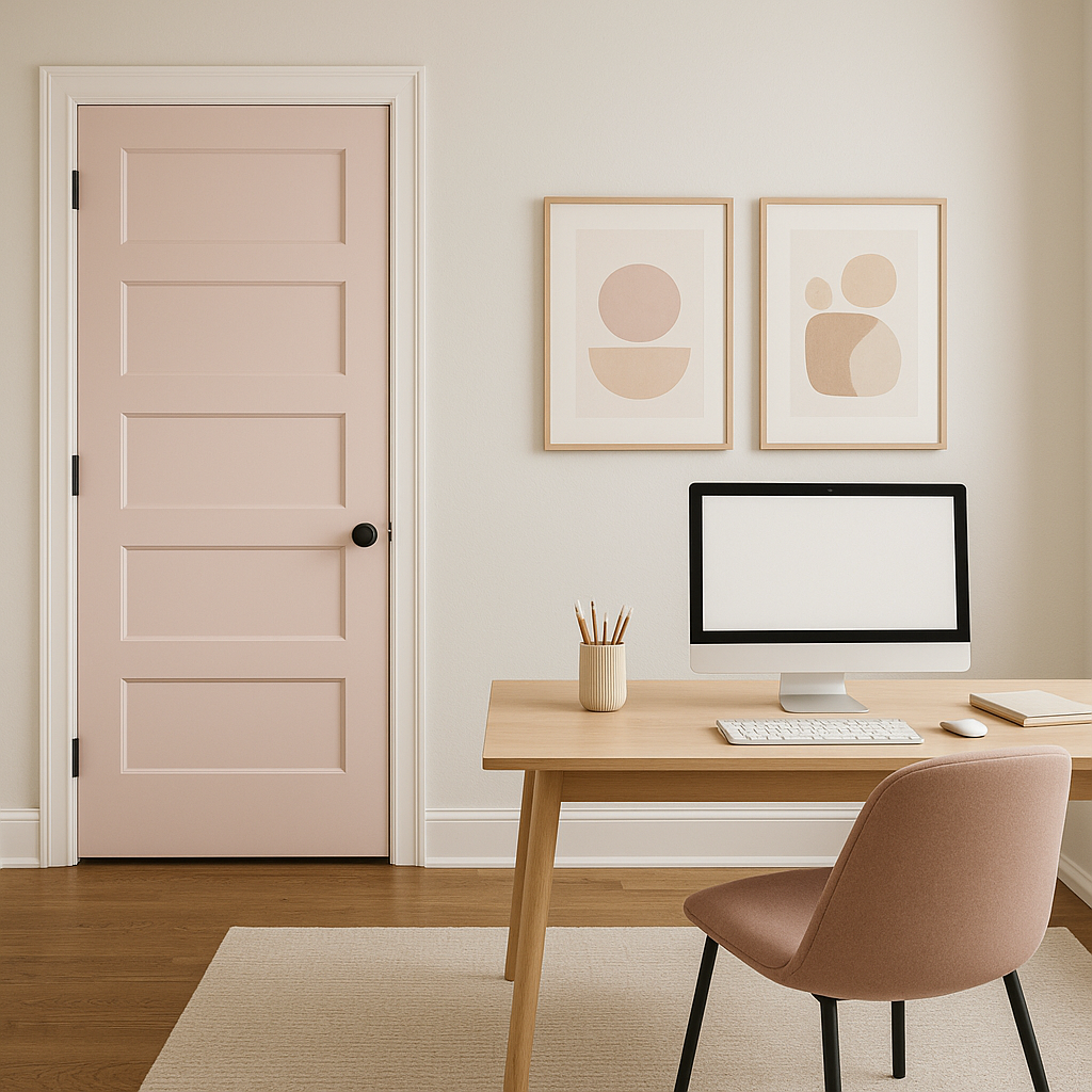
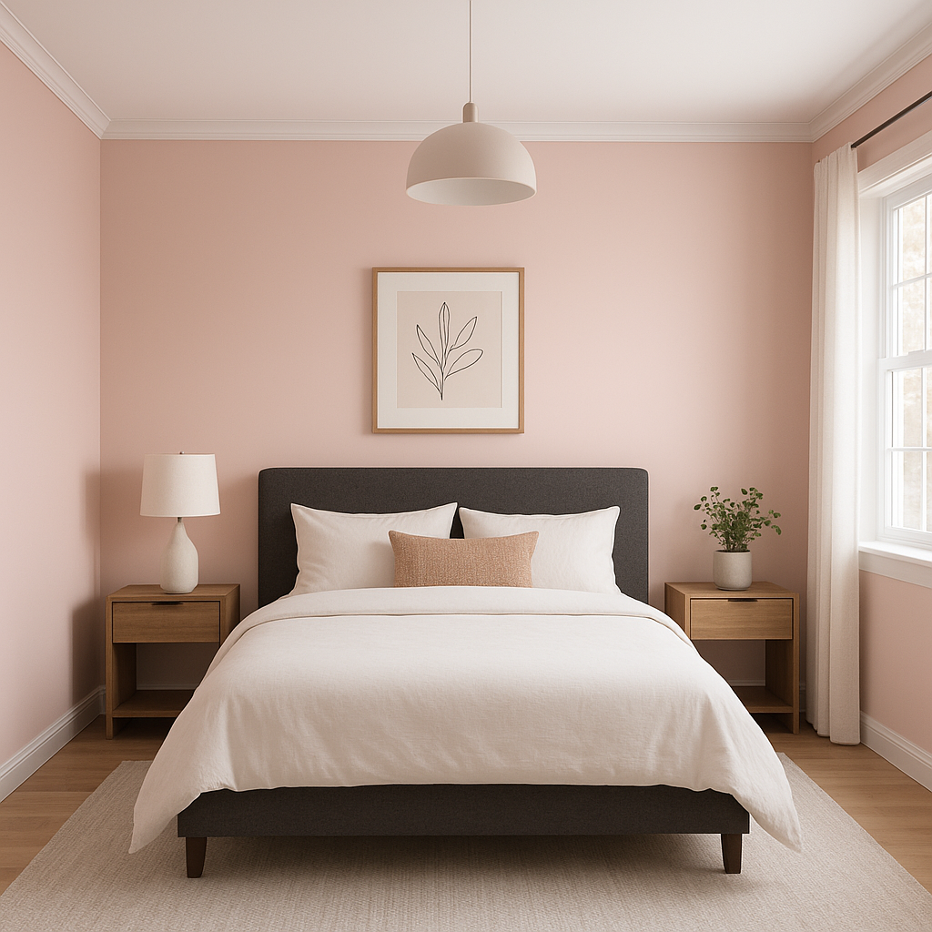
Benjamin Moore Primrose is a versatile color that can transform various spaces in your home or office. Here are some ideas for incorporating this warm yellow into your interiors:

  • Living Rooms: Use Primrose as a feature wall color or throughout the space to create a cozy and inviting atmosphere. Pair it with neutral furniture and accents for a balanced look, or add vibrant pops of color to energize the room.
  • Kitchens: The cheerful nature of Primrose makes it an excellent choice for kitchens. It pairs well with natural wood cabinets, brass hardware, and white countertops, creating a bright and welcoming culinary space.
  • Dining Rooms: Add a touch of sophistication to your dining room with Primrose. Pair it with dark wood furniture and warm lighting to create a space that feels both elegant and convivial.
  • Bedrooms: Primrose can bring a sense of warmth and tranquility to bedrooms. Use it on walls or as an accent color in bedding, curtains, or decor. Pair it with soft whites and muted grays for a serene retreat.
  • Nurseries and Kids' Rooms: The sunny disposition of Primrose makes it ideal for spaces designed for children. Its uplifting quality fosters positivity and creativity without being too overpowering.
  • Entryways and Hallways: Greet guests with the welcoming glow of Primrose in entryways or hallways. This color sets an inviting tone for the rest of the home.

Lighting Considerations

Primrose’s appearance can vary depending on lighting conditions. In spaces with ample natural light, it will appear brighter and more radiant, emphasizing its sunny golden undertones. Under artificial lighting, especially warm-toned bulbs, Primrose takes on a softer, cozier look. Be sure to test the color in your space under different lighting scenarios to ensure it complements your desired aesthetic.

Why Choose Benjamin Moore Primrose (1367)?

Benjamin Moore Primrose is a standout choice for those seeking a color that combines warmth, timelessness, and versatility. Its golden undertones add depth and character, making it an excellent option for spaces that need a touch of cheer and sophistication. Whether used as a primary wall color, an accent, or part of a broader palette, Primrose is sure to brighten and uplift any interior.

Explore All Our Core Services in More Detail

Live on the Eastern Slope of Colorado and looking for a painting professional, check out all our painting services and reach out for a free estimate.

Copyright © 2025 : Wild Fox Painting Inc.