Benjamin Moore Rock (1387) is a versatile gray that effortlessly bridges the gap between modern sophistication and timeless elegance. This medium-toned neutral offers a balanced blend of warmth and coolness, making it an excellent choice for a wide variety of settings. Whether you're designing a serene bedroom retreat or a sleek, minimalist living room, Rock provides the perfect backdrop for creating a welcoming and refined atmosphere.
Rock (1387) is a gray with understated warm undertones, giving it a slightly taupe-like quality. These subtle hints of beige and brown prevent the shade from feeling cold or stark, making it a more approachable choice than some cooler grays. This warmth ensures it pairs beautifully with natural materials like wood, stone, and leather, making it ideal for spaces that embrace organic textures and earthy finishes.
The undertones in Rock make it particularly adept at adapting to different lighting conditions. In well-lit, sun-drenched rooms, it appears lighter and airier, while in dimmer spaces, the earthy warmth becomes more pronounced, creating a cozy ambiance.
Benjamin Moore Rock (1387) shines when paired with complementary hues that enhance its understated elegance. Consider these coordinating colors for a harmonious palette:
These coordinating colors allow you to curate a palette that suits a variety of interior styles, from contemporary chic to warm farmhouse aesthetics.
Rock (1387)’s versatility makes it suitable for virtually any room in your home or office. Here are some ideas on how to incorporate this beautiful shade into your space:
Create a sophisticated and inviting living area by using Rock as the main wall color. Pair it with textured fabrics like linen or velvet in neutral tones for a cohesive look. Add pops of color through accessories such as pillows, throws, or artwork.
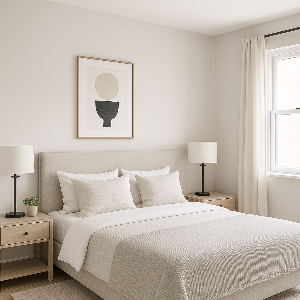
Rock’s subtle warmth makes it a perfect choice for bedrooms where comfort and relaxation are paramount. Use it alongside soft whites and muted pastels to craft a serene retreat. Incorporate natural wood or wicker furniture for an earthy touch.
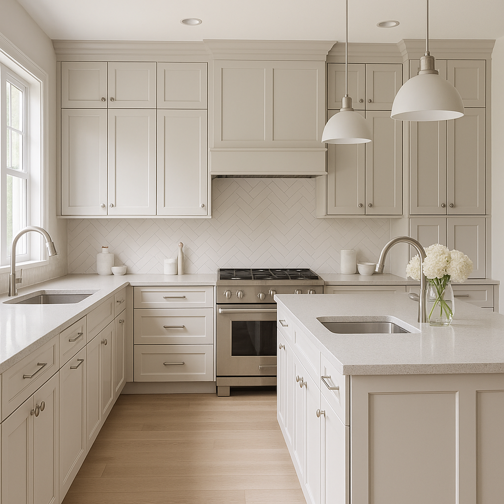
This gray is an excellent choice for kitchen cabinetry or dining room walls. Pair it with brushed nickel or matte black hardware for a modern flair, and complement the look with warm woods or marble countertops for a luxe yet approachable vibe.
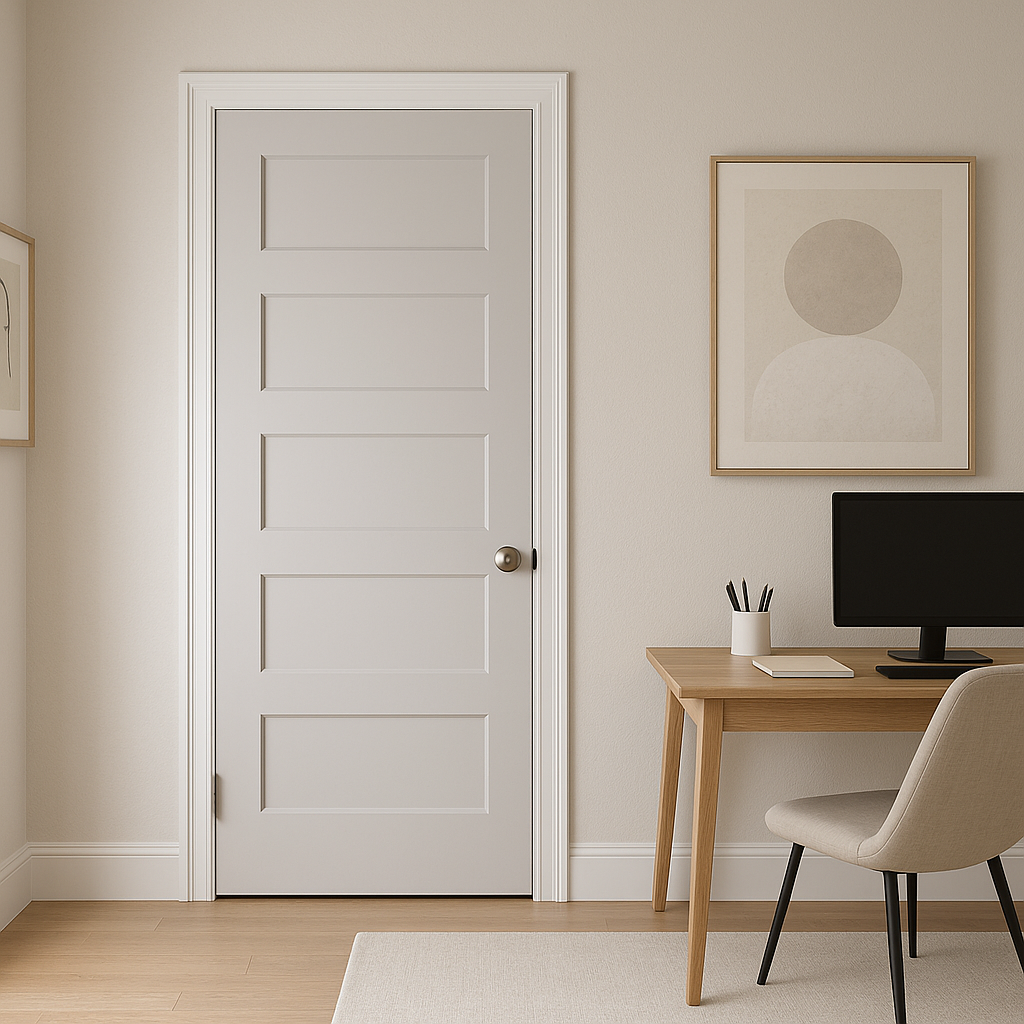
For home offices or study areas, Rock provides a neutral canvas that promotes focus and creativity. Combine it with crisp whites and deep charcoals for a clean, professional look that won’t feel overwhelming.
Rock adds depth to bathrooms while maintaining a clean and polished appearance. Pair it with white subway tiles, chrome fixtures, and soft blues or greens for a spa-like atmosphere.
Benjamin Moore Rock (1387) is more than just a neutral—it’s a color that adapts beautifully to its surroundings, lending warmth and depth without overpowering the space. Its subtle undertones make it a sophisticated choice for homeowners and designers seeking a balance between modernity and tradition. Whether used as a main wall color, on cabinetry, or as part of an accent scheme, Rock (1387) is a reliable, timeless option that will elevate any interior.
View Colors Only by Brand (No Imagery):
Sherwin-Williams
|
Benjamin-Moore
|
Behr
|
Valspar
Live on the Eastern Slope of Colorado and looking for a local painting professional, check out all our painting services and reach out for a free estimate.
Copyright © 2026 : Wild Fox Painting Inc. : 12435 Mead Way, Littleton, CO 80125


