Benjamin Moore Spring (1388) is a delightful green hue that effortlessly captures the essence of renewal and rejuvenation. Its soft, cheerful tone evokes the lush vibrancy of budding leaves and fresh grass on a crisp spring day. Whether you're looking to infuse your space with energy or create a calming retreat, this color offers a harmonious balance that works beautifully in a variety of settings.
Spring (1388) features warm yellow undertones that add a sunny and inviting quality to its green base. These undertones prevent the shade from feeling overly cool or stark, making it an approachable choice for both contemporary and traditional spaces. The subtle warmth ensures compatibility with a wide range of palettes, while its green essence provides a soothing connection to nature.
Benjamin Moore Spring (1388) pairs well with a variety of coordinating shades, allowing for versatile design possibilities. Here are some excellent options to enhance the beauty of Spring (1388):
Neutral Pairings:
Combine Spring (1388) with creamy off-whites such as Benjamin Moore White Dove (OC-17) or Benjamin Moore Swiss Coffee (OC-45) for a clean and serene look. These neutrals help balance the vibrancy of Spring while maintaining a sense of sophistication.
Complementary Greens:
For a layered green palette, consider deeper hues like Benjamin Moore Saybrook Sage (HC-114) or Benjamin Moore Gloucester Sage (HC-100). These earthy greens create depth and dimension while maintaining a cohesive nature-inspired theme.
Contrasting Colors:
Add a playful contrast with soft pinks such as Benjamin Moore Peach Blossom (2167-70) or dusty blues like Benjamin Moore Yarmouth Blue (HC-150). These colors highlight the warmth in Spring (1388) and bring a lively energy to your space.
Wood Tones and Metallics:
Spring (1388) shines when paired with natural wood tones, from light oak to rich walnut. Metallic accents like brushed gold or matte black further elevate its charm, adding a touch of modernity and elegance.
Spring (1388) is a versatile color that can be used in both residential and commercial interiors. Its lively yet soothing qualities make it suitable for a variety of applications:
Create a welcoming environment in living rooms or family spaces with Spring (1388). This color works well for accent walls or as the primary shade in rooms with ample natural light. Pair it with soft furnishings in neutral tones for a polished look, or use patterned textiles with hints of green for a cohesive palette.
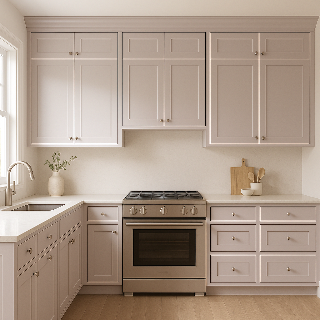
Spring (1388) brings a fresh and invigorating touch to kitchens and dining spaces. Use it for cabinetry, walls, or even a statement backsplash. Combine it with white subway tiles and natural wood finishes for a farmhouse-inspired aesthetic, or pair it with sleek blacks and grays for a modern vibe.
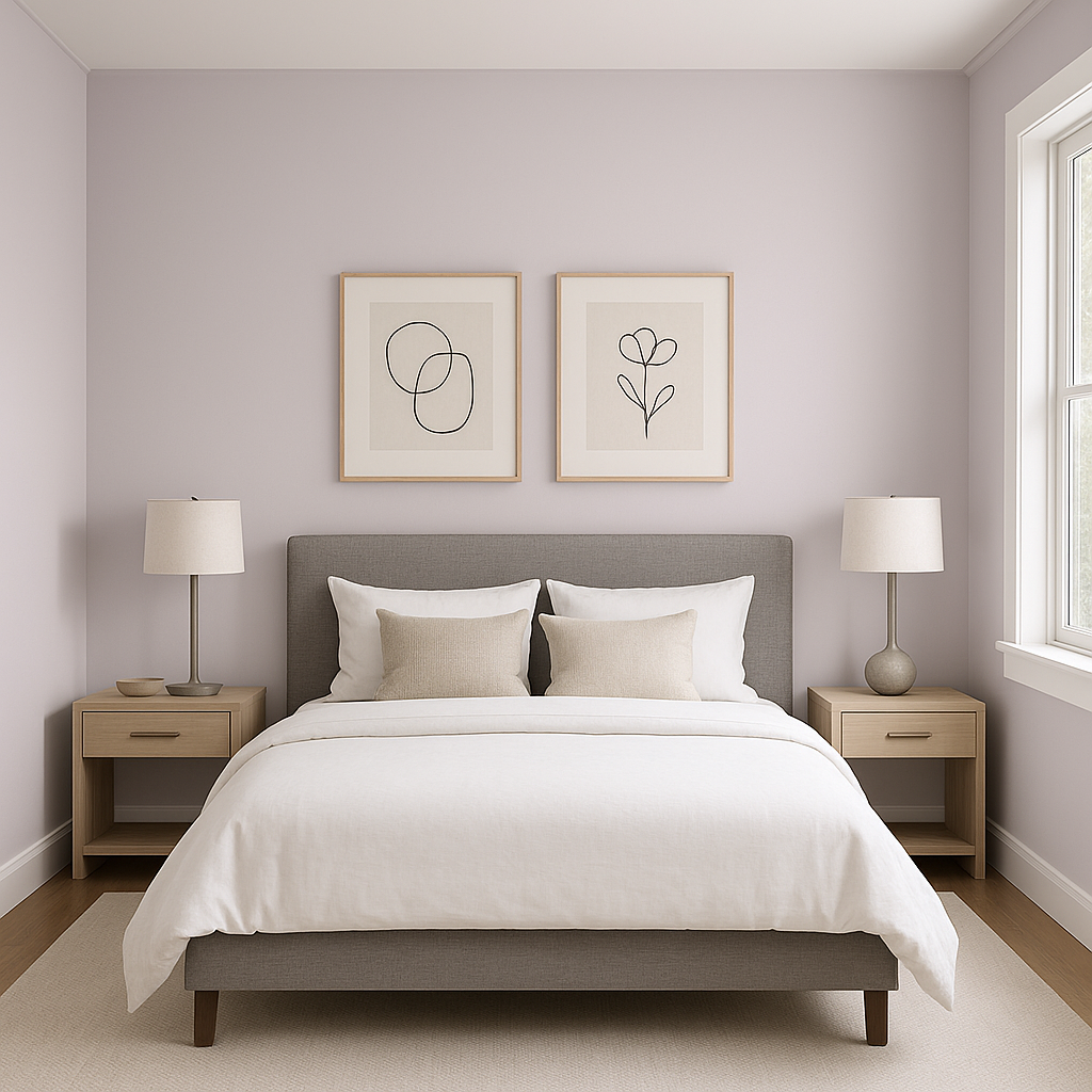
Its calming nature makes Spring (1388) an excellent choice for bedrooms and nurseries. The gentle green fosters relaxation while its warmth adds coziness. Use it on walls, paired with crisp white bedding and soft pastel accents for a serene retreat.
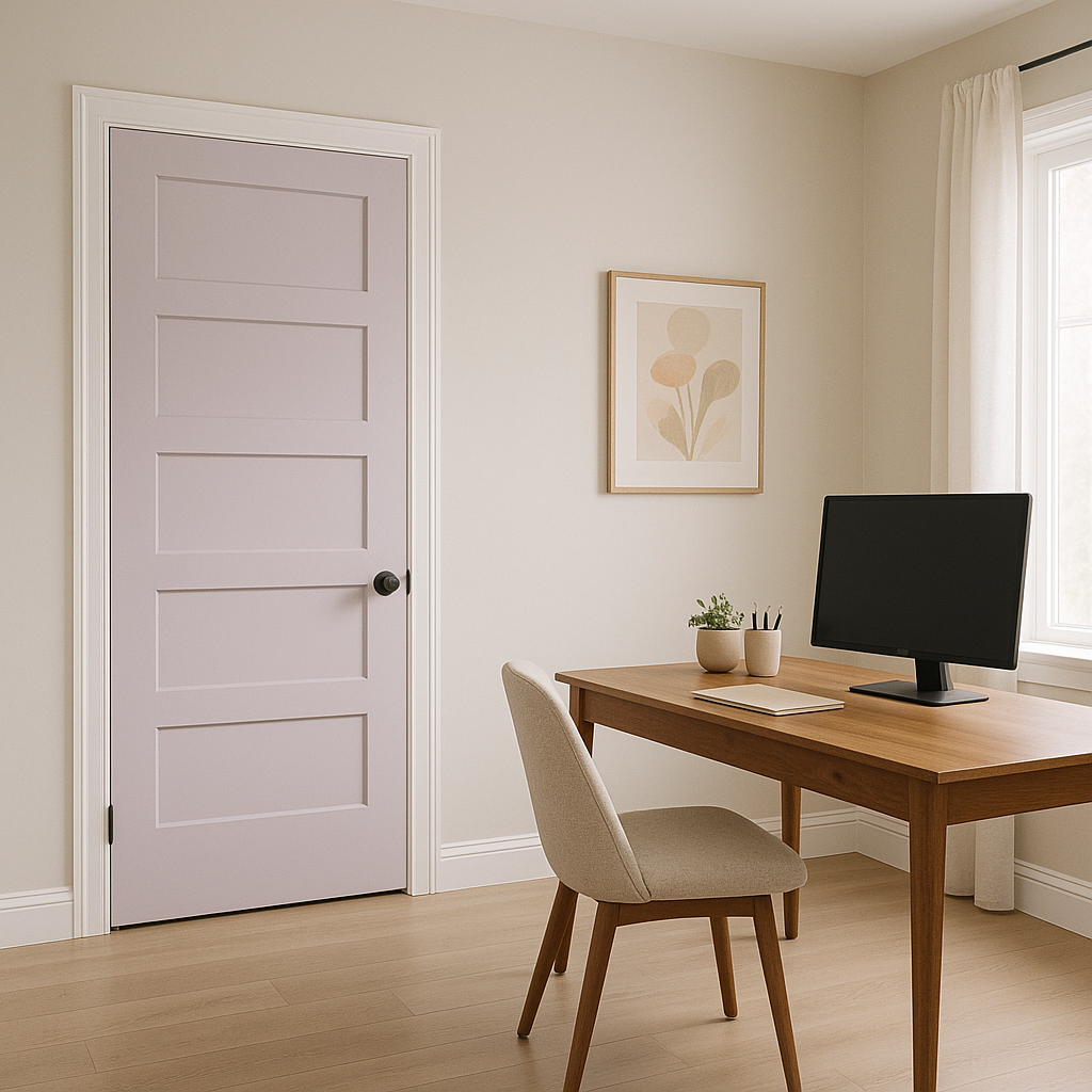
Infuse productivity and creativity into your home office with Spring (1388). The color’s connection to nature promotes focus and inspiration without feeling overwhelming. Pair it with clean lines, wooden furniture, and minimalistic décor for a balanced work environment.
Spring (1388) can also be a charming exterior paint choice. Use it for front doors, shutters, or even entire facades to make a cheerful statement. It pairs beautifully with white trim and natural stone accents, creating curb appeal that feels fresh and inviting.
Benjamin Moore Spring (1388) offers the perfect blend of vibrancy and versatility, making it an excellent choice for a variety of design styles. Its warm undertones, compatibility with coordinating colors, and ability to adapt to different spaces ensure that this green will breathe life into your home while maintaining a timeless elegance. Whether you’re looking to refresh a single room or transform your entire space, Spring (1388) is a color that delivers charm, personality, and endless possibilities.
View Colors Only by Brand (No Imagery):
Sherwin-Williams
|
Benjamin-Moore
|
Behr
|
Valspar
Live on the Eastern Slope of Colorado and looking for a local painting professional, check out all our painting services and reach out for a free estimate.
Copyright © 2026 : Wild Fox Painting Inc. : 12435 Mead Way, Littleton, CO 80125


