Benjamin Moore Grappa 1393 is a deep, luxurious shade that makes a statement in any space. This sumptuous color, part of Benjamin Moore’s renowned palette, is an enticing mix of plum and aubergine, exuding a sense of sophistication and opulence. Its bold profile makes it a perfect choice for those looking to infuse their interiors with depth and personality.
Grappa 1393 boasts a complex blend of undertones that give it its unique character. At its core, it leans heavily into purple, but subtle red and brown undertones add warmth and richness. The brown undertones soften the color, making it feel earthy and approachable, while the red undertones lend it a touch of vibrancy. These elements combine to create a versatile shade that feels both dramatic and welcoming.
The undertones shift depending on lighting conditions. By day, Grappa may appear more vibrant, with its red tones taking center stage under natural light. By night, under the warm glow of artificial lighting, it takes on a deeper, more subdued ambiance, emphasizing its earthy brown base. For this reason, testing the color in your specific space is key to understanding how it will interact with your lighting.
Benjamin Moore Grappa pairs beautifully with a variety of shades, allowing for versatile and layered design schemes. Here are some coordinating colors that can help you create a harmonious palette:
Grappa 1393 is a versatile shade that can be used in both bold and subtle ways, depending on the design intent. Here's how you can incorporate it into your space:
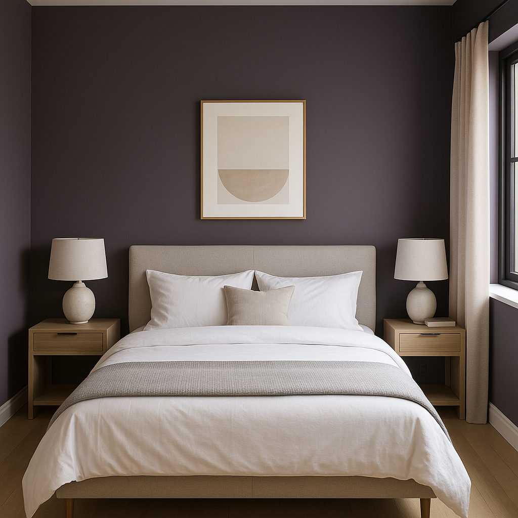
Grappa is an excellent choice for an accent wall. In living rooms or bedrooms, it can anchor the space and add depth without overwhelming the room. Pair it with lighter walls and complementary furniture for a balanced look.
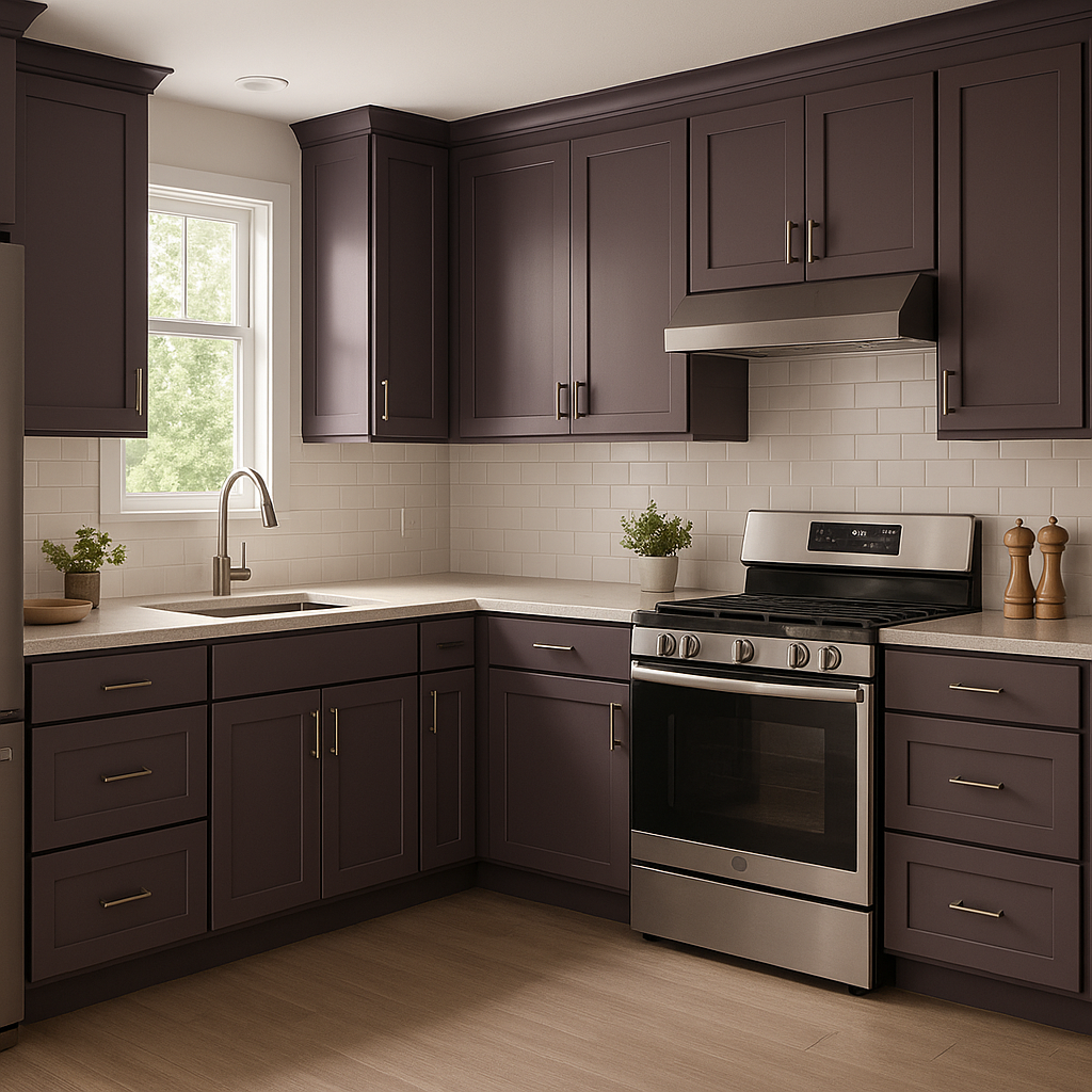
This dramatic hue is perfect for dining rooms, where its rich tone creates an intimate and luxurious atmosphere. Combine it with dark wood furniture and soft, ambient lighting for a space that feels indulgent and inviting.
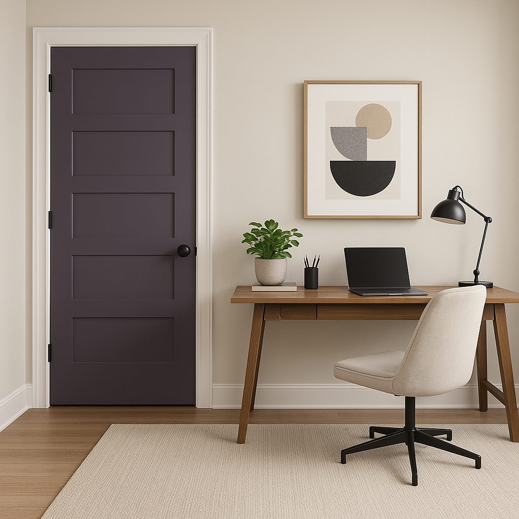
Grappa’s moody and sophisticated vibe makes it an inspired choice for home offices or libraries. Paired with leather furniture, brass accents, and traditional wood tones, it can evoke a sense of refinement and focus.
If you're feeling adventurous, consider using Grappa in a powder room. Small spaces are ideal for experimenting with bold colors, and this shade can create a jewel-box effect. Add a statement mirror and metallic fixtures to elevate the look.
View Colors Only by Brand (No Imagery):
Sherwin-Williams
|
Benjamin-Moore
|
Behr
|
Valspar
Live on the Eastern Slope of Colorado and looking for a local painting professional, check out all our painting services and reach out for a free estimate.
Copyright © 2026 : Wild Fox Painting Inc. : 12435 Mead Way, Littleton, CO 80125


