Benjamin Moore Spring (1402) is a stunning mid-tone green that captures the essence of renewal and growth. Aptly named, this color evokes the fresh vitality of budding leaves and verdant landscapes, making it an excellent choice for homeowners and designers seeking to infuse their space with a sense of natural tranquility and understated elegance.
Spring (1402) is a balanced green with subtle gray undertones that lend it a calming, grounded quality. These muted undertones prevent the shade from feeling overly vibrant or saturated, making it incredibly versatile. The gray infusion softens the green, allowing it to work beautifully in both modern and traditional settings. It avoids the starkness of brighter greens while maintaining a fresh and inviting appearance.
The undertones also ensure that Spring (1402) adapts well to varying lighting conditions. In bright natural light, it appears lighter and livelier, while in dimmer spaces, the gray undertones deepen, giving the color a more intimate and soothing feel. This adaptability makes Spring (1402) an excellent choice for a wide range of rooms, from living spaces to bedrooms.
Benjamin Moore Spring (1402) pairs effortlessly with an array of complementary colors, allowing you to create a harmonious and cohesive design scheme. Here are a few coordinating options to consider:
Warm Neutrals: Pair Spring (1402) with creamy whites like Benjamin Moore Simply White (OC-117) or beige tones such as Edgecomb Gray (HC-173) to create a soft, warm ambiance. These hues balance the freshness of the green while adding depth and sophistication.
Cool Grays: Combine Spring (1402) with cooler grays like Stonington Gray (HC-170) or Coventry Gray (HC-169) for a modern, sleek aesthetic that emphasizes the green’s earthy undertones.
Soft Blues: For a serene and airy effect, pair Spring (1402) with pale blues like Smoke (2122-40) or Beach Glass (1564). These shades evoke a coastal vibe and enhance the calming nature of the green.
Rich Accents: Add drama and contrast with deeper hues like Hale Navy (HC-154) or Kendall Charcoal (HC-166). These bold colors can be used for furniture, trim, or accent walls to ground the space and create visual interest.
Spring (1402) is a versatile color that works beautifully in various rooms and design styles. Here are some ideas for how to use this refreshing green in your home:
Create a peaceful and inviting living room by using Spring (1402) on the walls. Pair it with neutral furniture and natural textures like wood and woven fibers to enhance its organic feel. Add pops of white or subtle blues in throw pillows and decor for a well-rounded palette.
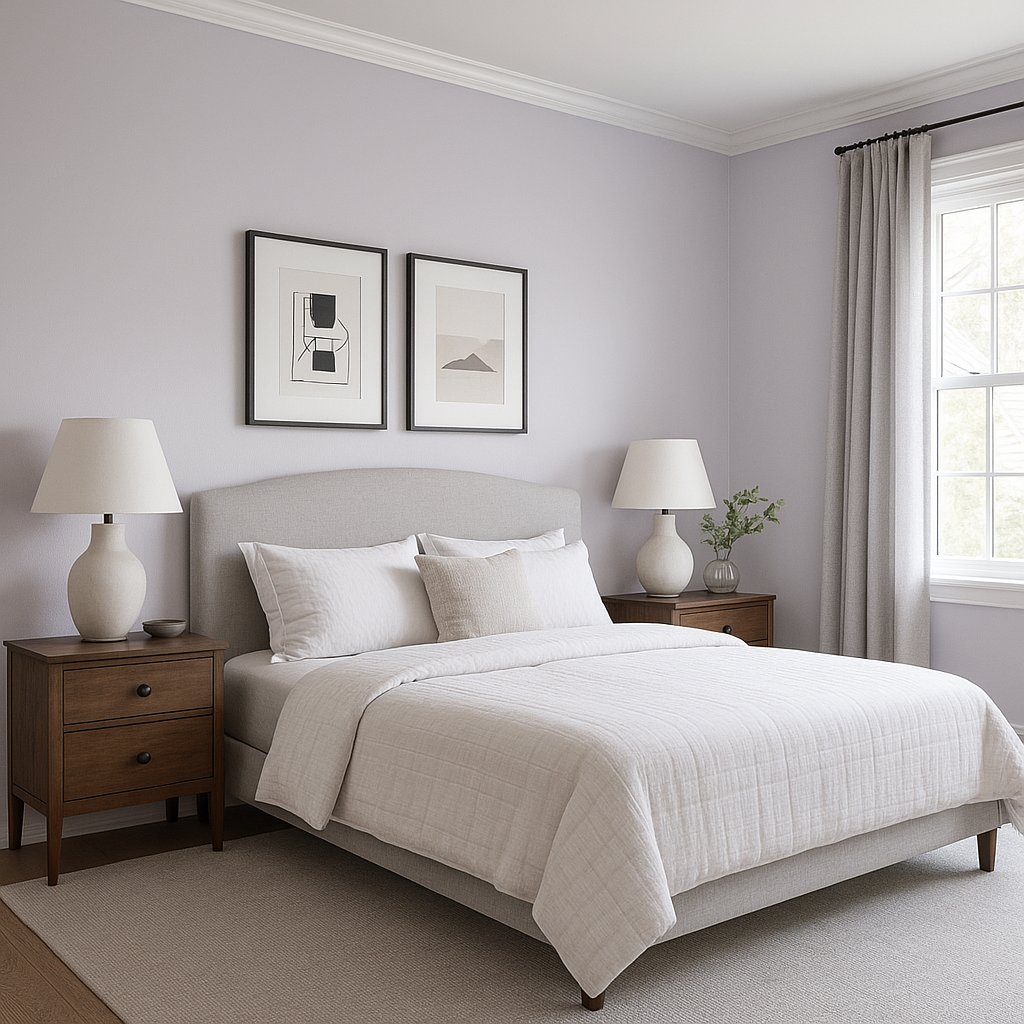
For a soothing retreat, consider Spring (1402) for bedroom walls or as an accent color. Its subdued green tones promote relaxation, making it an ideal choice for spaces where tranquility is key. Pair it with soft linens in white or beige for a serene aesthetic.
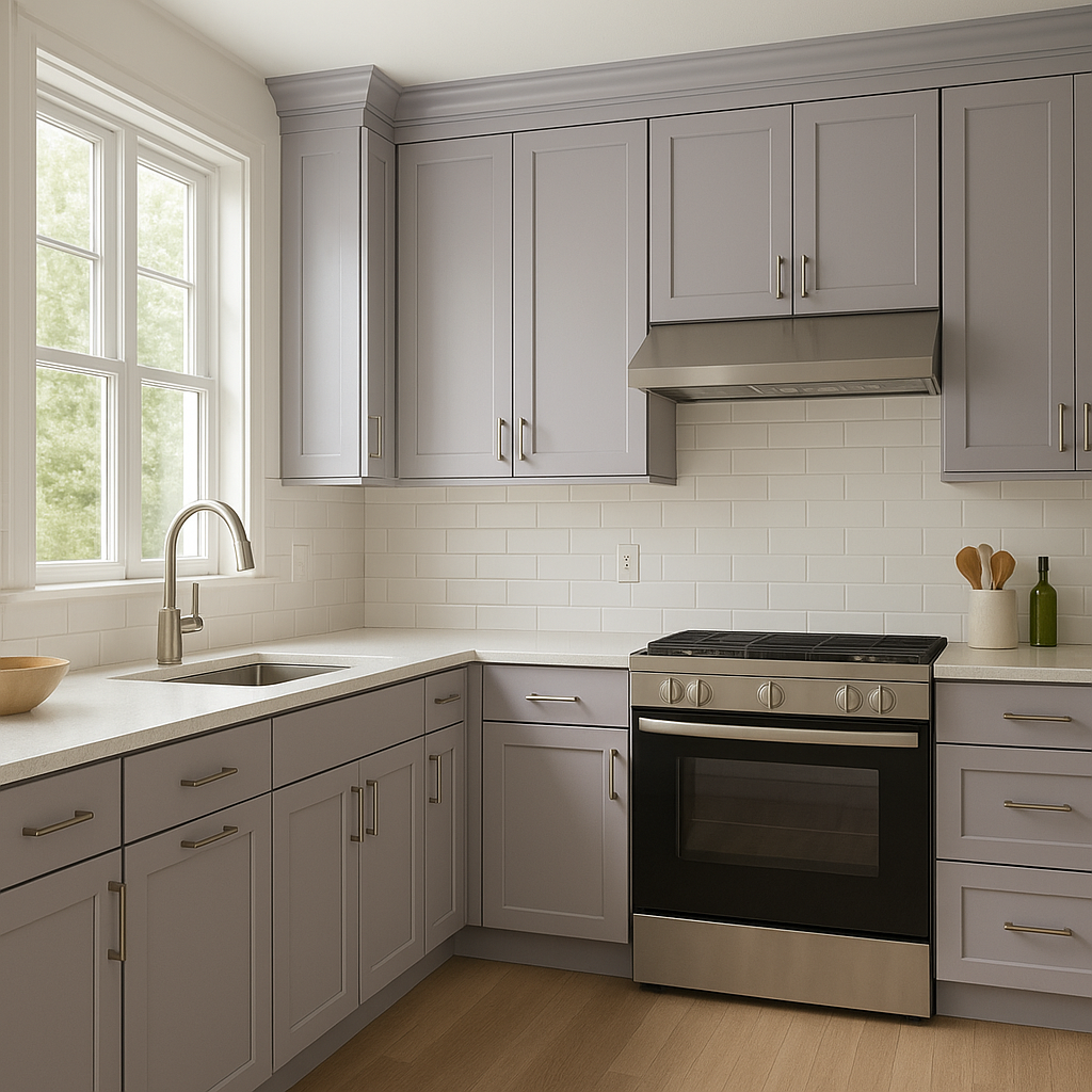
Spring (1402) is a fantastic option for kitchens, especially when combined with white cabinetry and brushed nickel hardware. Its fresh green hue creates a lively yet calming environment, perfect for the heart of your home. Incorporate natural wood finishes for a rustic touch or quartz countertops for a more contemporary vibe.
In a bathroom, Spring (1402) can evoke a spa-like atmosphere, particularly when paired with crisp white tiles, silver fixtures, and soft blue accents. This combination fosters a clean, rejuvenating space that feels both luxurious and inviting.
If painting an entire room feels too bold, consider using Spring (1402) for an accent wall or on furniture pieces like cabinets or bookshelves. Its mid-tone green adds depth and interest without overwhelming the space.
Whether you’re aiming for a serene oasis or a lively gathering space, Benjamin Moore Spring (1402) offers endless possibilities. Its earthy undertones, versatility, and ability to coordinate with a wide range of hues make it a go-to choice for interior designers and homeowners alike. By incorporating this refreshing green into your home, you can create a space that feels grounded, balanced, and effortlessly chic.
View Colors Only by Brand (No Imagery):
Sherwin-Williams
|
Benjamin-Moore
|
Behr
|
Valspar
Live on the Eastern Slope of Colorado and looking for a local painting professional, check out all our painting services and reach out for a free estimate.
Copyright © 2026 : Wild Fox Painting Inc. : 12435 Mead Way, Littleton, CO 80125


