
Benjamin Moore Crocus (1404) is a refined and versatile lavender that brings a sense of elegance and tranquility to any space. This soft, muted purple is infused with subtle gray undertones, creating a balance between warmth and coolness. Crocus is a color that feels modern yet timeless—perfect for those seeking a unique yet understated accent for their interiors.
Crocus has a complex interplay of undertones. Its primary hue is lavender, but the presence of gray softens the vibrancy, resulting in a sophisticated and subdued shade. This gray undertone keeps the color grounded, making it suitable for spaces where a bold purple might feel overpowering. Additionally, there are faint hints of blue, which lend it a cool, calming quality. These undertones make Crocus a versatile choice for a variety of design styles, from modern minimalism to vintage-inspired spaces.
Pairing Benjamin Moore Crocus with complementary or contrasting shades can create stunning color palettes that enhance the overall aesthetic of your room. Here are some ideas:
Benjamin Moore Crocus is incredibly versatile and can be used in a variety of spaces to evoke different moods and styles. Here are some ideas:
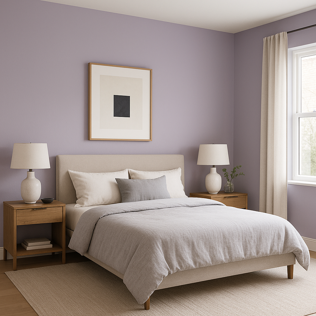
Crocus’s gentle lavender tone is ideal for bedrooms, creating a peaceful and restful atmosphere. Pair it with crisp white linens and soft gray accents for a calming sanctuary. For a more romantic vibe, incorporate blush pinks and metallic finishes like rose gold or brushed brass.
In bathrooms, Crocus can evoke a spa-like serenity. Pair it with marble countertops, white subway tiles, and chrome fixtures to create a luxurious yet soothing environment.
When used in living rooms, Crocus adds a touch of sophistication without overwhelming the space. It works beautifully as an accent wall color or as the primary wall shade in smaller areas. Add navy or dark gray furniture for contrast, or opt for pale neutrals to keep the look light and airy.
Crocus is a whimsical yet mature choice for children’s rooms. Its soft purple tone feels playful but can grow with your child over time. Pair it with pastel yellows, mint greens, or soft blues for a cheerful and inviting space.
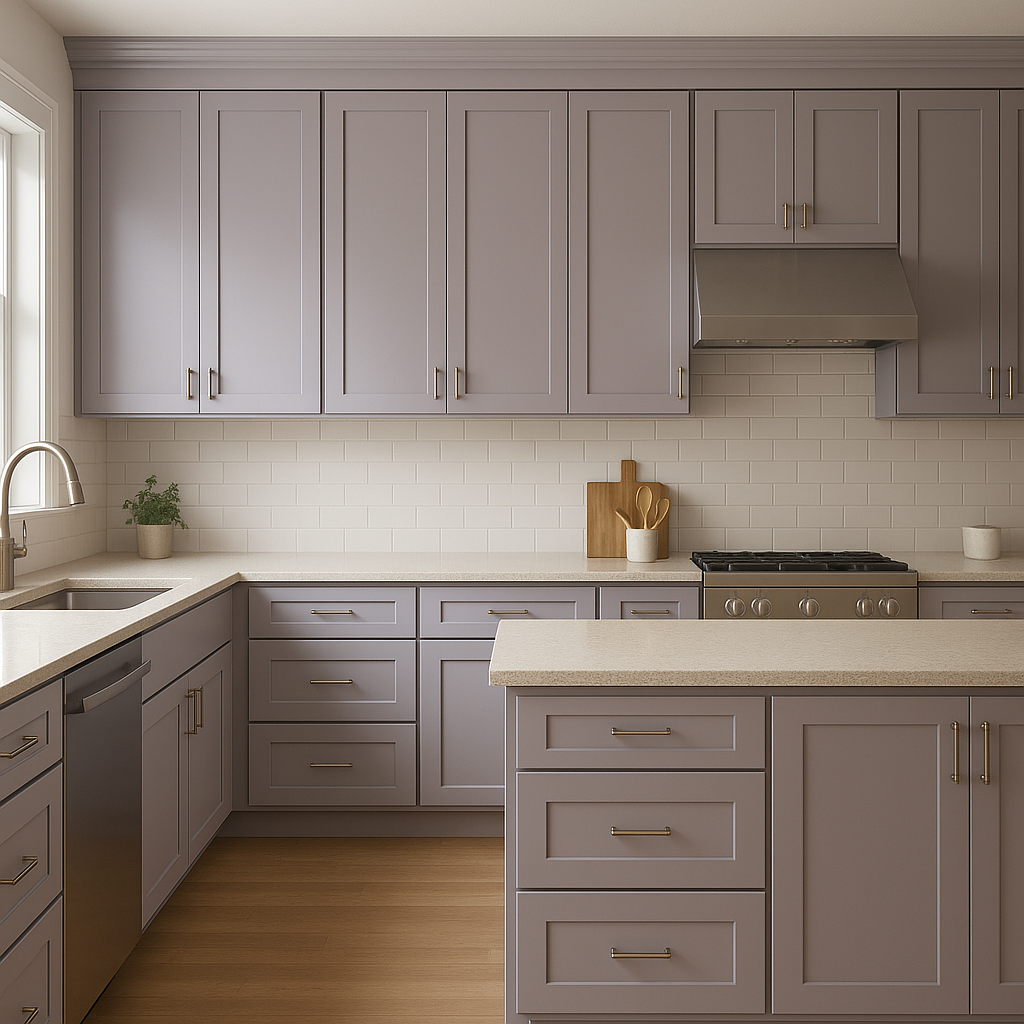
If you’re not ready to commit to Crocus on all your walls, consider using it as an accent. This shade works beautifully on built-in shelves, cabinets, or even painted furniture, adding a subtle pop of color to your design.
The appearance of Crocus can vary depending on your lighting. In natural light, its lavender tones are more pronounced, while artificial lighting can bring out its gray undertones. Use warm, soft lighting to highlight its cozy and inviting qualities or cool lighting to emphasize its modern elegance.
Benjamin Moore Crocus (1404) is an exceptional choice for those seeking a nuanced lavender that feels both sophisticated and adaptable. Whether you use it as the star of your palette or as a subtle accent, this hue is sure to elevate your design with its timeless charm and versatility.
View Colors Only by Brand (No Imagery):
Sherwin-Williams
|
Benjamin-Moore
|
Behr
|
Valspar
Live on the Eastern Slope of Colorado and looking for a local painting professional, check out all our painting services and reach out for a free estimate.
Copyright © 2026 : Wild Fox Painting Inc. : 12435 Mead Way, Littleton, CO 80125


