Benjamin Moore Purple (1413) is a sophisticated and rich color that strikes the perfect balance between boldness and subtlety. This grape-inspired shade exudes an air of opulence and creativity, making it a versatile choice for a variety of interior design styles. Whether you're aiming for a dramatic statement or a refined accent, Purple (1413) offers a depth that can elevate your space to new heights.
Purple (1413) is a medium-toned purple with cool undertones that lean slightly toward blue. These cool undertones bring a serene and calming quality to the color, making it ideal for spaces where relaxation is key. Despite its bold appearance, the blue undertones allow it to maintain a sense of softness, ensuring it doesn’t overpower the room but rather complements the overall design.
This color also has subtle gray influences, which lend it a muted elegance. These gray undertones help temper the vibrancy of the purple, making it versatile enough to pair with a wide range of colors and finishes. The result is a hue that feels modern and timeless simultaneously.
Pairing Purple (1413) with coordinating colors can create a harmonious and well-balanced palette tailored to your design goals. Here are some excellent options to consider:
Neutral Pairings
Bold Contrasts
Monochromatic Harmony
Purple (1413) is a versatile hue that works beautifully in various spaces and applications. Here are some ideas for incorporating this color into your home:
Use Purple (1413) as an accent wall in living rooms, bedrooms, or dining rooms to create a focal point that commands attention. Pair it with neutral furnishings and decor to let the color shine without overwhelming the space.
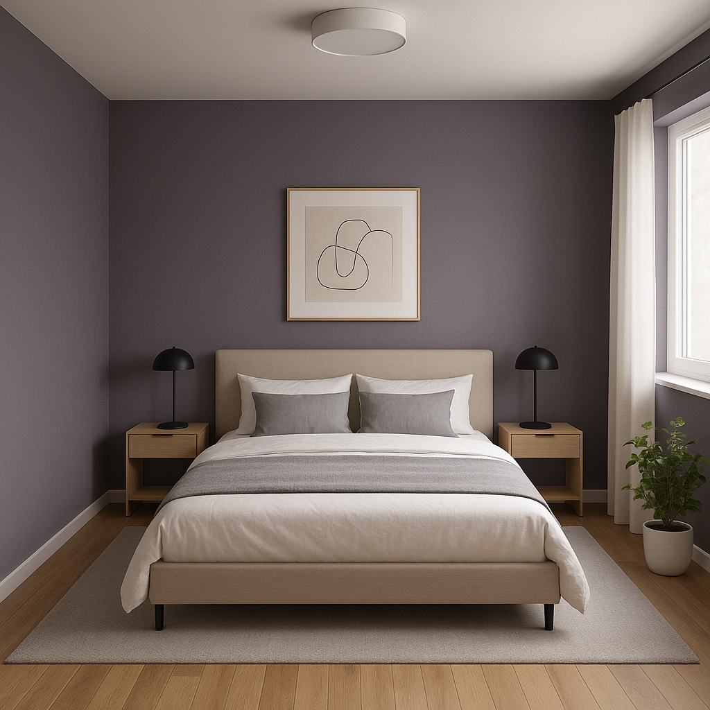
The cool undertones of Purple (1413) make it an excellent choice for bedrooms or relaxation spaces. It creates a tranquil yet luxurious atmosphere, perfect for unwinding after a long day. Pair it with soft, plush textiles like velvet or linen for added comfort.
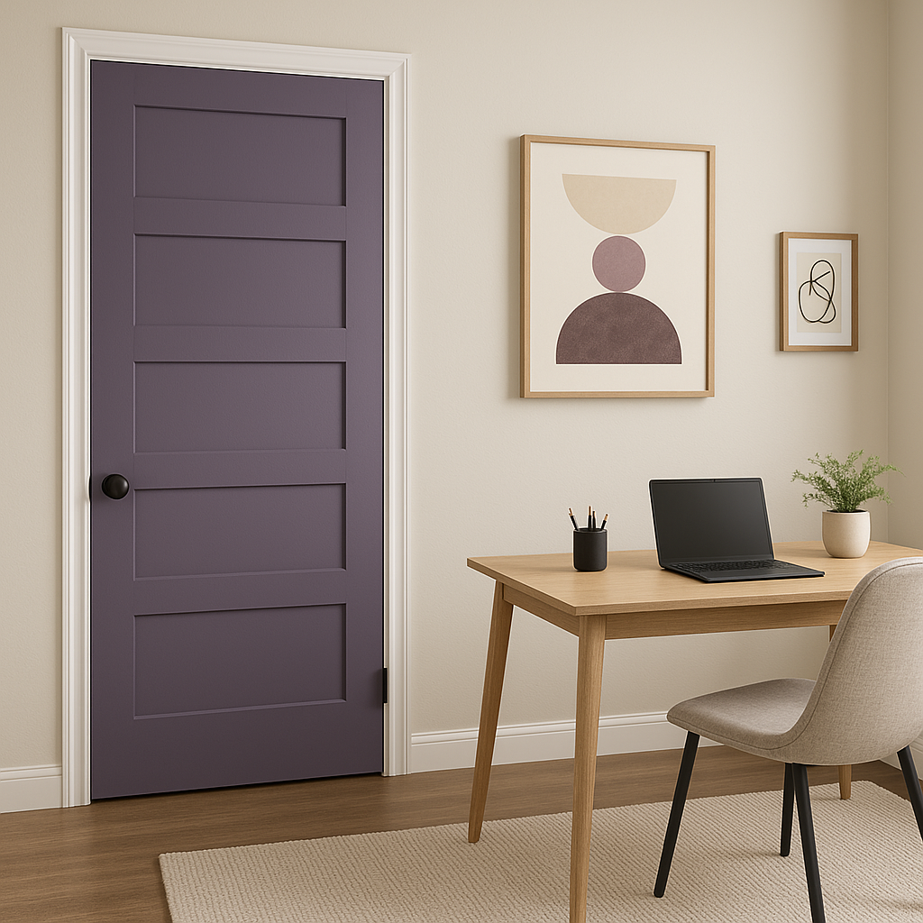
Purple is often associated with creativity and inspiration. Incorporating Purple (1413) into a home office or studio can stimulate imaginative thinking while maintaining a polished and professional look.
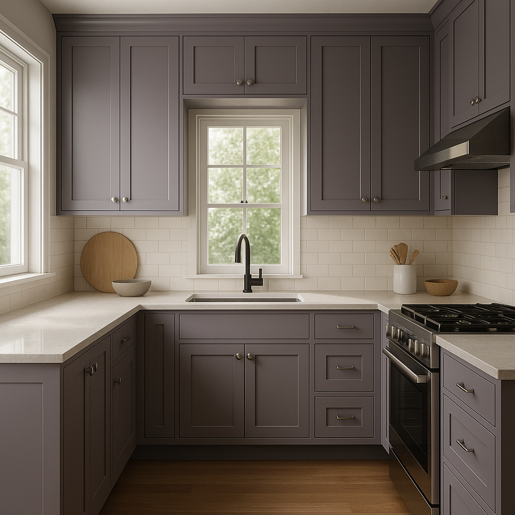
Elevate your bathroom design with Purple (1413) on walls or cabinetry. Its cool undertones pair beautifully with marble or ceramic finishes, adding a touch of spa-like elegance.
If committing to purple walls feels too bold, consider using Purple (1413) on smaller furnishings like chairs, side tables, or shelving. It also works well as an accent color in throw pillows, rugs, or artwork to tie the space together.
Benjamin Moore Purple (1413) is more than just a color—it’s a statement. Its rich, cool undertones and muted sophistication make it a versatile choice for both modern and traditional spaces. Whether you're designing a serene bedroom retreat or a bold living room centerpiece, this hue adapts effortlessly to your vision. Pair it with complementary colors, textures, and finishes to create a space that feels uniquely yours.
When used thoughtfully, Purple (1413) can transform any room into a masterpiece of design. Its depth and elegance ensure it will remain a timeless choice for years to come, giving your interiors a sense of personality and charm that’s hard to match.
View Colors Only by Brand (No Imagery):
Sherwin-Williams
|
Benjamin-Moore
|
Behr
|
Valspar
Live on the Eastern Slope of Colorado and looking for a local painting professional, check out all our painting services and reach out for a free estimate.
Copyright © 2026 : Wild Fox Painting Inc. : 12435 Mead Way, Littleton, CO 80125


