Benjamin Moore Softened (1420) is a timeless and tranquil paint color that embodies the perfect balance between warmth and coolness. This soft, muted neutral carries an understated elegance, making it an ideal choice for creating a peaceful atmosphere in any space. Whether you’re designing a modern sanctuary or a classic haven, Softened’s versatility ensures it can seamlessly complement a wide range of interior styles.
Softened (1420) is a light gray-beige with subtle taupe undertones. These delicate undertones make it feel warm without appearing overly yellow or brown. Its sophisticated neutrality leans slightly toward greige, a hybrid of gray and beige, giving it a contemporary edge. Depending on the lighting, Softened can shift in tone—appearing cooler in spaces with abundant natural light and warmer in dimmer environments. This dynamic quality makes it a favorite among interior designers for spaces that demand adaptability.
Softened pairs beautifully with a variety of color palettes, thanks to its neutral foundation. Here are some coordinating colors that work harmoniously with Softened:
These carefully curated colors ensure flexibility, whether you’re looking to create a monochromatic scheme or introduce contrast with deeper hues.
The understated elegance of Softened makes it a versatile choice for both residential and commercial interiors. Here are some ideas for incorporating this color into your spaces:
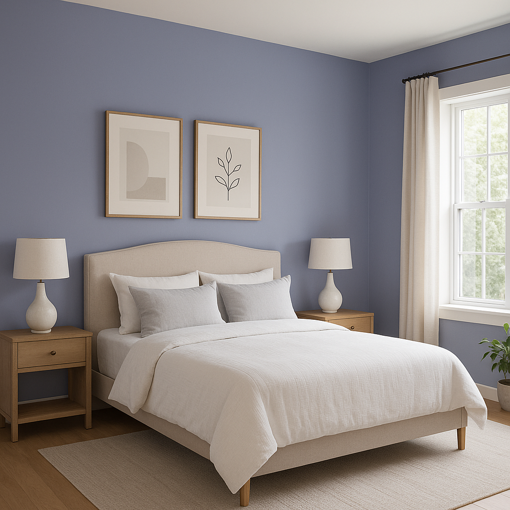
Softened serves as an excellent backdrop for living rooms and bedrooms, creating a soothing and restful environment. Pair it with plush textiles like velvet or linen in coordinating hues for a cozy yet chic look. Incorporate metallic finishes like brushed gold or silver for added sophistication.
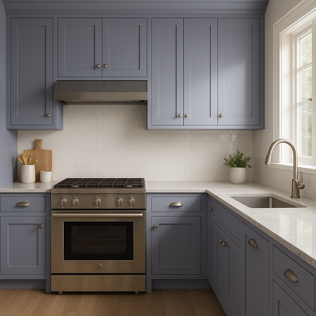
In kitchens and dining areas, Softened shines when paired with crisp white cabinetry or natural wood accents. Its neutral tone allows you to experiment with bold accessories, such as colorful dishware or statement lighting. Use it on walls for a cohesive, polished appearance or as a subtle backdrop for open shelving.
Softened’s calming taupe undertones make it a perfect choice for bathrooms. Pair it with marble countertops, chrome fixtures, and soft white towels to achieve a spa-like retreat. For a bolder look, add patterned tiles in coordinating colors like gray or blue.
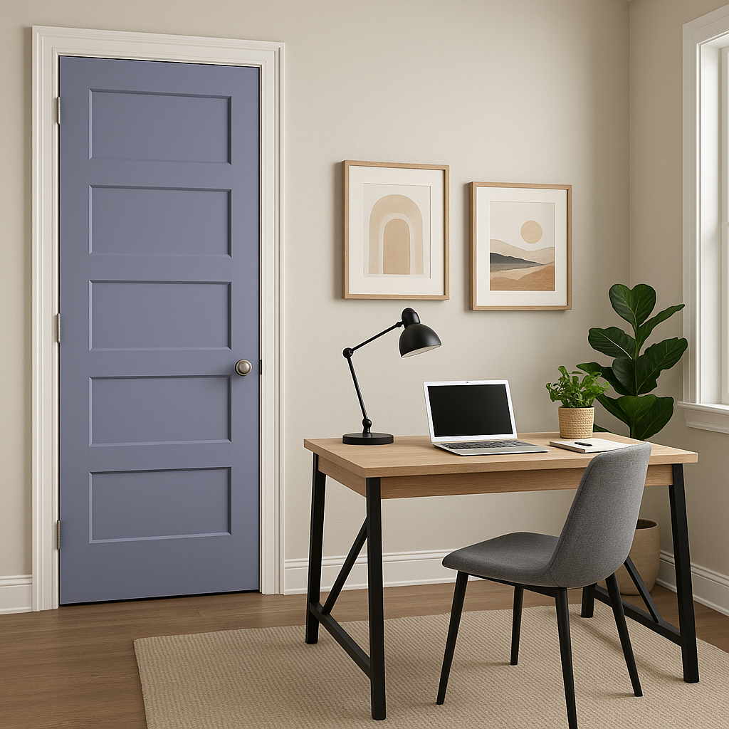
Create a tranquil and productive workspace by using Softened on home office walls. Its neutral tone helps reduce distractions while maintaining a fresh and elegant aesthetic. Pair it with contrasting darker furniture pieces or natural wood finishes for balance.
Softened works beautifully in transitional spaces like hallways and entryways. Its muted quality ensures it won’t overpower the flow of your home, while its taupe undertones add warmth and invitation to these often-overlooked areas.
Softened (1420) is the epitome of understated sophistication. It adapts effortlessly to various design styles, from contemporary to traditional, and works equally well in urban apartments and sprawling suburban homes. Its ability to shift in tone with lighting ensures it feels fresh and dynamic throughout the day. Whether you’re looking to unify your color palette or create a serene focal point, Softened is a versatile choice that will elevate your interiors.
Drafting this neutral into your design scheme allows you to embrace its serene charm, creating spaces that feel welcoming and effortlessly refined.
View Colors Only by Brand (No Imagery):
Sherwin-Williams
|
Benjamin-Moore
|
Behr
|
Valspar
Live on the Eastern Slope of Colorado and looking for a local painting professional, check out all our painting services and reach out for a free estimate.
Copyright © 2026 : Wild Fox Painting Inc. : 12435 Mead Way, Littleton, CO 80125


