Benjamin Moore Queen’s (1426) is a refined gray that exudes elegance and versatility, making it an exceptional choice for a variety of interior design styles. This mid-tone gray strikes a harmonious balance between warm and cool hues, offering a subtle softness that feels both timeless and inviting. Whether you're looking to create a serene retreat or a sophisticated backdrop for your décor, Queen’s delivers with understated charm.
One of the defining characteristics of Benjamin Moore Queen’s is its warm undertones. Unlike cooler, steely grays, Queen’s carries a hint of beige or greige, which softens the hue and makes it feel more approachable. These warm undertones help the color adapt beautifully to different lighting conditions, whether natural or artificial. In spaces with ample sunlight, the warmth becomes more pronounced, creating an airy and welcoming ambiance. Under dim lighting, the gray takes on a richer, cozier feel.
Queen’s pairs effortlessly with a wide range of colors, thanks to its neutral yet sophisticated nature. Here are some excellent coordinating colors:
Thanks to its adaptability, Benjamin Moore Queen’s can be used in nearly any room of the house, whether as a primary wall color or an accent shade. Here are some ways to incorporate this sophisticated gray into your home:
Queen’s provides a neutral yet stylish backdrop for living spaces, allowing furniture, art, and décor to stand out. Pair it with plush textiles and warm wood finishes for a cozy yet polished look.
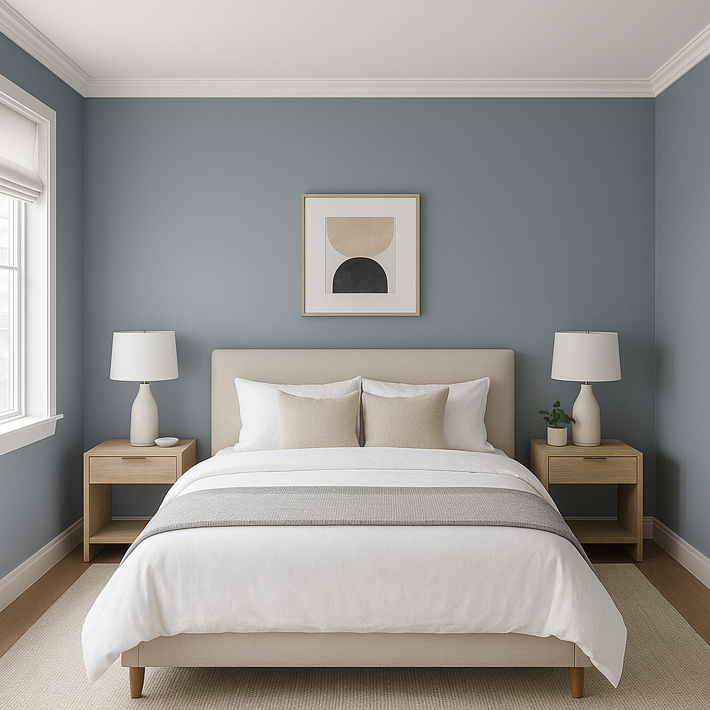
In bedrooms, Queen’s fosters a calm and soothing environment. Complement with soft, neutral bedding and subtle pops of color for a serene retreat that feels grounded and restful.
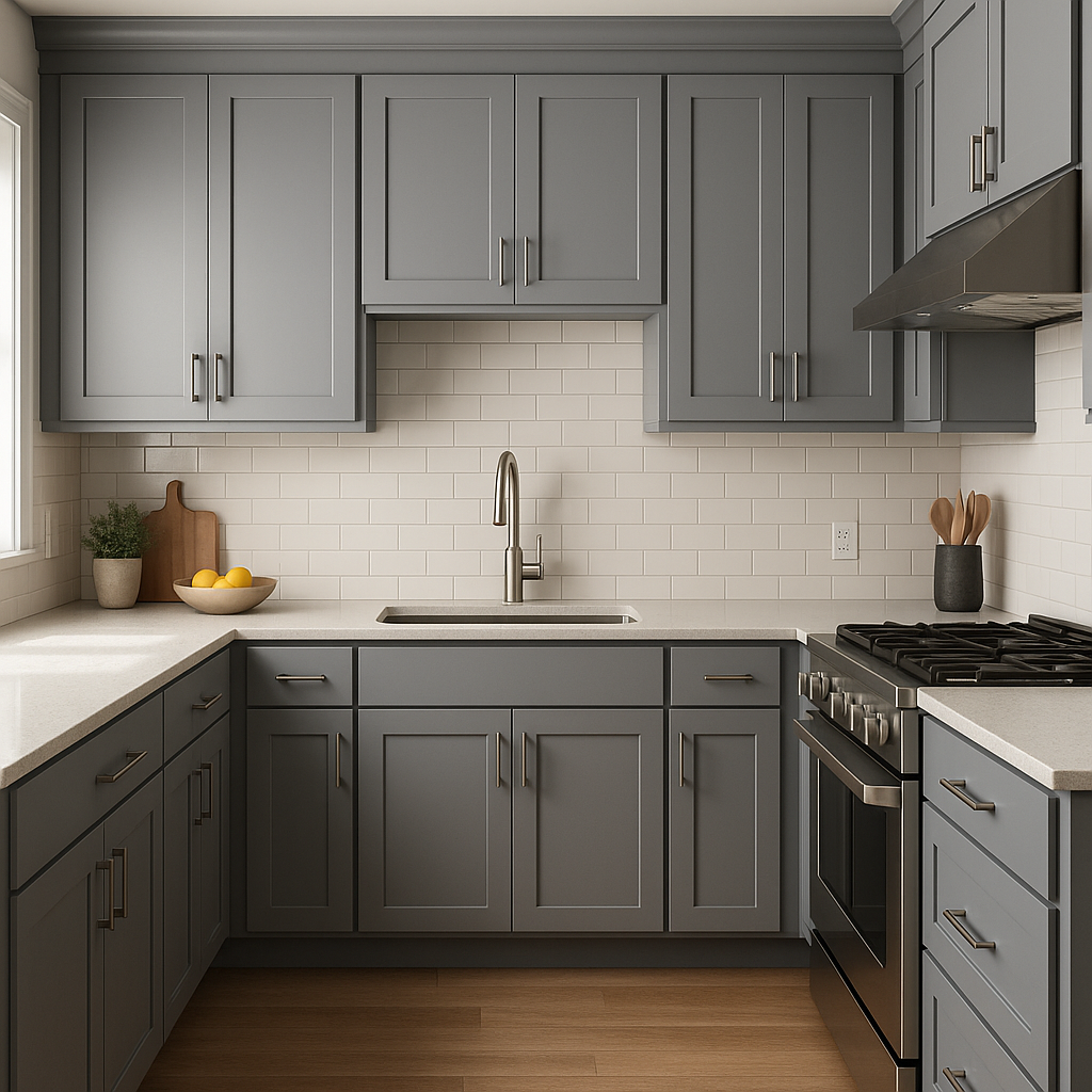
This shade works beautifully in kitchens and dining spaces, especially when paired with white cabinetry or warm wood tones. Its neutral quality makes it ideal for spaces where family and friends gather.
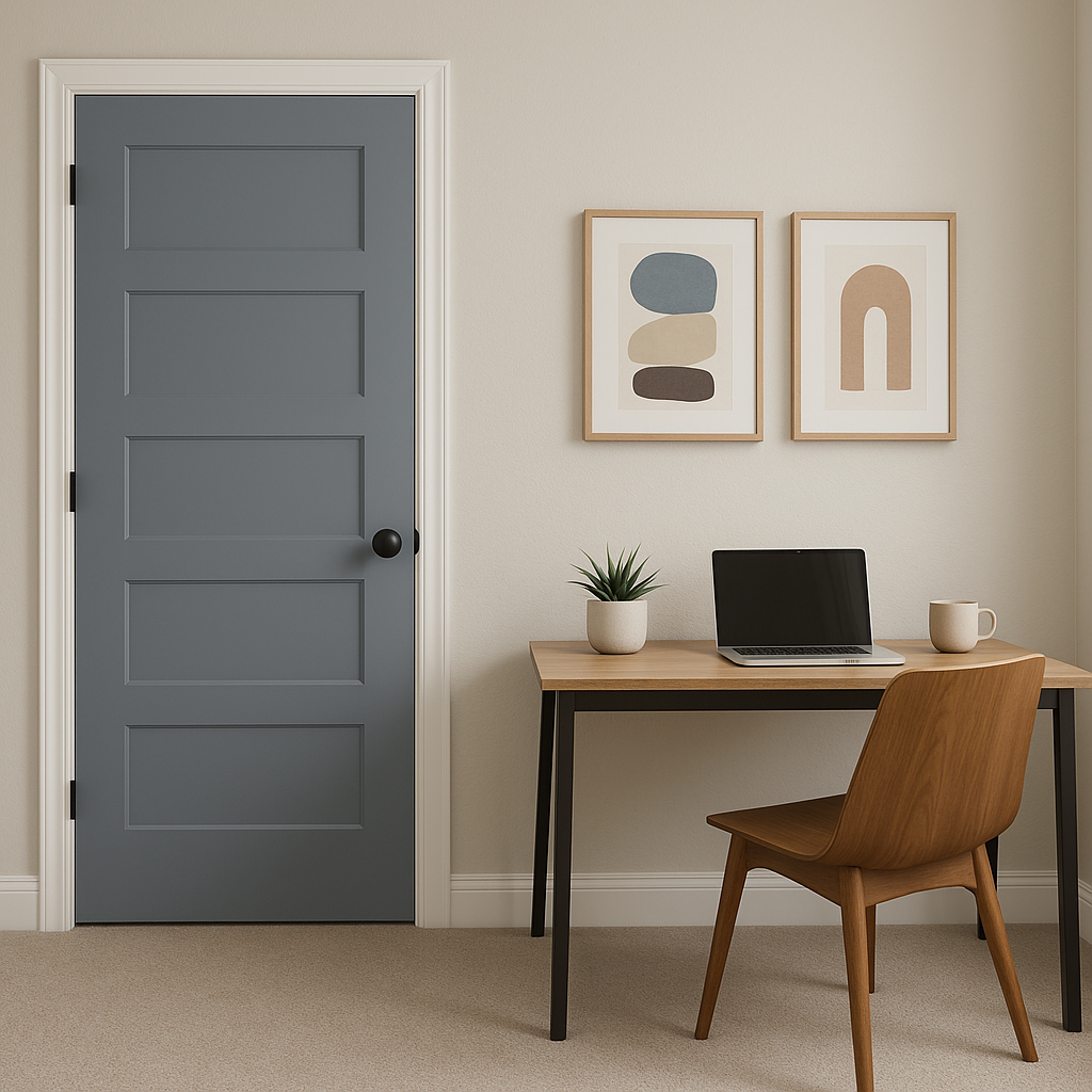
For a productive yet calming workspace, Queen’s balances focus and comfort. Pair it with clean-lined furniture and metallic accents for a professional, polished aesthetic.
Bring a spa-like quality to bathrooms by using Queen’s on walls or cabinetry. Pair it with polished nickel hardware and crisp white tiles for a timeless, serene design.
If you’re looking to make a subtle statement, use Queen’s on a feature wall. Pair it with lighter grays or whites in the surrounding space to create depth and visual interest.
As with any paint color, lighting plays a crucial role in how Queen’s appears in your space. Its warm undertones shine in rooms with natural light, while under cooler artificial lighting, it leans more toward a neutral gray. Test swatches in different areas of your home to ensure it complements your specific lighting conditions.
Benjamin Moore Queen’s (1426) is a versatile and sophisticated gray that offers endless possibilities for creating stylish and timeless interiors. Its warm undertones, compatibility with a range of coordinating colors, and adaptability to different spaces make it a go-to choice for homeowners and designers alike. Whether you're revamping a living room, adding elegance to a bedroom, or creating a serene bathroom, Queen’s is a color that truly stands the test of time.
View Colors Only by Brand (No Imagery):
Sherwin-Williams
|
Benjamin-Moore
|
Behr
|
Valspar
Live on the Eastern Slope of Colorado and looking for a local painting professional, check out all our painting services and reach out for a free estimate.
Copyright © 2026 : Wild Fox Painting Inc. : 12435 Mead Way, Littleton, CO 80125


