Benjamin Moore Wood (1428) is an understated yet versatile neutral that effortlessly bridges the gap between warm and cool tones. This medium greige (gray-beige) hue is a designer's dream, offering a sense of refined elegance while still being incredibly approachable. With its muted charm and balanced undertones, Wood (1428) can transform any space into a serene retreat or a stylish setting, depending on how it's paired and applied.
One of the standout features of Wood (1428) is its subtle undertones. This shade leans slightly warm due to its beige base but is tempered by cool gray influences. The result is an impeccably balanced greige that feels grounded yet airy. While it doesn’t lean heavily into yellow or pink tones, it can reveal faint taupe or earthy undertones depending on the lighting and surrounding decor. This chameleon-like quality makes it adaptable to both modern and traditional interiors.
In spaces with abundant natural light, Benjamin Moore Wood (1428) can appear slightly warmer, showcasing its beige character. Conversely, in areas with cooler artificial lighting or limited sunlight, its gray undertones may take center stage, creating a more subdued and contemporary look. This versatility ensures it performs beautifully in nearly any room or lighting condition.
Benjamin Moore Wood (1428) is a flexible neutral that works seamlessly with a variety of color palettes. Here are some recommended coordinating colors to inspire your design:
Benjamin Moore Wood (1428) is a versatile shade that shines in a variety of applications. Whether you're designing a cozy living room, a serene bedroom, or a stylish office, this neutral can adapt beautifully to your needs. Here are some ideas for incorporating it into your space:
Wood (1428) is the perfect backdrop for living spaces where comfort and sophistication are key. Pair it with plush furniture in warm tones or sleek metallic accents for a balanced aesthetic. Add texture through rugs, throws, and curtains to create a welcoming atmosphere.
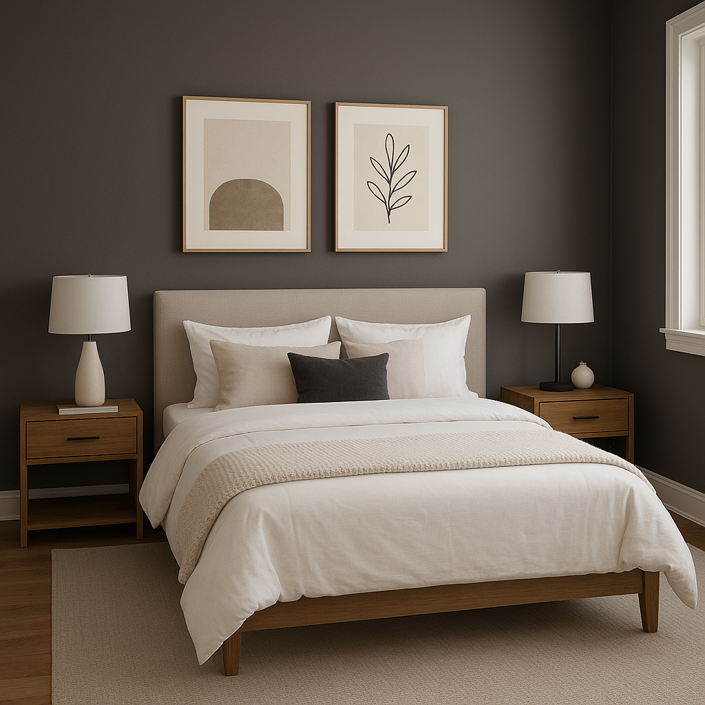
In bedrooms, Wood (1428) evokes a sense of calm and relaxation. Combine it with creamy whites, soft blues, or muted greens for a tranquil retreat. Use it on the walls to create a cocoon-like effect or as an accent to complement lighter tones.
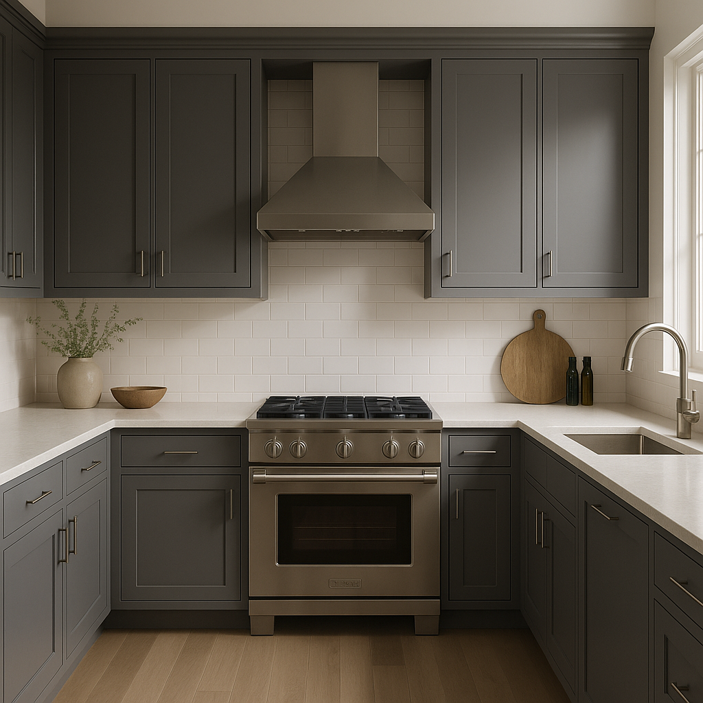
This greige shade works wonderfully in kitchens and dining areas, where timeless elegance is desired. Pair it with white cabinetry and warm wood finishes for a classic look, or incorporate matte black fixtures for a modern edge.
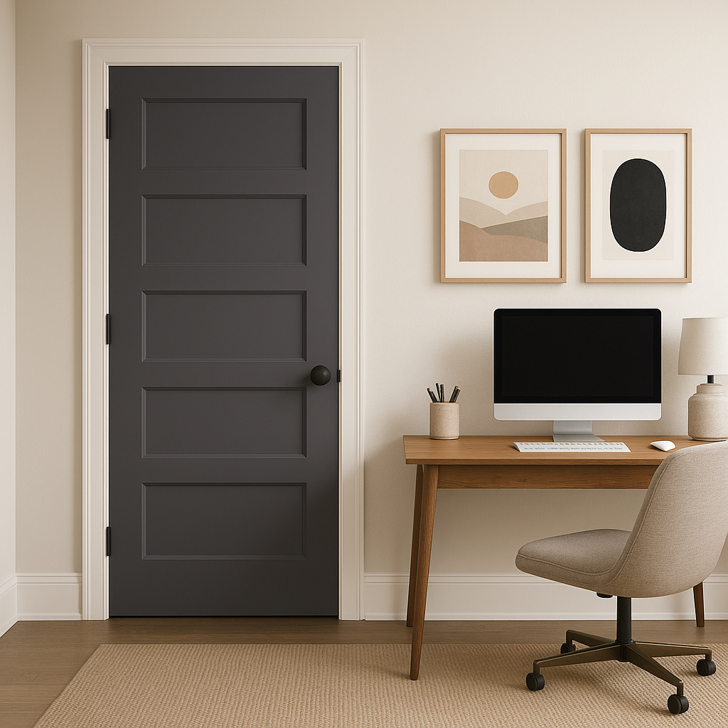
For home offices, Wood (1428) fosters focus and productivity. It’s neutral enough to avoid distraction while still providing a sense of warmth. Pair it with natural wood furniture and pops of greenery for a serene yet functional workspace.
Not just limited to interiors, Wood (1428) is a fantastic choice for exteriors as well. Its balanced undertones make it ideal for siding, shutters, or trim. Pair it with crisp whites or deep charcoals for curb appeal that feels both contemporary and timeless.
Benjamin Moore Wood (1428) offers a harmonious blend of warmth and coolness, making it one of the most versatile neutrals in the Benjamin Moore collection. Its understated elegance allows it to complement a wide range of decor styles, from modern minimalism to rustic charm. Whether used as a main wall color, an accent, or even a backdrop for bold art pieces, Wood (1428) brings a subtle sophistication that makes any space feel curated and refined.
This timeless greige is a favorite among interior designers for good reason—it’s adaptable, elegant, and endlessly versatile. When paired with thoughtfully chosen coordinating colors, Benjamin Moore Wood (1428) can elevate your home into a space that feels effortlessly stylish yet warmly inviting.
View Colors Only by Brand (No Imagery):
Sherwin-Williams
|
Benjamin-Moore
|
Behr
|
Valspar
Live on the Eastern Slope of Colorado and looking for a local painting professional, check out all our painting services and reach out for a free estimate.
Copyright © 2026 : Wild Fox Painting Inc. : 12435 Mead Way, Littleton, CO 80125


