Benjamin Moore Freesia (1432) is a timeless and versatile paint color that offers a sophisticated neutral with subtle, warm undertones. This elegant shade is a soft taupe with hints of beige and gray, making it a perfect choice for creating a cozy and inviting atmosphere without being overly bold or dramatic. Its balanced warmth ensures it complements a wide variety of design styles, from traditional to contemporary, while its understated charm allows it to work beautifully in both residential and commercial spaces.
The magic of Benjamin Moore Freesia lies in its nuanced undertones. At first glance, it appears as a classic taupe, but upon closer inspection, you'll notice delicate hints of beige and gray. These warm undertones give Freesia a grounded, earthy feel that adds depth and dimension to any space. Unlike cooler grays, Freesia brings a touch of warmth, making it ideal for rooms that need a sense of comfort and softness. It avoids leaning too yellow or too pink, remaining firmly in the realm of neutrality, which makes it exceptionally versatile.
Benjamin Moore Freesia pairs seamlessly with a range of coordinating colors, enabling you to craft a cohesive and sophisticated palette.
Benjamin Moore Freesia is a neutral powerhouse that can be used in nearly any space, thanks to its adaptable undertones and timeless appeal.
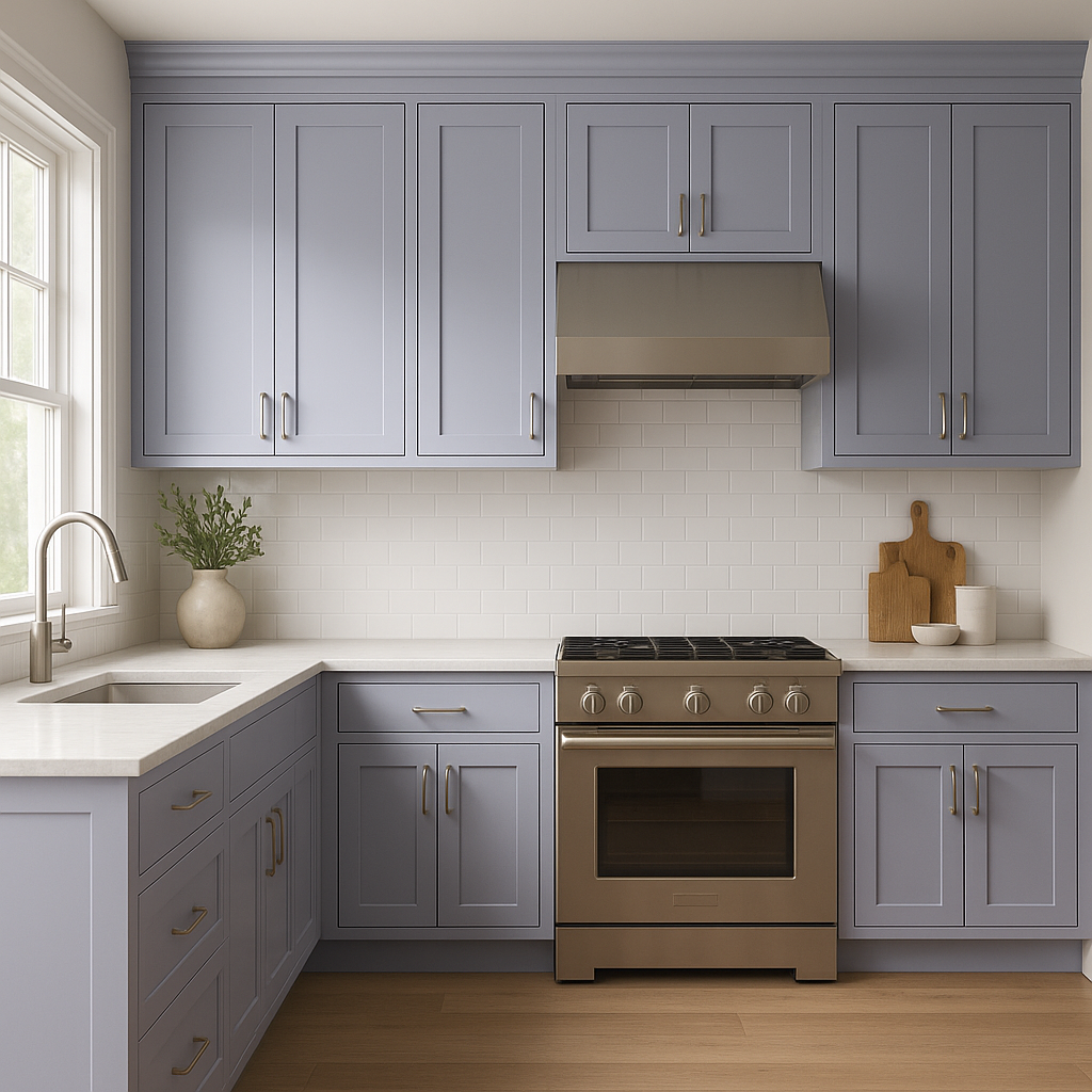
Freesia is an excellent choice for living rooms where comfort and sophistication are key. Pair it with plush furniture, textured throw pillows, and warm wood accents to create a space that feels inviting yet refined.
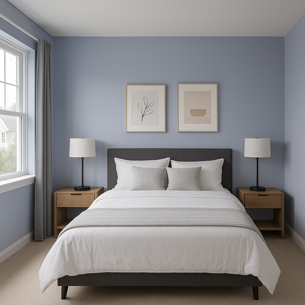
The soft warmth of Freesia makes it ideal for bedrooms, promoting relaxation and tranquility. Combine it with crisp white bedding, soft blush accents, or muted greens for a serene sanctuary.
For dining rooms, Freesia's understated elegance lends itself to creating an intimate atmosphere. Pair it with rich wood furniture and metallic lighting fixtures for a polished and welcoming space.
Make a lasting first impression by using Freesia in your entryway. Its neutral tone provides a warm and inviting backdrop for artwork, mirrors, or bold accent pieces.
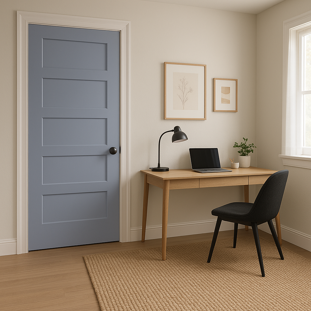
Freesia is a perfect choice for home offices or workspaces, where it fosters productivity while maintaining a calm and balanced atmosphere. Pair it with clean white trim and sleek furniture for a modern yet approachable look.
Give bathrooms a spa-like feel by using Freesia alongside soft whites, natural stone accents, and brushed nickel fixtures. Its warm undertones evoke a sense of relaxation and subtle luxury.
Benjamin Moore Freesia (1432) stands out as a neutral that delivers both warmth and sophistication. Its subtle beige-gray undertones make it a versatile choice that can adapt to a variety of lighting conditions and interior design styles. Whether you’re aiming for a cozy retreat, a polished professional space, or an inviting communal area, Freesia provides the perfect foundation for creating a harmonious color palette.
This shade is not just a paint color—it’s a design tool that helps transform spaces into reflections of comfort and elegance. Whether paired with deep wood tones, soft pastels, or crisp whites, Freesia is sure to elevate any interior, making it an indispensable choice for homeowners and designers alike.
View Colors Only by Brand (No Imagery):
Sherwin-Williams
|
Benjamin-Moore
|
Behr
|
Valspar
Live on the Eastern Slope of Colorado and looking for a local painting professional, check out all our painting services and reach out for a free estimate.
Copyright © 2026 : Wild Fox Painting Inc. : 12435 Mead Way, Littleton, CO 80125


