Benjamin Moore Lavender (1438) is a soft, elegant hue that captures the essence of subtle sophistication. With its delicate balance of violet and gray, this timeless shade exudes a sense of calm while maintaining a contemporary edge. Whether you're looking to create a serene bedroom sanctuary, a polished living room, or an inviting accent wall, Lavender (1438) offers versatility and charm in equal measure.
The beauty of Benjamin Moore Lavender lies in its nuanced undertones. While its primary identity is rooted in soft violet, it also carries a whisper of cool gray. This gray undertone tempers the purple, preventing it from feeling overly sweet or overwhelming. At the same time, subtle hints of warmth ensure it doesn’t feel too cold or sterile, making it an adaptable color for a variety of spaces. Depending on the lighting, you may notice this shade leaning slightly more toward a muted lavender or a grayish-purple tone, which adds to its dynamic appeal.
When designing a cohesive interior, pairing Benjamin Moore Lavender with complementary colors can elevate the overall aesthetic. Here are a few color suggestions to help you create a harmonious palette:
Neutral Partners:
Accent Colors:
Earthy Complements:
These coordinating colors offer endless possibilities, allowing you to adapt Lavender (1438) to both traditional and modern design schemes.
Benjamin Moore Lavender is a versatile shade that works well in a variety of applications and spaces. Here are some ideas to inspire its use in your home:
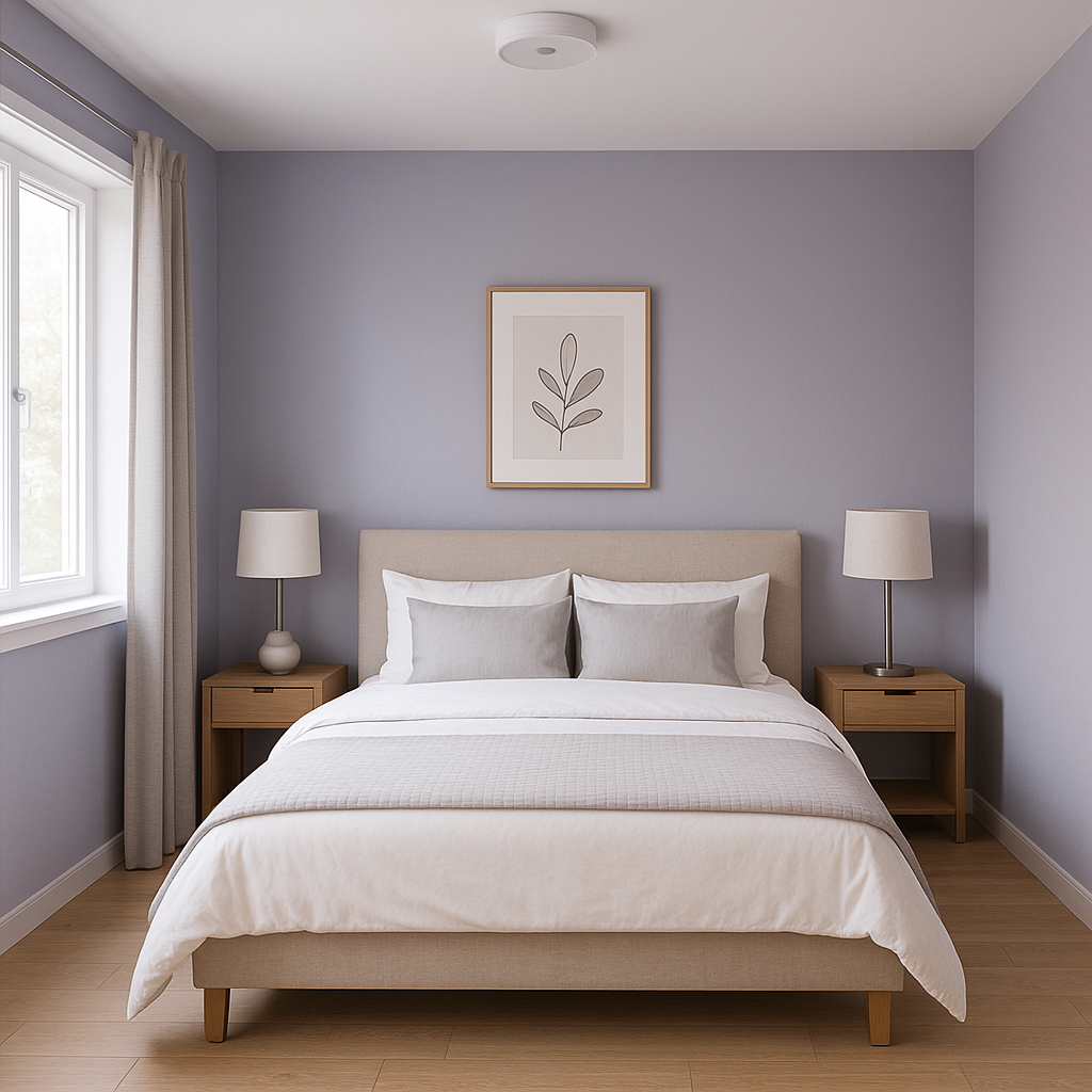
Lavender is inherently soothing, making it an ideal choice for bedrooms. Its tranquil quality invites rest and relaxation, and when paired with soft whites or muted grays, it creates a spa-like atmosphere. Layer the room with plush textiles, such as linen bedding and velvet throw pillows, to amplify the sense of luxury.
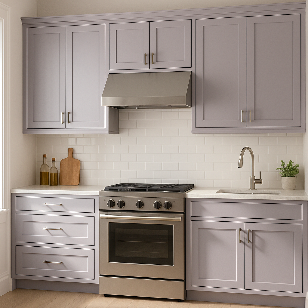
For living spaces, Lavender adds a refined touch without dominating the room. Use it on walls to create a polished backdrop for neutral furniture, or incorporate it as an accent color through decorative elements like throw blankets, curtains, or area rugs.
Transform your bathroom into a serene, spa-inspired oasis with Lavender. This shade pairs beautifully with white subway tiles, marble countertops, and silver or chrome fixtures to create a clean, modern aesthetic. Add greenery or lavender-scented candles to enhance the relaxing vibe.
Lavender offers a refreshing alternative to traditional pink or blue for a nursery. Its soft, muted tone feels nurturing and calming, making it ideal for creating a peaceful environment for your little one.
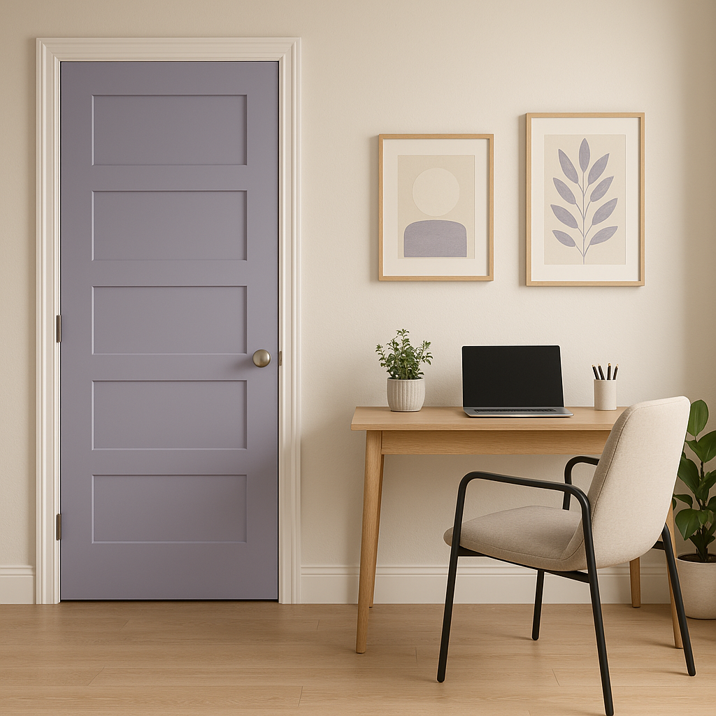
If you prefer a more understated approach, try using Lavender as an accent color. Paint a single wall in this hue to make it a subtle focal point, or apply it to furniture pieces such as a dresser or bookshelf to introduce a pop of personality into your space.
Lighting can dramatically impact how Benjamin Moore Lavender appears in your space. In natural daylight, the color reads soft and airy, with its violet undertones shining through. In spaces with warm, incandescent lighting, the gray undertones may appear more pronounced, lending the color a cozy, enveloping quality. To ensure you love how it looks in your room, test a sample in different areas and observe it throughout the day.
Benjamin Moore Lavender (1438) is more than just a paint color—it's an invitation to create serene, stylish spaces that feel effortlessly elegant. With its balanced undertones, complementary pairing options, and versatility across a range of applications, this shade is a timeless choice for homeowners and interior designers alike. Whether you're refreshing a single room or revamping your entire home, Lavender (1438) has the potential to inspire and elevate your design vision.
View Colors Only by Brand (No Imagery):
Sherwin-Williams
|
Benjamin-Moore
|
Behr
|
Valspar
Live on the Eastern Slope of Colorado and looking for a local painting professional, check out all our painting services and reach out for a free estimate.
Copyright © 2026 : Wild Fox Painting Inc. : 12435 Mead Way, Littleton, CO 80125


