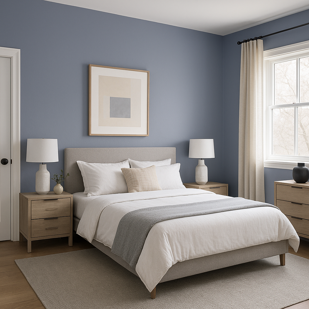
Benjamin Moore Irises 1440 is a timeless, sophisticated shade that brings a sense of calm and refinement to any space. This soft, muted blue with a touch of gray evokes the delicate beauty of irises in bloom, creating a serene and tranquil atmosphere. Whether you're looking to create a soothing retreat or add an understated elegance to your home, Irises 1440 is a versatile choice that complements a variety of styles and spaces.
Benjamin Moore Irises 1440 is a blue-gray shade that leans slightly towards a cooler palette. Its gray undertones soften the blue, making it less saturated and more restrained, which contributes to its sophisticated appeal. The subtle gray also helps the color adapt to different lighting conditions. In natural light, Irises 1440 appears more airy and fresh, while in artificial or dim lighting, the gray undertones take center stage, giving it a more subdued, moody quality.
Irises 1440 pairs beautifully with a variety of coordinating colors, allowing you to create a cohesive and balanced design. Here are some complementary shades and combinations to consider:
Neutrals: For a classic and understated look, pair Irises 1440 with soft neutrals like Benjamin Moore White Dove (OC-17) or Simply White (OC-117). These creamy whites enhance the cool undertones of Irises 1440 while providing a crisp and clean contrast.
Deep Contrast: Add drama with a bold, dark accent color like Benjamin Moore Kendall Charcoal (HC-166) or Hale Navy (HC-154). These deeper shades create a striking contrast while maintaining a cohesive cool-toned palette.
Earthy Greens: To bring in an organic and nature-inspired feel, consider pairing Irises 1440 with muted greens like Saybrook Sage (HC-114) or Soft Fern (2144-40). These tones add warmth and depth to the overall scheme.
Warm Accents: For a touch of warmth and balance, add muted warm tones like Palladian Blue (HC-144) or Edgecomb Gray (HC-173). These shades soften the cool nature of Irises 1440 and work seamlessly in transitional spaces.
Irises 1440 is a versatile color that works well in a variety of spaces. Its calming qualities make it particularly suited for areas where relaxation and comfort are priorities. Here are some ideas for incorporating this color into your home:
Bedrooms: Create a restful retreat by using Irises 1440 as the primary wall color. Pair it with soft white bedding, natural wood accents, and layered textures for a cozy, serene atmosphere.
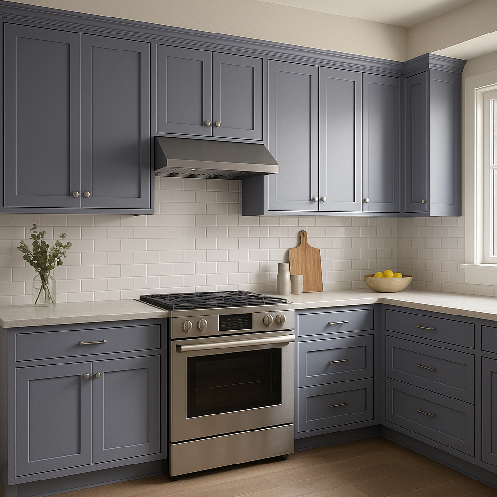
Bathrooms: The cool, spa-like quality of Irises 1440 makes it a perfect choice for bathrooms. Use it on walls or cabinetry and pair it with marble countertops and silver fixtures for a luxurious, tranquil feel.
Living Rooms: For a sophisticated living room, combine Irises 1440 with plush gray or navy furniture, metallic accents, and layered lighting. Its understated elegance provides a perfect backdrop for modern or traditional designs.
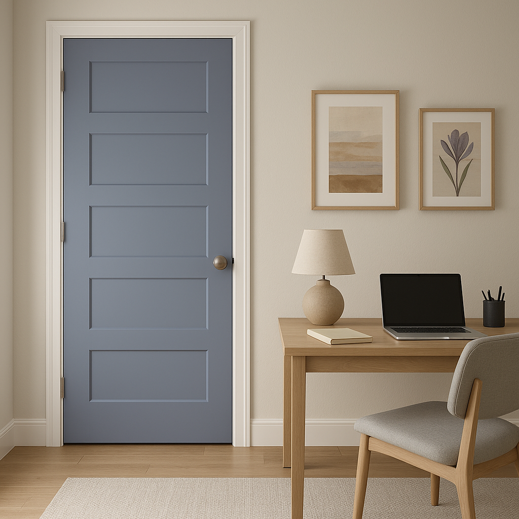
Home Offices: Enhance focus and productivity by painting your home office in this serene blue-gray. Combine it with streamlined furniture and minimalist décor for a clean and calming workspace.
Accent Walls: If you’re not ready to commit to a full room of Irises 1440, use it as an accent wall color. It pairs beautifully with lighter neutrals and adds depth without overwhelming the space.
Lighting plays a crucial role in how Irises 1440 appears in your home. In rooms with ample natural light, the blue tones will feel fresh and invigorating,
View Colors Only by Brand (No Imagery):
Sherwin-Williams
|
Benjamin-Moore
|
Behr
|
Valspar
Live on the Eastern Slope of Colorado and looking for a local painting professional, check out all our painting services and reach out for a free estimate.
Copyright © 2026 : Wild Fox Painting Inc. : 12435 Mead Way, Littleton, CO 80125


