Benjamin Moore Frozen (1448) is an understated yet sophisticated gray that embodies timeless elegance and modern versatility. This color is part of the Classic Color Collection, celebrated for its ability to complement a wide range of interior design styles, from minimalist modern and industrial chic to cozy farmhouse and transitional spaces. With its cool undertones and soft appearance, Frozen creates an inviting and tranquil atmosphere, making it a popular choice for homeowners and designers alike.
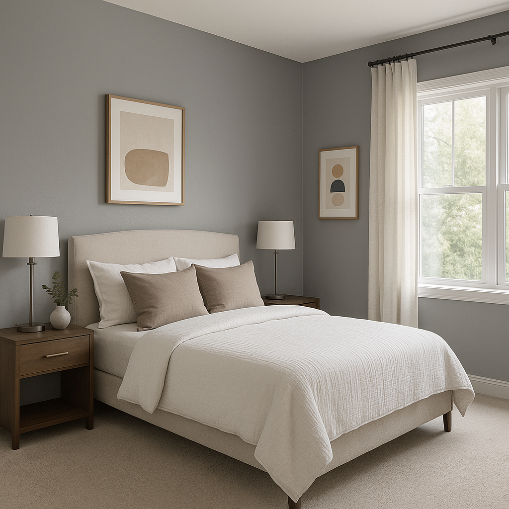
Frozen (1448) is a cool-toned gray with subtle blue undertones that give it a refreshing and crisp character. These undertones add depth to the color, making it feel airy and serene without appearing overly cold or stark. The blue undertones lend themselves beautifully to spaces where you want to evoke a sense of calm, such as bedrooms, bathrooms, or reading nooks.
Its balanced blend of gray and blue makes Frozen a versatile neutral that can shift slightly depending on the surrounding lighting. In spaces with ample natural light, the blue undertones are more pronounced, while in dimmer settings, the gray base takes center stage, offering a more grounded and muted look.
Benjamin Moore Frozen pairs effortlessly with a wide variety of colors, thanks to its adaptable undertones and neutral base. Here are some coordinating color suggestions to create cohesive and aesthetically pleasing palettes:
Frozen works beautifully with clean whites such as Chantilly Lace (OC-65) or White Dove (OC-17). These whites enhance the crispness of Frozen, creating a fresh and modern atmosphere that feels open and airy.
To amplify the subtle blue undertones, pair Frozen with soft blues like Breath of Fresh Air (806) or Ocean Air (2123-50). This combination is perfect for coastal-inspired spaces or rooms where you want a soothing and harmonious vibe.
For a nature-inspired palette, consider pairing Frozen with muted greens like Silver Sage (506) or Hazy Skies (OC-48). These shades bring out the cool tones of Frozen while adding a touch of organic warmth to the space.
For a more dramatic look, pair Frozen with deeper, darker colors such as Kendall Charcoal (HC-166) or Hale Navy (HC-154). This sophisticated pairing works well in offices, dining rooms, or accent walls.
To add a hint of warmth, complement Frozen with beige or taupe shades like Edgecomb Gray (HC-173) or Revere Pewter (HC-172). This pairing softens the cool tones and creates a balanced, inviting space.
Frozen is an excellent choice for living rooms where you want to create a calming yet contemporary ambiance. Pair it with plush furnishings, textured throws, and metallic accents for a high-end look.
The tranquil nature of Frozen makes it ideal for bedrooms. Combine it with soft linens, natural wood furniture, and subtle patterns to craft a serene retreat.
Frozen’s cool undertones shine in bathrooms, especially when paired with crisp white tiles, chrome fixtures, and airy accessories. It evokes a spa-like feel that is both clean and rejuvenating.
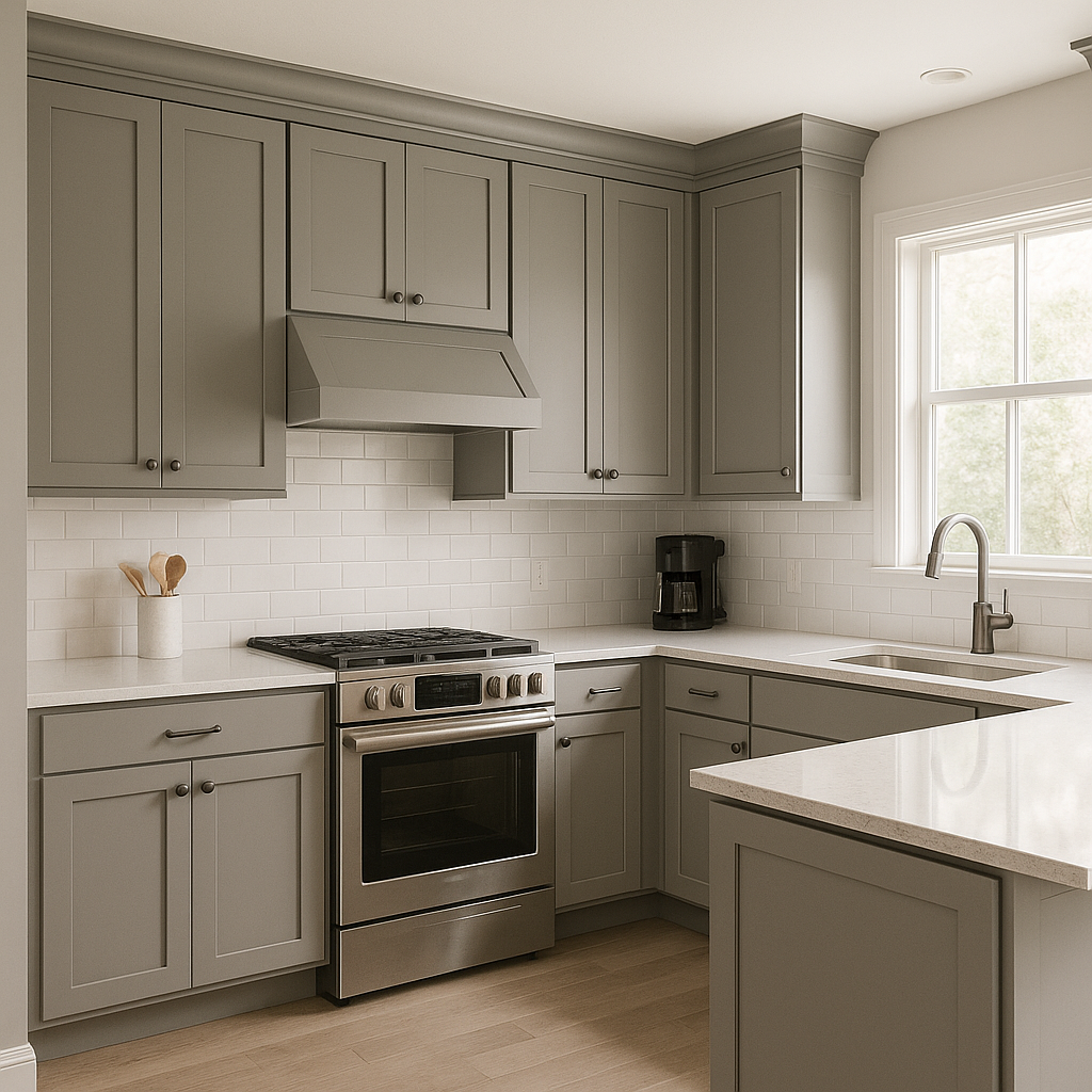
For kitchens, Frozen works well on cabinetry or walls, adding sophistication without overpowering the space. Pair it with marble countertops and brushed nickel hardware for a polished aesthetic.
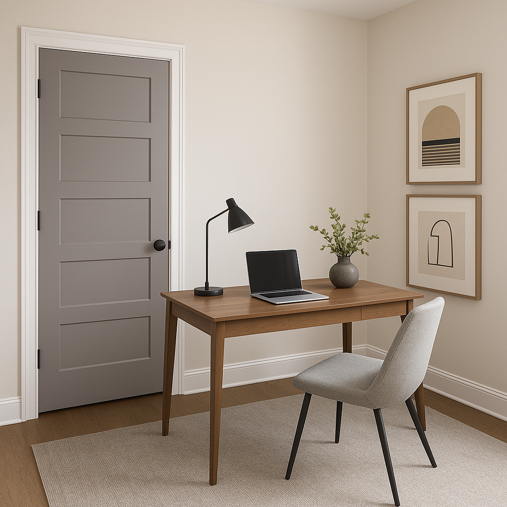
Frozen’s soothing palette is conducive to focus and productivity, making it a great choice for home offices and study areas. Pair it with darker accents for a professional yet inviting environment.
In hallways and entryways, Frozen creates an understated backdrop that allows art, furniture, or architectural details to shine. Its versatility ensures a seamless transition between adjoining spaces.
As with all paint colors, lighting plays a crucial role in how Benjamin Moore Frozen appears in your space. In rooms with natural light, Frozen’s blue undertones will appear more vibrant, creating an airy feel. In spaces with artificial or soft lighting, it may lean toward a more neutral gray, offering a muted and elegant look. Always test Frozen using paint swatches or samples in your specific room to observe how the lighting affects its appearance throughout the day.
Benjamin Moore Frozen (1448) is a refined gray that serves as a versatile backdrop for a wide range of design styles and color palettes. Its cool undertones and timeless appeal make it a go-to choice for creating calm, elegant, and inviting spaces. Whether used as a primary wall color or as an accent, Frozen delivers sophistication and versatility to any room in your home.
View Colors Only by Brand (No Imagery):
Sherwin-Williams
|
Benjamin-Moore
|
Behr
|
Valspar
Live on the Eastern Slope of Colorado and looking for a local painting professional, check out all our painting services and reach out for a free estimate.
Copyright © 2026 : Wild Fox Painting Inc. : 12435 Mead Way, Littleton, CO 80125


