Benjamin Moore Pinch (1449) is a warm, medium-to-dark taupe that exudes sophistication and understated elegance. With its earthy richness and subtle complexity, Pinch is a versatile paint color that works beautifully in a variety of spaces and design styles. Whether you’re looking to create a cozy living room, a serene bedroom retreat, or a polished home office, this shade offers a refined, grounding presence that enhances your interior design vision.
What sets Pinch apart is its nuanced undertones. This taupe-based hue carries delicate warm gray and brown undertones, making it feel inviting and approachable while maintaining a sense of depth. Depending on the lighting, you may notice soft hints of clay or mocha emerging, which add character and warmth to the overall shade. In north-facing rooms or spaces with cooler light, the gray undertones may take center stage, giving the color a more subdued, modern aesthetic. In contrast, south-facing or warmly-lit spaces will draw out the brown undertones, enveloping the room in a cozy, earthy glow.
Benjamin Moore Pinch (1449) pairs seamlessly with a range of complementary colors, making it a dream for designers and homeowners alike. Its neutral qualities allow it to serve as a main wall color or as a grounding accent in a layered palette. Here are some suggestions for coordinating colors:
Pinch is incredibly adaptable, making it suitable for a variety of rooms and design styles. Here’s how you can incorporate this versatile color into your home:
Create a welcoming and stylish living area by using Pinch as the primary wall color. It pairs beautifully with warm wood tones, plush furnishings, and metallic accents like brass or bronze. Add texture with natural materials such as jute rugs or linen curtains to enhance the earthy vibe.
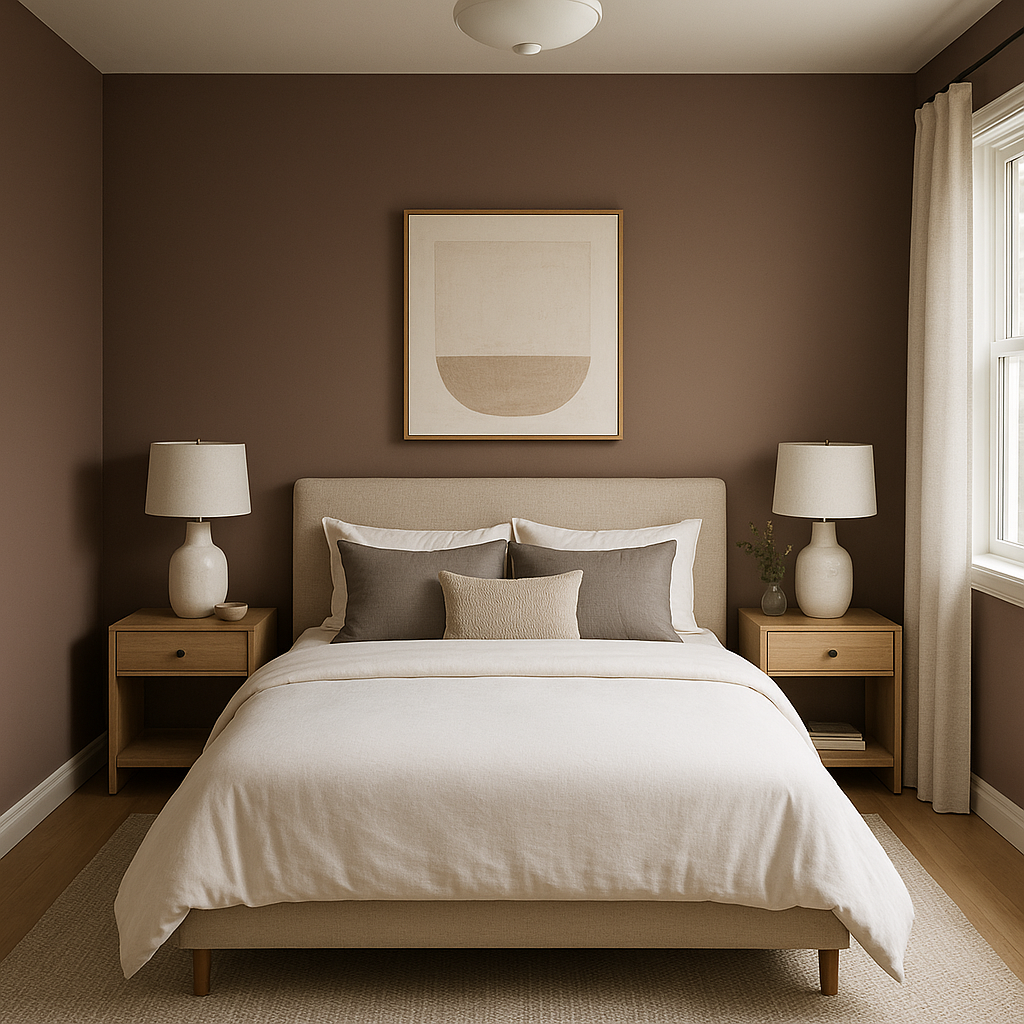
Pinch is an excellent choice for bedrooms, thanks to its calming and cocooning qualities. Pair it with soft beige or ivory bedding for a serene, neutral retreat, or layer in jewel-toned accents like emerald green or deep plum for a more luxurious feel.
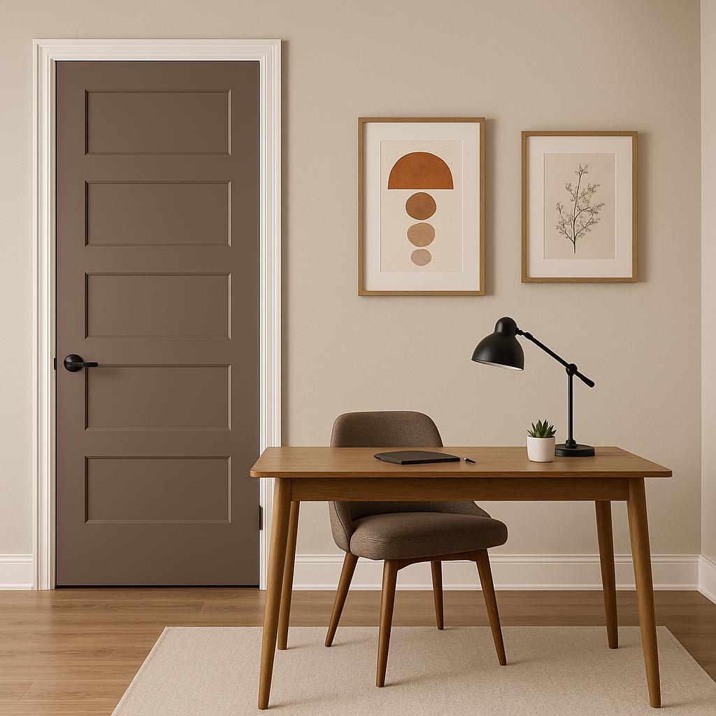
For a productive yet stylish home office, Pinch offers the perfect combination of warmth and professionalism. Use it on the walls and pair it with crisp white trim and dark wood furniture for a classic, tailored look.
If you’re not ready to commit to Pinch as the main color, consider using it as an accent wall in a dining room or entryway. Its rich tones add depth and visual interest without overwhelming the space.
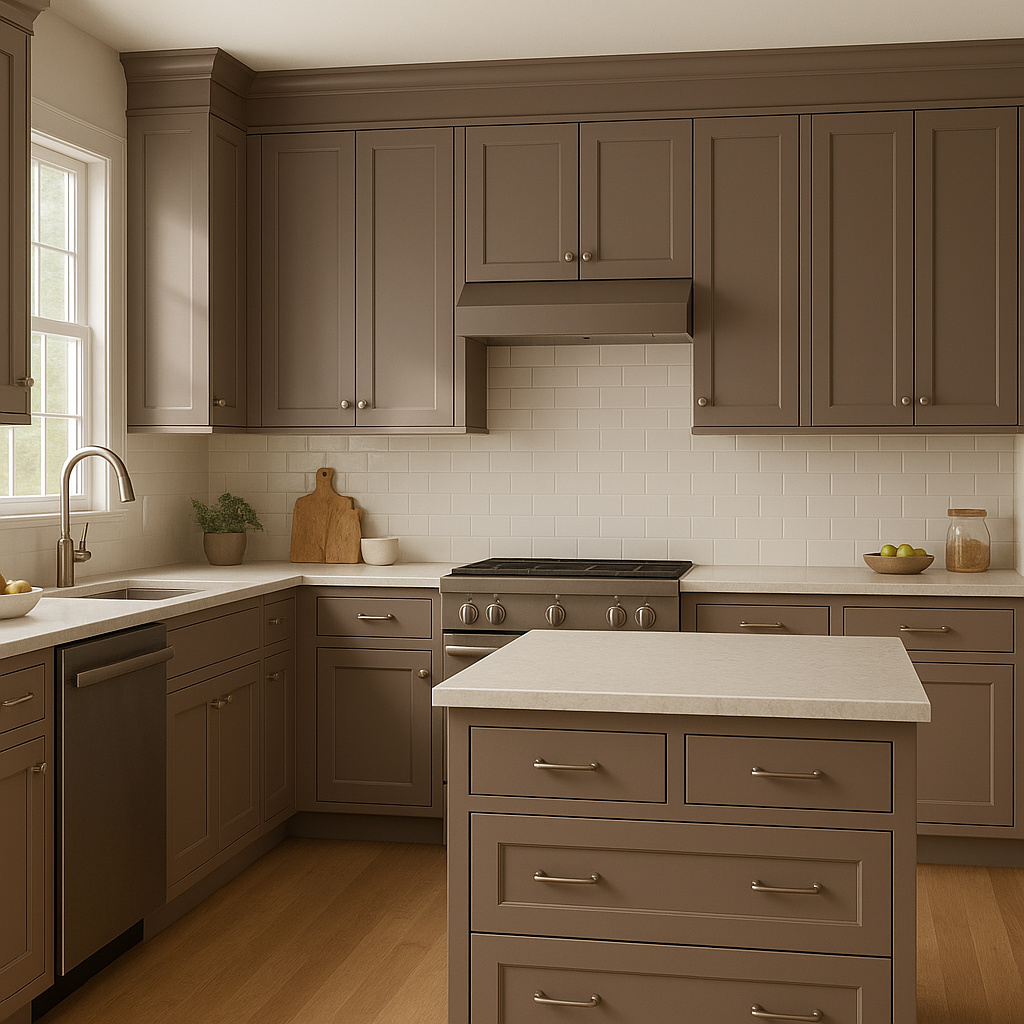
Pinch works surprisingly well in kitchens and bathrooms, especially when paired with white subway tiles, marble countertops, or brushed gold fixtures. It adds a cozy, grounded feel to these functional spaces while maintaining a modern edge.
Lighting plays a significant role in how Benjamin Moore Pinch (1449) will appear in your space. In natural daylight, the color leans slightly warmer, showcasing its brown undertones. Under artificial lighting, especially warm incandescent or LED bulbs, Pinch’s richness becomes more pronounced, creating a cozy and intimate atmosphere. Testing the color in your specific lighting conditions is always recommended to ensure it achieves the desired effect.
Benjamin Moore Pinch (1449) is a truly timeless and versatile neutral that strikes the perfect balance between warmth and sophistication. Its ability to complement a wide range of colors and design styles makes it a go-to choice for anyone looking to create a polished, welcoming, and effortlessly elegant interior.
View Colors Only by Brand (No Imagery):
Sherwin-Williams
|
Benjamin-Moore
|
Behr
|
Valspar
Live on the Eastern Slope of Colorado and looking for a local painting professional, check out all our painting services and reach out for a free estimate.
Copyright © 2026 : Wild Fox Painting Inc. : 12435 Mead Way, Littleton, CO 80125


