Benjamin Moore Violet (1451) is a stunningly understated and versatile paint color that offers the perfect blend of elegance and charm. This soft, muted violet tone has a subtle gray undertone, making it feel sophisticated rather than overly vibrant. Its refined presence makes it an ideal choice for creating a serene and inviting atmosphere in any space. Whether you're designing a cozy bedroom retreat or adding a touch of character to a living room, Benjamin Moore Violet (1451) brings a sense of calm and understated luxury.
One of the defining traits of Benjamin Moore Violet (1451) is its balanced undertones. This shade features delicate gray undertones that temper the purple hue, ensuring it doesn’t feel overpowering or overly sweet. The gray base gives the violet a slightly cool temperature, making it ideal for spaces where you want a calming and grounded aesthetic.
In certain lighting, you may notice hints of blue undertones peeking through, which further deepens its complexity. These subtle shifts in tone allow Violet (1451) to remain dynamic and adaptable, giving your walls a sense of depth and dimension that feels modern yet timeless.
Benjamin Moore Violet (1451) pairs beautifully with a variety of colors, making it a versatile choice for both monochromatic and contrasting palettes. Here’s how you can coordinate this hue with complementary shades:
These coordinating colors allow you to use Benjamin Moore Violet (1451) in a variety of design styles, from traditional to modern to eclectic.
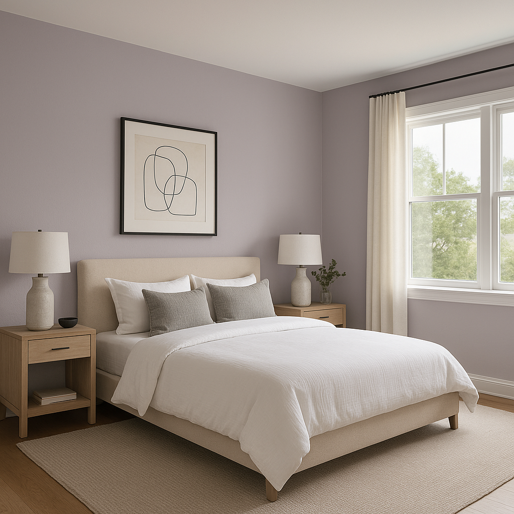
Violet (1451) is an exceptional choice for bedrooms, offering a soft and soothing backdrop for relaxation. Pair it with crisp white bedding and natural wood accents for a tranquil, spa-like retreat. Its muted gray undertones ensure the room feels sophisticated rather than overly feminine, making it suitable for shared spaces.
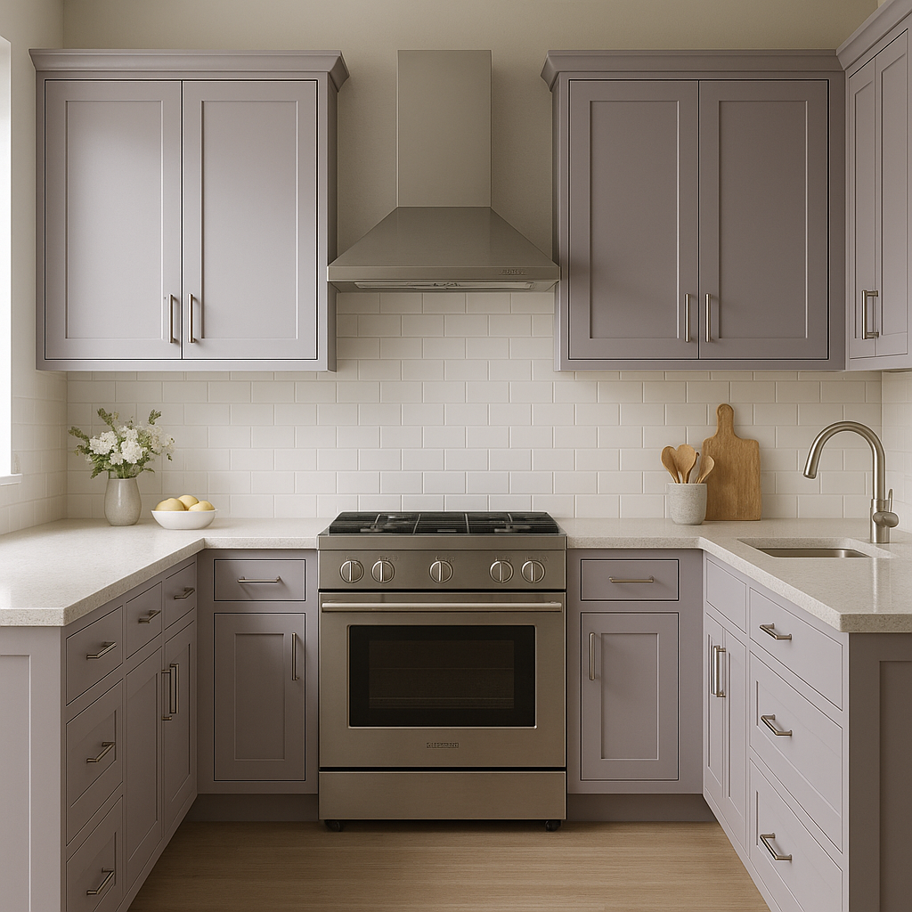
In living rooms, Violet can bring understated charm and elegance. Pair it with a mix of neutral tones and metallic accents, such as brushed gold or silver, for a look that’s both modern and glamorous. Add layered textures like velvet throw pillows or area rugs to amplify its luxurious feel.
In bathrooms, Violet (1451) creates a serene and calming environment that’s perfect for unwinding after a long day. Pair it with white or marble finishes for a clean and spa-inspired aesthetic.
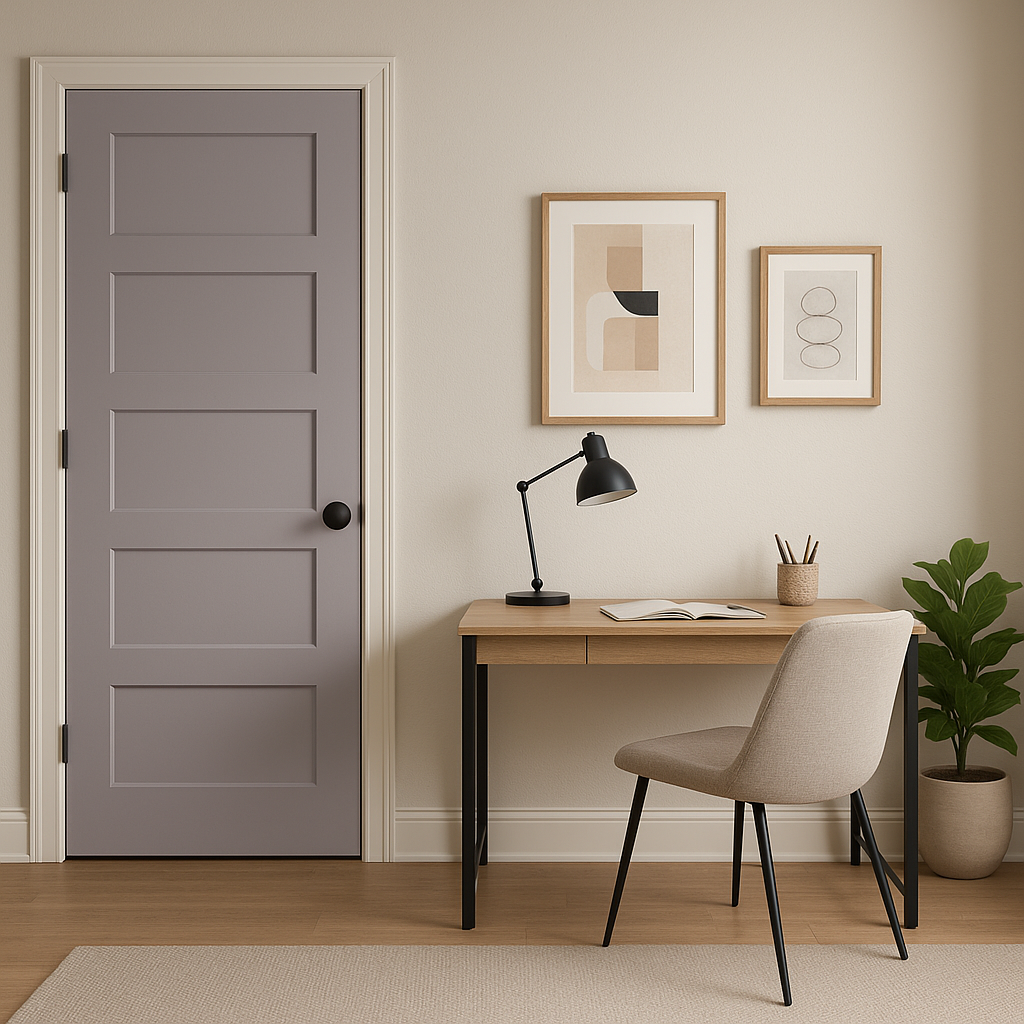
For a home office, Violet (1451) offers a sense of calm focus, making it an ideal choice for productivity. Pair it with warm woods and deep blues for a balanced, professional look that feels inspiring yet grounded.
If you’re looking to make a subtle statement, Violet (1451) is an excellent choice for accent walls. Use it in spaces with plenty of natural light to allow its complexity to shine, and pair it with lighter neutral tones to keep the room bright and airy.
Benjamin Moore Violet (1451) shifts beautifully depending on lighting conditions. In natural light, its gray undertones are more prominent, creating a soft and tranquil ambiance. In darker spaces or under artificial lighting, its violet hue deepens, adding richness and depth. For best results, test the color in your space at different times of day to fully appreciate its dynamic qualities.
Benjamin Moore Violet (1451) is a quintessential example of a color that combines elegance, versatility, and timeless beauty. With its balanced undertones, coordinating color options, and wide range of uses, this shade is perfect for transforming spaces into sophisticated havens of style and relaxation. Whether you're drawn to its soft serenity or its muted complexity, Violet (1451) is sure to elevate your design vision effortlessly.
View Colors Only by Brand (No Imagery):
Sherwin-Williams
|
Benjamin-Moore
|
Behr
|
Valspar
Live on the Eastern Slope of Colorado and looking for a local painting professional, check out all our painting services and reach out for a free estimate.
Copyright © 2026 : Wild Fox Painting Inc. : 12435 Mead Way, Littleton, CO 80125


