Benjamin Moore Vintage 1455 is a sophisticated and enduring neutral that effortlessly combines warmth and depth. This soft taupe-gray shade is a go-to choice for creating a timeless and elegant aesthetic in any space. Its refined appearance strikes a perfect balance between cool and warm tones, making it an incredibly versatile option for a variety of design styles, from modern to traditional.
The beauty of Vintage 1455 lies in its nuanced undertones. This color features a harmonious blend of warm beige and cool gray, giving it a soft, earthy quality. The warm undertones prevent it from feeling too stark, while the gray inflection adds a sense of calm and sophistication. These characteristics make Vintage 1455 adaptable to different lighting conditions, where it can appear slightly warmer in natural light and more neutral under artificial lighting.
Benjamin Moore Vintage 1455 pairs beautifully with a wide range of colors, allowing you to create a cohesive and layered look in your home. Here are some standout coordinating colors:
These color pairings make it easy to design a space that feels cohesive and thoughtfully curated.
The versatility of Benjamin Moore Vintage 1455 makes it suitable for a variety of applications throughout your home. Whether you’re refreshing a single room or tying together an entire house, this color acts as a perfect canvas for your design vision. Here are some ideas for using Vintage 1455:
Vintage 1455 is an excellent choice for living rooms, where its warm undertones create a welcoming and comfortable atmosphere. Pair it with soft linen fabrics, natural wood tones, and metallic accents for a cozy yet refined space.
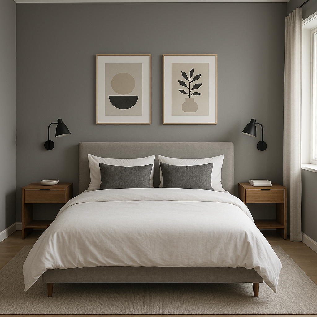
In bedrooms, Vintage 1455 promotes relaxation and tranquility. Consider layering it with plush textiles in muted tones like ivory, blush, or sage green to create a serene retreat.
For dining spaces, Vintage 1455 exudes understated elegance. It pairs perfectly with dark wood furniture and warm lighting to create an inviting environment for entertaining or family meals.
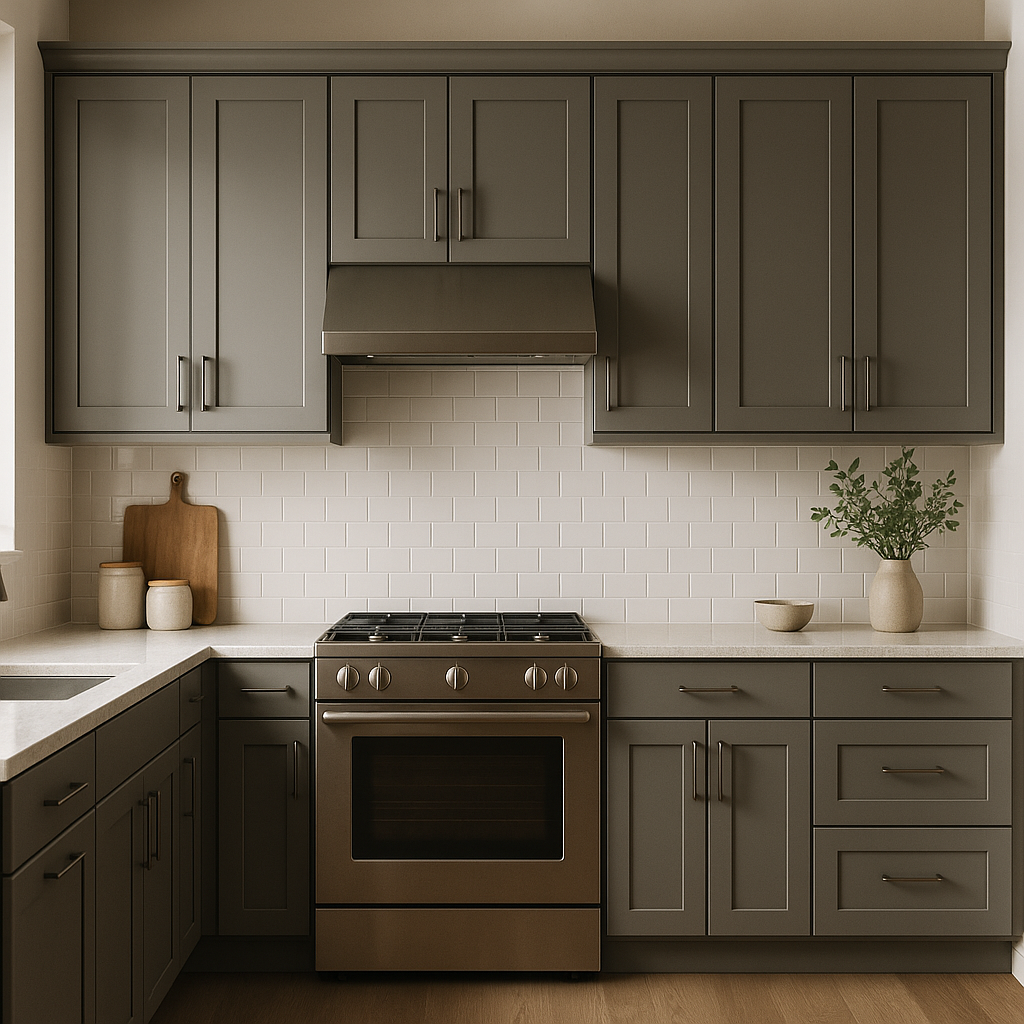
Thanks to its neutral versatility, Vintage 1455 is a great backdrop for kitchens and bathrooms. Use it on walls to complement white or gray cabinetry, or even as a cabinet color paired with marble or quartz countertops for a modern yet timeless look.
In transitional spaces like hallways and entryways, Vintage 1455 sets the tone for your home’s overall aesthetic. Its neutrality ensures it works well with adjoining rooms, creating a seamless flow throughout your space.
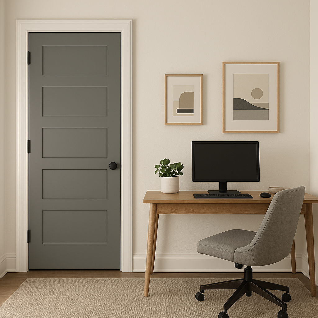
The calming nature of Vintage 1455 makes it an excellent choice for home offices or studies. Pair it with darker accent colors like Hale Navy or Kendall Charcoal to create a sophisticated and focused workspace.
View Colors Only by Brand (No Imagery):
Sherwin-Williams
|
Benjamin-Moore
|
Behr
|
Valspar
Live on the Eastern Slope of Colorado and looking for a local painting professional, check out all our painting services and reach out for a free estimate.
Copyright © 2026 : Wild Fox Painting Inc. : 12435 Mead Way, Littleton, CO 80125


